Thursday, March 23, 2006

New low or steady as you go?


Does the graph show continuous decline or stable approval broken by sharp decline and then steady approval again? The red line is my usual model for presidential approval. The green line uses less than half as many polls to estimate each day of the trend, making it more responsive to short term changes, but also more likely to respond to "noise" rather than "signal".

MysteryPollster Mark Blumenthal posed an important question last week. He pointed out that one can read the polling since January as showing an abrupt downturn in approval of President Bush in February but a steady approval rating since that drop. Mark wrote:
I do wonder if the spacing of polls in this case helps create the impression of a gradual "week-to-week" sinking when the real change may have been an abrupt decline in late February in the wake of news about the UAE ports deal (beginning the weekend of Feb. 18-19) and about the chaos in Iraq following the bombing of the Samarra mosque (on Feb. 22). When I looked at polls conducted between early December and Early February, I saw no trend in the Bush job rating. Obviously, all of the polls conducted since mid February show a decline 3 to 8 points depending on the pollster. The very few organizations that have polled twice since mid-February (which as of this morning includes an update from Fox News) also show no significant trend over the last 2-3 weeks. If we connect the dots before and after mid-February -- whether one pollster at a time as in yesterday's graphic or with Franklin's lowess regression -- we get the impression of a steady decline. But could that apparent gradual trend be just an artifact of the timing of the polls?

I've taken too long to give MP an answer, in part because it is a damn good question and in part because I really wanted to look at these data rather than dash off a "defense" of my model's fit. I hope we can go beyond making this question a Rorschach test of poll perceptions. It is NOT an easy issue to decide, and your eyes may tell you a different story than mine. Nonetheless, here is my best shot.


The graph above shows two plausible fits to the approval data since January 1. (Each is estimated using ALL polls for both 2005 and 2006 but I'm only focusing on the 2006 data.) The red line is the fit I use in my regular posts of current approval of President Bush. It is a fit that uses about 35 polls to estimate each day on the trend line. I've found that this gives a trend estimate that is pretty responsive to changes yet also fairly resistent to the effects of one or two unusual polls ("noise"). It also fits the actual poll data well, with no evidence of systematic failure to follow the trends in the polls when we look back to all the polls since 2001. As you can see, it suggests a decline in approval since mid-January that started slowly and then accelerated in early February. Most important, this trend suggests that approval continued to fall at a steady rate throughout February and the first half of March. (Data go through the Newsweek poll of 3/16-17, the latest available as of this writting.)


In contrast, the green line is not as smooth and suggests that approval was relatively stable at 42-43% in January, then stepped down around February 1, was stable briefly, then took a sharp decline around February 19 or so, but stabilized again around March 10 or so. This trend estimate uses about 15 polls in the estimate of each day's trend, less than half what I normally use. The advantage is it can catch changes quicker than my usual estimate. It also just so happens to support Blumenthal's observation. Frank Newport of the Gallup Poll also sees this pattern that Blumenthal had previously pointed out:
In general, it's clear that the public's assessment of Bush's job performance has not undergone a dramatic free fall, as some may think. Gallup's regular assessment of president job approval ratings allows us to determine that Bush's ratings have remained remarkably constant for significant periods. The pattern of late has been marked by periods with virtually identical ratings, followed by small shifts and then another period of stability.
(That quote is now on Gallup's subscription only site, so no link to it.)

So how do we go about getting some purchase on this question? First, let's be clear that a constant downward trend does not mean that the trend must continue. We saw a sharp upturn in approval after November 11, 2005 when the White House launched a strong defense of the President's policies. My usual trend line picks that up nicely as you can see here. However, I'm the first to admit that it requires data to show a change in trend, and it took some time before my usual trend line picked up the November change in the president's ratings. I wrote here on December 6 that an upturn was visible, and followed that with posts confirming the trend (see the December archive). It took 7 new polls after November 11 before I posted something. So it does take a while for my model to spot a change, but with moderate amounts of data the change will show up in my "standard" model. So if Blumenthal and Newport are right, I should see my trend line flatten out with a few more polls in hand. But as the figure shows, so far it hasn't. However, if we want to shift to the riskier but more responsive green trend, then we'd see that things have settled down into a "steady as you go" period.

So let's try some stats to see if we can find evidence for or against the "constant decline" model or for the "sudden shift, then steady" model.

An alternative to the local regression trends I usually present is a linear regression model that includes changes due to specific events-- in this case, Katrina, the Libby indictment/Meiers withdrawal, the November 11 speech offensive, and now a post-State of the Union period. The advantage of this is that the linear model forces trends to be exactly linear within periods. If the data do not fit this assumption, we should be able to see this in either the plot or in the residuals plot (of the errors from the fitted model.) Here is the fit, with a local regression fit for comparison.
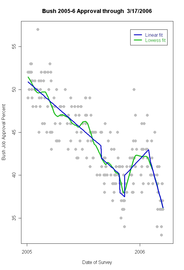


I've used a local regression here that is between my usual and the less smooth one above. The local fit shows the stable approval in December and early January, that is NOT present in the linear fit which predicts continued rise during that period. However, the local regression and the linear decline match each other almost exactly after January. That suggests the linear fit is not a bad estimate (though if I'd used a rougher local regression with fewer data points it would of course have shown the plateaus we see in the green line of the first graph.)

A better way to look at fit is to check the residuals, the deviations between the observed polls and the predicted value of the linear fit. If the model is reasonable, we should see a random scatter around a mean residual of zero. The variability around that line should be stable, and there should be no local movement away from a mean of zero. Here is what that plot looks like:
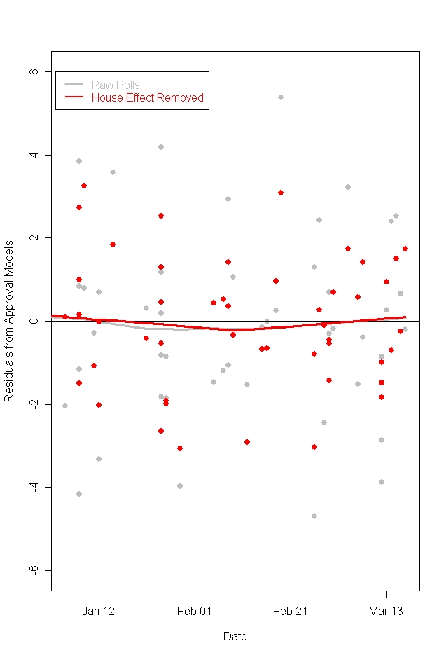


The red and gray lines are local fits and show no significant departure from a mean of zero. They do hint that the trend may be changing since mid-February, but if so the change is on the order of a quarter-to-a-half of one percent, far below levels we could find statistically significant. This plot also separates out raw poll results from results adjusted for "house effects", the tendency of different polling organizations to find approval ratings higher or lower than the average. The gray points are raw polls, and spread a little bit wider around the zero-line. The red points have removed the house effects (adjusting all to the mean of all house effects) and is a little more tightly bunched. However, regardless of whether we remove the house effects or not, the residuals still center around zero with no clear evidence of departure from the linear model. This argues for a steady decline since February 1, rather than the decline-then-steady model.

These house effects are moderate in size. If we imagine that we get a batch of polls that all come from organizations with "negative" house effects, we could be fooled into thinking that the trend was down more than it really is. If we got a batch from more positive pollsters, we could think things had stabilized or even increased. And if we get polls more or less randomly-- from some "positive" houses and some "negative"-- and mixed together over time, then the house effects shouldn't distort things very much in terms of trend (though of course comparing results from a "positive" house to a "negative" house would certainly be confusing.) Here are the estimated house effects, based on all polls taken in 2005-06.


House effects are consistent but relatively modest. They vary within 3 percentage points of the average effect. However, comparing an NPR poll (which tends to be favorable to the president, with a Pew or Quinnipiac poll can produce a difference of a shade over 5%. In my "adjusted approval" data below, I've taken out these effects, so that we can make better "apples-to-apples" comparisons.

If we plot the data with and without house effects and fit a local regression, we should see a difference between the lines if house effects are distorting the trend. If the fitted lines are pretty similar, then we should see an approximate parallel between the two fits. (I've again used less data per point than usual so change can be more apparent. The green line is the same as in the first graph above. The blue line uses exactly the same amount of data but with the house effects taken out of the approval rating. I've also expanded the time frame to go back to November to show both the rise and the fall of approval.)


Taking out the house effects smooths the local fit a bit, especially in late December and early January. In March, the green line based on raw data shows the flattenning and slight upturn we've seen above. But the blue line, with house effects removed, shows no evidence that the decline in approval has hit a steady state.

These views of the data have required some fancy stats with adjustments and fits and residuals. What if we take a simpler view of the data? Let's group the polls into two-week intervals, from November 11 through the March 17 latest poll. This gives us a reasonable number of polls in each group:

Weeks --- N of polls
11/13 --- 5
11/27 --- 7

12/11 --- 11
12/25 --- 1

1/8 --- 9

1/22 --- 9

2/5 --- 9
2/19 --- 9
3/5 ---- 11

In the boxplot below focus on the heavy black line in the middle of most boxes. That's the median of the polls taken in that week. The box goes out to the 25th and 75th percentiles of polls that week. In a period with really consistent polls, namely 2/5, there is no box-- just the median. Also during the 12/25 period there was only a single poll, hence only a median. And 2/19 most polls were low, so the median and 25th percentile are the same. The width of the box indicates how many polls were taken during the period, from 1 during 12/25 to 11 during 3/5. The spread of the boxes gives you a feel for how much variation there was among polls during the two weeks, and the trend in the median should tell us what is happening over time.

So no fancy stats here, just looking at what happens to the median over time. First the raw, unadjusted, approval:


Just following the medians there is little suggestion of any slowing of the decline in approval, at least for two-week wide intervals of polls. The medians fall each period from 1/8 through 3/5.

What if we take out the house effects?
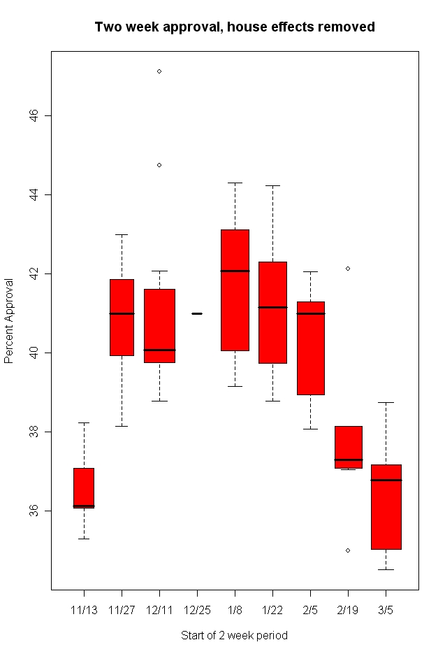


Now the decline is still monotonic, but the three periods through 2/5 don't show as pronounced a decline as they did in the raw data. There is then a sharp drop in the 2/19 data, and only a small further decline in 3/5. This is more the Blumenthal and Newport story again. It is also a bit different from the local regression lines we saw above which made the trend look steady when adjusted for house effects. So what gives here? Temporal aggregation. Clumping in two-week periods has masked some effects by lumping together high and low weeks. Look at the same data with a one-week interval (and small numbers of polls per week, but that's the price you pay.)
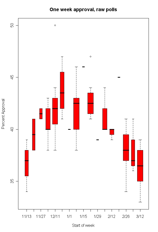


With un-adjusted approval ratings, the regular decline is still pretty clear, though week-to-week variation is greater with fewer polls. When we look at the adjusted approval rating, removing house effects here is what we get:


More noise, and few polls in some weeks, but to my eye at least I still see continued downward movement and not stabilization.

So what's the data say? The local regression line can be made more responsive to short term data, and when that is done we can see a local fit that looks like the Blumenthal/Newport story. Using more data to estimate the trend for each day removes this and gives continued downward movement. Which is it? The linear model, with changes at the time of major events over the past 15 months finds very little evidence for departure from linear decline since the State of the Union address on January 31. The residual plot showed a seemingly random distribution of errors, as it should, and the mean residual remained very close to zero throughout the period. I do conceed that there is perhaps 0.25-0.5% shift, but that is not close to statistically significant.

If we remove the house effects and replot the data with a local regression, we find that results with house effects removed also show continued decline. This argues that seeming stabilization might be due to the mix of polls that have been released in the last week or two.

Finally, if we go low-tech, the trends in the medians of the polls again suggests to me little evidence of new stability, but rather of a continuing downward trend, at least through the week of 3/12.

Now, what does the future hold? I don't know. The President has started a new round of speeches, press conferences and town meetings to boost his standing. I've argued here that he needs to do that and that opinion should respond to this effort. Others have argued that he's already gone to that well, and it won't work again. We'll see.

What I stress is that my models here are not intended to predict future events. My goal is to clarify what the data show has happened. I'm pretty sure approval has continued down. If the data next week show it has stopped and started up, then I'll be happy to show that. But I'll be unhappy if eventually the timing of the stabilization or upturn is shown to have occurred before March 19. If so, I'll point that out too.

Monday, March 20, 2006

Partisanship moves


(Click the figure, then click it again to see the full resolution.)

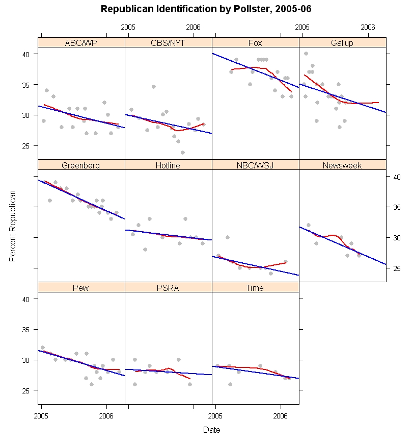
Partisanship is a moving target over time and exhibits considerable variation across pollsters. The combination of both over time and across pollster variation makes simple comparisons of partisan balance across polls potentially misleading and agreement on a single partisan distribution difficult at best.

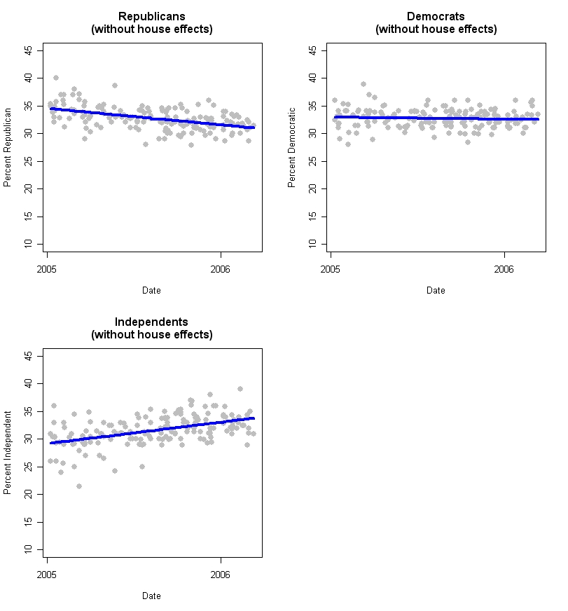
Between January 1, 2005 and March 12, 2006, Republican partisan identification declined by an estimated 3.6%. The percentage of the adult population calling themselves Independent rose by 4.6%, and the percentage of Democrats declined by a statistically insignificant 0.4%. These changes are important for polling methodology and also present a politically important shift in the partisan balance.

In the first post of this series on partisanship (here), I showed that pollsters differ substantially in the percentages in each partisan group their polls typically find. In this post I turn to change over time. While much more stable than many political attitudes, party identification is not immune to systematic variation over time. This makes the party id distribution for any pollster a moving target, while posing the problem of how to know what the target is at any given moment. This is particularly an issue for those who think polls should be weighted to a constant distribution of partisanship, or even to a moving average of previous polls. Perhaps more importantly it means that those who judge a poll's merit on the basis of it's partisan balance need to be much more aware of how much variation there is, even over the relatively short span since President Bush's reelection. Differences between polls that are pointed to as signs of at best “bad samples” and at wost malignant bias by pollsters are in fact well within the range of variation typically found across polls and over time.

In the figure above, I plot the trends in Republican identification through 2005-06 for all pollsters for whom I have sufficient observations to make reasonable estimates. (The AP is omitted because their results are generally only available in a “leaned” form, with Independents who lean to either party included in the party totals. The data here are only for “unleaned” question formats.) The “house effects” are clear in the range of vertical variation across pollsters. Fox is quite high (they are also high on percent Democrats) while NBC/WSJ is quite low (they are also low on Democrats.) And the others vary between these extremes. As we saw in my previous post, most of the variation across polls is related to the percentage of Independents. Fox gets few Independents, and is thus high on both Reps and Dems. The Fox question wording does not offer an explicit “Independent” alternative, which surely accounts for this difference. NBC/WSJ is quite high on Independents, and so is low on both partisan groups. There is no obvious question wording that would explain this consistent house effect.

More importantly, however, all of the pollsters show a downward slope over the course of the 14+ months included here. While there is substantial variation in what the percentage of Republicans is at a given moment in time, all the polls agree that this percentage has fallen since January 2005. The straight line in each panel is the linear estimate of trend over time. The red curved line is a local regression that can provide a non-linear fit to change. While the trend is somewhat non-linear for Fox and Gallup* in particular, and a bit off of linear for CBS/NYT and perhaps NBC/WSJ, in most panels the trend is pretty close to linear regardless of which estimator is used. Also the slope varies across the polls, but not hugely. A statistical model that allows the slopes to vary (along with house effects) is not statistically distinguishable from a model that assumes equal linear slopes (but with different house effects for the level of Republican identification.)

(*Gallup data requires explanation. Gallup does not routinely release the partisan breakdown on their polls, at least not that I've been able to find. They do list partisanship breakdowns for all polls on their subscription only website. The data I display here is taken from the Roper Center at the University of Connecticut's “iPoll” database, which is available to subscribers and which includes permission to publish results of research based on the data. My university is a subscriber. Those data end in September 2005. As an individual, I am a long time subscriber to the Gallup website but do not wish to publish data they do not consider available without fee to anyone on the web. I've therefore used their data through March 2006 in my statistical analysis, and in the fitting of the regression and local regression lines in the above figure, and those that follow. However, to honor their desire to protect their data from release, I've suppressed the plotting of data points in the Gallup series after September 6, 2005, the last data available to me from the Roper Center. As is clear from the figure, Gallup data show a Republican decline through September 2005, but this flattens out after that. I believe it would be misleading not to show the trend based on the entire dataset so I've included the linear and non-linear trend lines estimated on the full dataset but have not plotted the data points themselves after early September. You will have to take my word for it that the Gallup data after September scatter more or less randomly around the non-linear trend line. The linear fit is not terrible but does under-estimate Republican identification for the Gallup poll late in 2005 and in 2006.)

By pooling the data across polls, and fitting a linear model with dummy variables to capture house effects, I estimate that Republican identification was 34.6% on January 1, 2005 and 31.0% as of March 12, 2006. That is a small change compared to shifts in presidential approval over the same period, but is a statistically and substantively significant shift in the relatively more stable partisanship measure.

Paradoxically, the loss of Republican identifiers should be helping President Bush's approval rating among “the base”. If those shifting out of Republican and into Independent are very marginal Republicans, then their support for the President should be less than that among stronger identifiers. By leaving the party, they avoid dragging down presidential approval among the remaining GOP identifiers. For example, in recent Gallup polls approval among Republicans has been around 80%, and about 30% among Independents (roughly speaking). If we added back to the GOP the 3.6% they've lost, and if they behaved like other Independents, then approval among the GOP would be only 74.8%, not the current 80%. So that isn't a huge amount, but it is noticeable. (Of course, the 3.6% might not be typical of other Independents, so the effect could be less. But you get the idea.)

These estimates are based on samples of adults. The 2004 exit polls estimated a Republican share of 37% among actual voters, a modest advantage for Republican turnout. Election day was 59 days before January 1, so my estimate would be 35.1% Republican on election day, if the trends in 2005-06 extended back to election day 2004, within 2% of the exit poll estimate.

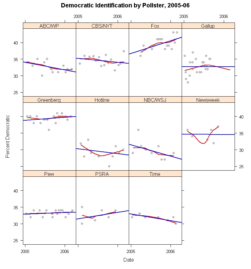
In contrast to Republican identification, the percentage of Democrats has remained quite stable in most polls since January 2005. The figure below shows the trend in Democratic identification using the same methods as for Republicans above.


The variation in slopes over time are generally modest, with the exception of Fox and NBC/WSJ. Once more a statistical test fails to find convincing evidence that the trends differ significantly across polls. (The Fox upward trend is likely related to the question wording. I discuss this below.) When pooled across polling houses, and taking account of house effects, the estimate is that Democratic identification is statistically flat over this time period, with a non-significant decline of 0.4%. By these estimates, Democrats made up 32.9% of the adult population on January 1, 2005 and 32.5% on March 12, 2006. Here the gap with the 2004 exit polls is larger. The exit polls estimated that Democrats and Republicans both made up 37% of the voters on election day. Based on these 2005-06 polls, the Democrats were about 4% lower than this in the population, at least as of January 1, 2005. In the last 14+ months, the Democrats appear essentially unchanged, despite the bad times for President Bush and the losses suffered by the Republican identifiers. So what about Independents?


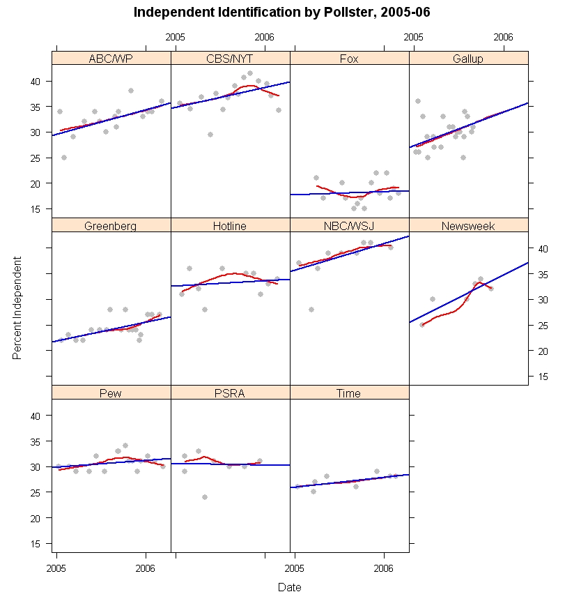
Independents have grown in size across most of the polls. PSRA (Princeton Survey Research Associates) has them flat, and Fox has a small slope but every other poll shows small to substantial gains in Independent identification over the last 14+ months. The gains are essentially linear, as the local regressions lie very close to most of the linear fits. And a statistical model again finds that a model in which Independents gain at a common rate across polls cannot be rejected (with house effects for level but not for slope.) Based on the model, Independents have moved from 29.2% at the start of 2005 to 33.8% as of March 2006, a 4.6 percentage point increase.

There is a considerable debate in political science over how malleable partisan identification is. I belong to the camp that argues for significant responsiveness of party id to the policy positions of the parties. Others (Morris Fiorina, and the team of Bob Erikson, Jim Stimson and Mike MacKuen, for example) argue that party identification responds to government performance of one kind or another. We all agree that partisanship can shift in non-trivial ways over relatively short periods of time. There is another side, led by Don Green and colleagues who argue that party id is actually very, very stable and except for some random measurement error is really not responsive to other political forces. We'll leave that discussion for another day.

When shifts occur in party id, it is reasonable that those most likely to shift categories on the partisanship question are those in or near to independence. (There are arcane academic debates on exactly why this is, but in the big picture it seems reasonable enough that those with the weakest attachments to parties would be most likely to shift when given a reason.)

So how does that help us with the data before us? In 2004 the presidential election favored President Bush who won by a small but comfortable margin in the popular vote. If we assume this is because short term forces favored the Republican candidate, it is reasonable that some people who are near the dividing line between independence and Republican identification were moved to shift a bit to their right, into declaring themselves “Republican” when asked “In politics, as of today, do you consider yourself a Republican, a Democrat, or an Independent?”, the Gallup form of the question. In 2005 and so far in 2006, the balance of forces has been against the President and the Republican party. The result should be that those who were moved a little into the Republican category during 2004 are now likely to move out and into independence. The result is a downturn of Republican identifiers and a growth in the proportion of Independents.

What about the Democrats? The 2004 election was one of the most polarizing elections in the last 60 years. It would seem plausible that some Independents who lean towards the Democratic party were convinced to declare themselves “Democrats” as a result of this polarization. When the election period was over, we might normally expect these people to drift back into independence as well, resulting in some decline in Democratic as well as Republican identification. However, the bad year for President Bush has produced political forces consistently disadvantaging the Republicans, and hastening the departure of especially weak identifiers. At the same time these forces should act to hold the most marginal Democrats in the party, keeping them from drifting against the tide of partisan forces over the last year or so.

Of course, we don't have individual level data, so this is a plausible explanation, not one that is beyond debate. We would need to see which individuals shifted to be confident that my story is correct. With only these aggregate data it is possible that some other, more complex, interchange among the three partisan groups has occurred. The net effect, however, is not in doubt: fewer Republicans, more Independents, about the same number of Democrats.

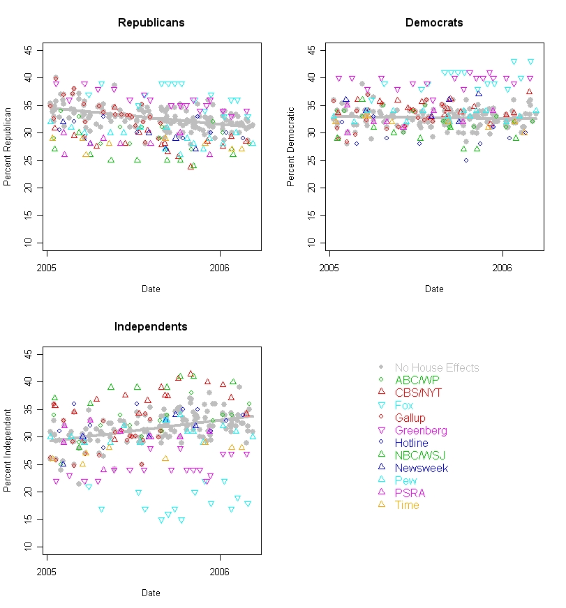
But how much spread is there across polls, and what happens if we take out the house effects to our view of partisan trends. The figure below shows each partisan group over time, with the observed data and with a trend (in gray) of what we would estimate partisanship to be having taken out the house effects using my statistical model.


The spread of partisan estimates is considerably larger than the spread of estimates with house effects removed. This is especially striking for the Independents, where the house effects are huge. The very low percentage of Independents in the Fox poll is undoubtedly due to their question wording, “When you think about politics, do you think of yourself as a Democrat or a Republican?” The lack of an explicit “Independent” option would be expected to drive down that category, and it clearly does. While not quite as extreme as the results from allocating partisan “leaners” to a party, the Fox question results in a distribution that appears much more partisan for both parties than other polls. NBC/WSJ has the opposite result. Their question is seemingly innocent, “Generally speaking, do you think of yourself as a Democrat, a Republican, an Independent, or something else?” They don't get many “something else's”, only about 4%, yet their Independent group is quite large relative to other polls. This could be due to interviewer training, I suppose, but the large number of Independents is something of a mystery to me (unless interviewer's encourage “something else” respondents to choose Independent before recording the response. Based on other polls with a “something else alternative, this could add 6-8% to the Independent category. Still, that wouldn't explain the low numbers of Dems and Reps that NBC/WSJ get.) The result is that NBC/WSJ is consistently low on both Republicans and Democrats. Other polls fall between these extreme house effects.

The gray dots and trend line shows what the distribution of partisanship would be if we remove the house effects but keep the common trend over time. The distribution is reasonably tight about the trend, certainly compared to the raw polls.

These figures should make clear why comparing party identification across different pollsters and/or at different times is a dangerous business. It is certainly true that house effects differ and they differ substantially. So compared to Fox, everyone else has too few Republicans. Of course, they have too few Democrats as well! The problem is there are house effects but more importantly we don't have any single “correct” value for party identification. The figures here demonstrate that there is great variation, yet who is to say that any one of these pollsters is “right” and the others wrong? The technology of polling is essentially shared by all. I deny that anyone seeks to intentionally ask biased questions. Rather question wording variation reflects the purposes of the survey organization, and these may differ for legitimate reasons, as when Fox leaves out an Independent option, or when some pollsters offer a “something else” alternative or stress “Generally speaking...” as opposed to “In politics as of today...”. These produce different results, but none is clearly better or worse than the others.

So if we can't agree on a single standard, what can we do? We can estimate the house effects, and compute a pooled estimate normed to a single survey house. This figure appears below (and in gray in the figure above as well.)


Here (and throughout this analysis) I've used Gallup as the reference pollster simply because Gallup does more surveys than anyone else in my dataset and it makes sense to use the house with the most cases as the base. This does not mean that Gallup has the “right” measure of partisanship. It is merely convenient.

If we wanted to weight datasets to a fixed partisan distribution, this figure shows the problems we encounter, even after pooling across 165 surveys. First, there is a trend. Weighting to ANY static values for partisanship will be wrong if partisanship actually moves, as the data here demonstrate. If instead you use a moving average of past polls, you'll always have estimates behind the current point on the trend line. So you could use the regression estimate for the current party balance, which still uses the past but requires a good fit to the trend. As it happens we do have a good fit to the linear trend here, but there is no reason to think that is guaranteed in the future. And while these trends are not extremely sharp, they do imply a shift of 3.6% down from Republicans and 4.6% up among Independents. Some strong words have been used to describe polls as “biased” for differences of this magnitude compared to what the antagonists think are the “right” numbers. So that is a non-trivial issue.

Second, the variability around these regression lines suggests uncertainty of about +/-4% even when we leverage all our data as much as we can. My estimate of current Republican identification is 31.0%. But I can't say with any confidence that it is not 28% or 29% or 33% or 34%. Or maybe even 27% or 35%. And this is after taking out all house effects and allowing for change over time.

Some argue for weighting to the exit polls, which is ironic in light of all the criticism of exit polls after the last three elections!

My point here is not to take sides on the weighting to party id issue (though my analysis is relevant) but rather to point out how difficult it is to have a target party distribution that is precise enough to have absolute confidence in (which is what you need if you are going to weight to it.) We are pretty darn sure what the percentages by education, sex, race and region are in this country. Those make good weighting criteria. Not nearly so good an idea for party, no matter how you care to measure it.

Finally, there are some that argue that even the variation around the trend line in the figures is evidence of systematic response to political events. While I cannot distinguish this from random noise, it is possible that some of this variation is “real”, but very short term, change Weighting to an unrealistically stable target might avoid partisan criticism but would also distort the actual variability of public opinion.

To conclude this look at party over time, as Galileo said, “it moves.” Right now that is working to disadvantage the Republicans, but not so much in favor of the Democrats. The rise in Independents may itself change if they are pushed more strongly towards one party or the other.


Click here to go to Table of Contents

Friday, March 17, 2006

Three years of opinion on the war


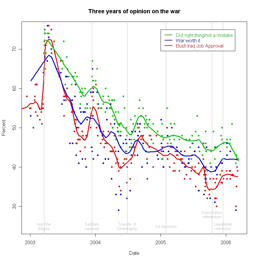
In three years support for the war in Iraq has declined from 70% to just over 40%. Approval of President Bush's handling of the war has fallen somewhat more, to under 40%.

Americans appear to make some distinctions between the justification of the war, its costs and the skill with which the war has been waged. Higher percentages think that “going to war with Iraq” was the right thing, while somewhat smaller percentages think that the costs of the war have been worth it.

President Bush gets still lower ratings for his handling of “the situation in Iraq”, suggesting that the White House has failed to gain the full support of those who still think the war was justified and worth the cost. The President might have been better advised over the past three years, and certainly the last two years, to have embraced the war as his legacy and stressed the importance of “freeing Iraq from Saddam Hussein.” Such a position would not win over those opposed to the war from the beginning, but simply gaining the support of those still convinced we did the right thing would be an improvement in his standing with the public. Instead the White House spent most of 2005 trying to push a domestic agenda which was largely a failure, and in the process distancing the President from the war that, for better or worse, is certain to be his primary legacy. The data suggest the President should have continued to dance with the girl he invited to the prom, rather than trying to find a prettier partner.

Data: The data here are from a number of survey organizations that have asked similar questions about the justification and cost of the war, as well as approval of the President's handling of the war. The question wordings vary, so I've included the text below. The “war worth it” items show the greatest variation, no doubt because some stress the cost in lives while others only ask about abstract costs and benefits.

I have not included data on questions about withdrawal of troops because that series of data is much more limited, while these items span the entire length of the war, providing comparable measures of support for the war over time.

Did right thing/not a mistake” question wording:

ABC/WP: "Considering everything, do you think the United States did the right thing in going to war with Iraq, or do you think it was a mistake?"

AP: "All in all, thinking about how things have gone in Iraq since the United States went to war there in March 2003, do you think the United States made the right decision in going to war in Iraq or made a mistake in going to war in Iraq?"

CBS/NYT: "Looking back, do you think the United States did the right thing in taking military action against Iraq, or should the U.S. have stayed out?"

Fox: "Do you think going to war with Iraq was the right thing for the United States to do or the wrong thing?"

Gallup: "In view of the developments since we first sent our troops to Iraq, do you think the United States made a mistake in sending troops to Iraq, or not?"

Pew: "Do you think the U.S. made the right decision or the wrong decision in using military force against Iraq?"

Newsweek: "From what you know now, do think the United States did the right thing in taking military action against Iraq last year, or not?"

Time: "Do you think the United States was right or wrong in going to war with Iraq?"

War worth it” question wordings:

ABC/WP: "All in all, considering the costs to the United States versus the benefits to the United States, do you think the war with Iraq was worth fighting, or not?"

CBS/NYT: "Do you think the result of the war with Iraq was worth the loss of American life and other costs of attacking Iraq, or not worth it?"

Gallup: "All in all, do you think it was worth going to war in Iraq, or not?"

NBC/WSJ: "When it comes to the war in Iraq, do you think that removing Saddam Hussein from power was or was not worth the number of U.S. military casualties and the financial cost of the war?"

Bush Iraq Job Approval question wordings are all very similar. The basic phrasing is: "Do you approve or disapprove of the way George W. Bush is handling the situation in Iraq?"

Thursday, March 16, 2006

Bush approval decline continues


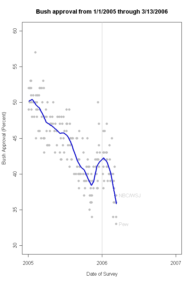
New polls from the Pew Research Center and from NBC/Wall Street Journal add to the bad news for President Bush and the Republican party. The Pew poll, taken 3/8-12/06 registers only 33% approval, down 7 percentage points since early February. The NBC/Wall Street Journal poll taken 3/10-13/06 registers 37% approval, down 2% from their late January reading. (Mystery Pollster has a very interesting post on the litany of "new low" headlines that is well worth reading.)

The effect of these and other recent polls is to lower my estimated approval to 35.9%., down over 6 percentage points since the new year began. A new low (with apologies to MP!) The difference between MPs analysis of change in the individual polls and mine is that I'm accumulating the evidence across all polls, and collectively they are implying that the "true" level of support continues to fall. I've written previously on the problem of spacing between polls here. At this point, President Bush's approval is falling 1% each 12.5 days, the most rapid decline of his presidency. If a poll has a 3% margin of error, we'd only observe a statistically significant change in that poll over a 38 day interval. Hence most changes in polls taken only a week or two apart are not statistically significant even if they are following the same rate of decline. The accumulated evidence across all the polls is a better estimate of the trend in approval, and is reflected in my blue trend line in the figure. Even so, day-to-day movements are not statistically significant, so I agree with MP that it probably shouldn't be headline news that a "new low" has been reached every day, simply because the trend is continuing down. By definition if the trend is down and you've passed the previous low, then every day is a "new low". Perhaps better to focus on the trend than the new record lows.

The President began a new series of speeches this week aimed at shoring up support for the Iraq war and his leadership. That tactic worked well in November and December, underscoring the importance of a positive message to move public opinion. Since the new year began, the messages from Washington and a series of events has been overwhelmingly negative for the White House. In November and December, the White House won the news cycle pretty consistently, and to good effect. They have not, so far, been able to sustain that performance in 2006. This week's beginning of a new offensive will test their ability to do so.

Monday, March 13, 2006

Approval of handling Iraq and overall job


(Click figure and click again for best image quality.)

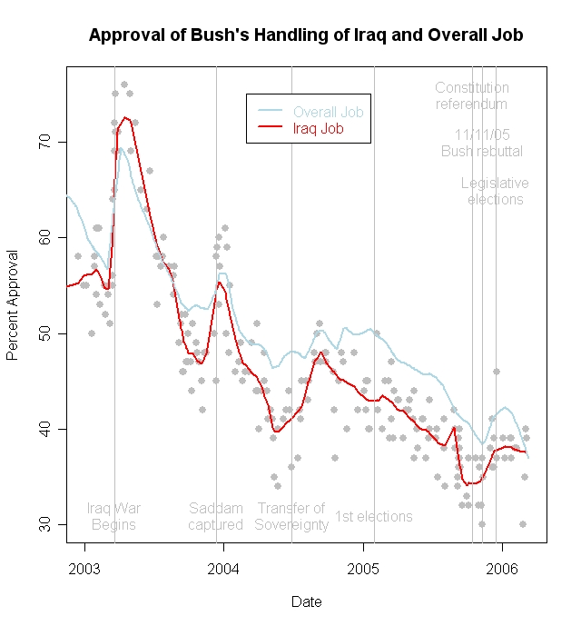
Since late in 2003, President Bush's overall approval ratings have been higher than approval of his handling of the Iraq war. While the war may have pulled down his overall approval, his standing with the public was higher than it would have been based on the war alone. To be sure both approval rates respond to events in similar ways, and the correlation between the two is quite high, making assertions of which "causes" which tenuous at best.

It is nevertheless interesting to consider the dynamics of each approval rating since the last two months of 2005. In Iraq, signs of some progress appeared in the form of approval of the draft constitution in a national referendum on October 15 and the holding of legislative elections on December 15. Approval of President Bush's handling of Iraq stopped declining close to October 15, and rose through the date of legislative elections.

In the interim, President Bush (and Vice-President Cheney) launched a strong response to the administration's critics on November 11, 2005. Largely focused on the war, the administration sustained a rhetorical campaign of unusual intensity for some 3-4 weeks, until mid-December.

It is interesting that overall job approval did not respond to the Iraq constitutional referendum, but turned sharply around almost exactly on the date of the November 11 White House offensive. In contrast, approval of the President's handling of Iraq does appear to have stabilized shortly before the October 15 referendum, then began a 4-5 percentage point rise starting with the November 11 speech and continuing through the December legislative elections.

The downturn in President Bush's overall approval, however, does not appear to be related to opinion of his handling of Iraq. Iraq opinion has been essentially flat since the first of the year, while overall approval has begun a steep decline since the first week of January.

To the extent these differences are meaningful (and I think they are... to an extent) it seems that the war is not the immediate cause of the President's recent trouble with voters (as some reports of the polls have claimed). It is more likely domestic political failures--- including a lack-luster State of the Union address which failed to set out a policy agenda that could win back former supporters, the Vice-President's awkward handing of the press corps, a Republican report on Katrina and last but certainly not least the difficulty with a Dubai company operating US ports--- that have brought the President to the lowest overall job approval of his tenure.

For the first time since late 2003, the President finds that the war is no longer a drag on his job approval. His overall rating is now worse than the public's view of his handling of the war.

Bush approval at new Gallup low of 36%


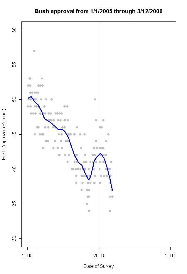
President Bush's approval rating fell to 36% in the Gallup poll conducted 3/10-12/06. This was a new low for the President in Gallup's polling. Disapproval remained unchanged at 60%, with 4% undecided. The addition of the new Gallup data drives my estimated support (the blue line in the figure) to 36.9%, also a new low for President Bush.

Since January 1, 2006 the President's approval rating has fallen at a rate of 1% every 12.5 days, the most rapid sustained rate of decline in his presidency. Over the entire year of 2005, a particularly bad year for the President, approval declined at a rate of 1% every 29.3 days.

(The estimates here use all publicly available polling, not just Gallup.)

Friday, March 10, 2006

AP poll at 37% approval/Zogby at 38%


President Bush's approval has slipped 3% in the latest Associate Press/Ipsos poll, to 37% approval and 60% disapproval. This ties the previous low for approval in the AP/Ipsos poll and falls one point short of the all time disapproval rate of 61% on 11/7-9/05 (37% approve/61 %disapprove.) The Zogby poll for 2/27-3/2 is also down to 38% from 40% approval, and up to 62% disapproval from 60%, since their 2/16-18 poll.

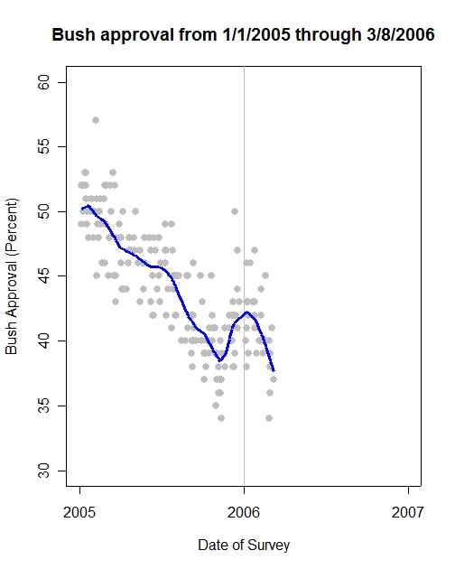
The new data drive my estimated approval to a new low of 37.6%. The downward trend across polls suggests a continued decline in the past week. On 3/7/06 estimated approval stood at 38.2%.

These declines are from an estimated high point on January 9 of 42.3%, or a loss of 4.7% over 8 weeks. This is one of the sharpest rates of decline in the Bush presidency. See the graph for the entire Bush presidency here.

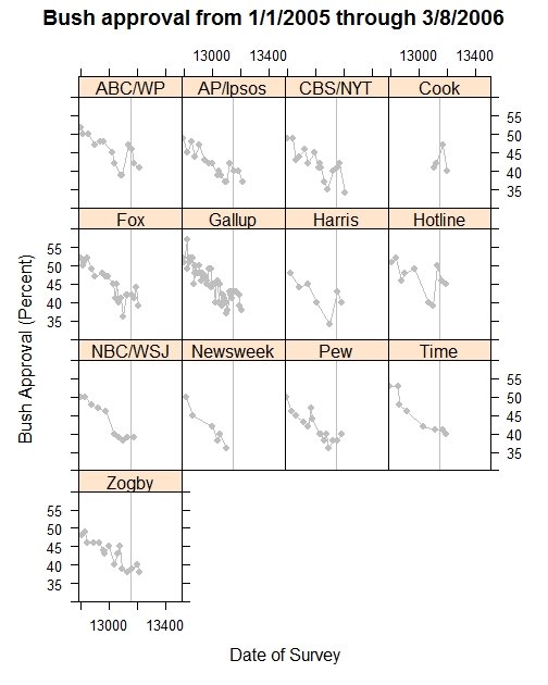
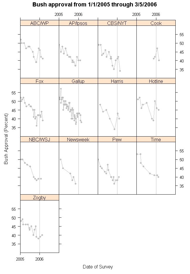
The "apples-to-apples" graph shows approval by each of the major pollsters. The new data points are from AP/Ipsos and from Zogby. Several of these polls have not delivered new data in the last month but presumably will soon.

Presidential Approval and Disapproval in Historical Perspective


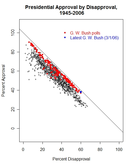
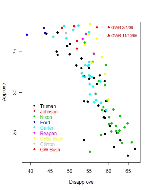
Chris Bowers over at MyDD had an interesting bone to pick with my previous post on how low presidential approval can go. Because his point is interesting, and because it has come up before I want to give an extended answer. Chris' point was that focusing on President Bush's "approval" numbers ignores his "disapproval" number. In comparison with past presidents, the current Bush "disapproval" is relatively high-- he is tied for the fourth worst rating since WWII. If we focus (as I do) on approval rating, then he is in the middle of the bunch, bad but not one of the worst. Chris called for putting the "approval" numbers in more context. Amen. Here is some.

The reason I focus on approval is that approval and disapproval are near-mirror images of each other. If every respondent in a survey either approved or disapproved, then the two HAVE to add to 100%, Approve+Disapprove=100. One can't go up without the other going down by an equal amount. Hence there is no added information in looking at disapproval rather than approval. HOWEVER, there are some respondents who say they "Don't Know" enough to evaluate the president's job performance. This allows approval and disapproval to now vary somewhat independently of each other, but the three still have to add to 100%, Approve+Disapprove+Don't Know=100%. When the DK rate is high, there can be a fair amount of independent variation. But when it is low, approve and disapprove must mirror each other quite closely. What I MEANT to say here... approve, disapprove and dk are each exact functions of the other two. For example disapprove = 100-approve-DK. That means that for a given value of approval, disapprove will vary depending on the DK rate. Higher DK means disapprove will be lower for a fixed level of approval. Lower DK means higher disapproval, again for a fixed level of approval. So approve and disapprove are not exact mirrors of each other as DK varies. When DK levels fluctuate substantially the relationship between approve and disapprove is less exact. When DK levels are relatively steady (at any level) then approve and disapprove are closer to exact mirrors of each other. One way for DK to hold steady is for it to assume very low levels, as has largely been the case with G.W. Bush. (Thanks to reader Patrick N. for pointing out that I hadn't said what I meant to say.)

In the figure above, we see that President Bush is near the lowest approval (highest disapproval) rating of his term. (Based on Gallup only so we can compare across presidents.) What is also clear is that his ratings are mostly much closer to the diagonal line in the plot. This line represents the limit of approval-disapproval pairs if DK were equal to zero.
Any point on the line is an approval-disapproval pair that adds to 100%. The figure makes clear that Bush has had much less independence between approval and disapproval because his rate of Don't Know responses is lower than past presidents. Therefore his approval and disapproval mirror each other and using both provides little more information than using the other.

The decrease in "Don't Know" responses over time is striking. The figure below shows the range of DK responses since Truman. The "box" contains 50% of the polls, with the lines extending out to about 95% of the polls. The circles are outliers.


What is striking is that since Reagan, the don't know rate has declined sharply and continuously. Each successive president has averaged lower DK rates than his predecessor. This decline coincides with the increased polarization of electoral (and congressional) politics over the past 25 years. It is tempting to conclude that the more polarized politics has produced a citizenry that is also more willing to evaluate presidential performance and less likely to have no opinion. Unfortunately it could also be due to declining survey response rates. For many variables, a low response rate doesn't necessarily imply a poor measurement of opinion because the reasons for not responding are uncorrelated with opinion. However, in this case it is likely that saying "don't know" is correlated with political engagement, interest and knowledge. All three of those are correlated with willingness to respond to an opinion survey. So the explanation for the decline in don't knows must remain uncertain (at least for the analysis I can do here-- this would be a good term paper for a grad student out there, hint hint.)

Whether for important substantive reasons of greater polarization, or for technical reasons of survey response rates, the don't know rate has declined. That means that Bush's approval and disapproval MUST more nearly mirror each other, and they obviously do in the top figure. It also makes simple comparison with past presidents more difficult. Truman's 65% disapproval came when 13% still said "Don't Know". Bush has rarely been over 5% don't know and is often at 2 or 3%.

We can compare Bush to the presidents who have been in worse shape by either approval or disapproval. The graph below shows them all. While many polls have been below his approval number, a smaller number (though not tiny) have been worse on disapproval. Chris' basic point, which I (and the data) agree with.


The 60% current disapproval would go with an approval of only 25-30% based on these past presidents, in which case Chris is exactly right that Bush should be seen as much weaker than assessments based only on approval suggest. However, his current 38% approval has in the past mostly gone with DISAPPROVAL rates of about 45-55%, a bit lower than his current rate. Either way his approval ratings are somewhat atypical of previous presidents, and simply picking one or the other or both doesn't account for the changing rate of DK responses.

Rather than tote up a score card to rank President Bush as "4th worst" of merely "6th worst" ratings, I'd look at the first figure here. Now matter how you look at it, being towards the bottom right is bad news for any president. In this case with very few don't know responses, disapproval will go up in lock step as approval goes down. The problem for the White House is how to reverse the movement that has taken this administration from the top left of the figure to the bottom right. There are still 34 months to go for the administration. It can get worse or it can get better. Which will it be?


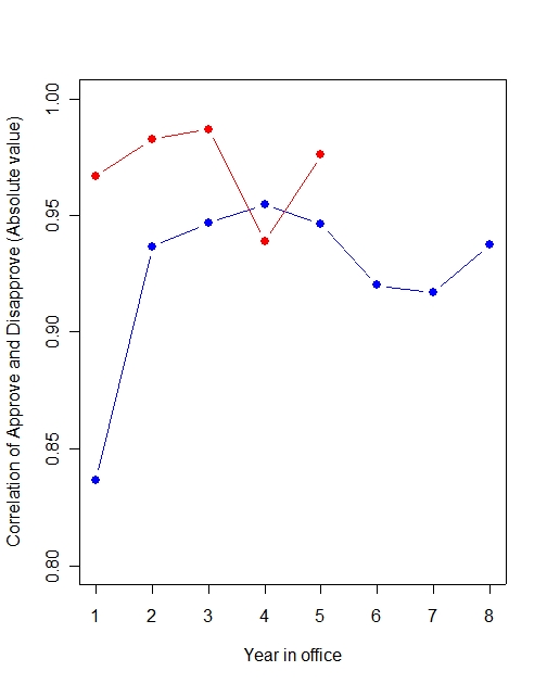
P.S. The correlation between approval and disapproval has always been quite high after the first year in office. Bush's correlation is even higher, since DK is small. Here is the figure. (The drop in correlation in 2004 is interesting. Both approval and disapproval stayed in a narrower range in 2004 than in other years, which lowered the correlation.)


(The actual correlation is, of course, negative. I've plotted absolute value so the graph "goes up" as intuition would say it should.)

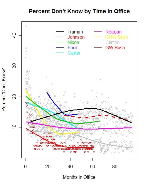
Don't knows also fall with time in office, but much more so in recent years. Here are those data:


Tuesday, March 07, 2006

CBS polls have small effect on estimated approval


(Hint: Click and then click again for full resolution of the figure.)

MysteryPollster Readers: For more on house effects and CNN/ORC, try here

Estimated approval in all polls (blue line) and without any CBS News polls (red line). While the CBS News polls exhibit a house effect of -3%, meaning the CBS polls tend to fall 3% below the overall trend in 2005-06, the effect of including or excluding CBS polls from the estimation of the national trend in presidential approval is minimal. The red line (without CBS) very closely mirrors the blue line (with CBS).

The latest estimate of approval, 38.2%, would increase slightly, to 38.6% without the CBS polls. Becuase there is no evidence here that including the CBS News polls affects my estimate of approval, I will generally avoid further comment and include these polls routinely, as I have in the past.

There are various discussions of "house effects", both here in previous posts and on Robert Chung's excellent site here. Interestingly, Chung finds that for 99 CBS News polls conducted since 2001, and including the most recent, CBS polls have actually averaged a small positive house effect, overestimating Bush support. That positive effect was larger earlier in the administration and has become smaller recently (to my eye, negative since 2004, which is the period in which I estimate the -3% house effect.) Read Chung's pages for the details. The graphics and the explanation are about the best there are. One of these days I'll get around to a full post and analysis on house effects of my own, but I believe my results are closely in line with Chung's except for differences in the time periods we use for estimation.

While nothing I say here will stop the criticism of any poll that disagrees with partisan predispositions, and the selective interpretation of which polls are "accurate" and which are "biased", the data do in fact speak, at least to those willing to listen.

Click here to go to Table of Contents

Estimated Bush Approval Reaches New Low


(Hint: Click graph, and click again for full resolution.)

The current estimated approval for President Bush (blue line) has reached a new low for his presidency. The blue trend line stands at 38.2% approval as of polls completed through March 5, 2006. The previous low for the trend line was 38.4% approval on November 10, 2005, just after the "Scooter" Libby indictment and the withdrawal of the Harriet Miers Supreme Court nomination. On November 11, the White House launched an aggressive and successful campaign to defend the President's policies. This resulted in a rise to 42.3% approval on January 9, 2006, a significant gain of 3.9% and the first rise in estimated approval since January of 2005. Since that time, however, the administration has lost all of the ground gained.

The downturn is apparent in most polls, as the "apples-to-apples" graph below shows. Not all polls have conducted surveys since mid-February when most recent low-readings have become apparent.


The White House's brief success at the end of 2005 has suffered a series of setbacks throughout January and February 2006. Some successes would, perhaps, be more valuable for reversing the current trend than a second rhetorical offensive might be. Unfortunately, legislative success becomes harder the lower the President's numbers fall, and policy success has largely eluded the White House in the second term.

Saturday, March 04, 2006

How low can approval go?


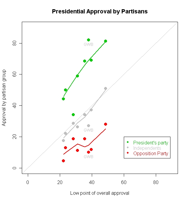
Approval at the low ebb of post-war presidencies by partisan groups. (Kennedy and Johnson are omitted due to missing data.) President Bush is helped substantially by the still solid support from Republicans. This partially compensates for his below par performance among independents and Democrats. The Bush data points are for his current standing (March 1) of 38%, not his all time low of 37% on November 13, 2005. (Can you guess who the unlabeled points are? Test your knowledge. Answers are at the bottom of this post.) Hint: Click on the figure and then again for optimal resolution.


Reader Stephanie M. wrote in with an excellent question today: How low can presidential approval fall? Is there some natural lower limit below which it cannot go. At the same time, some Democratic partisans are posing the same question, though with more glee than scientific curiosity.

The short answer, of course, must be that no one knows how far President Bush's approval rating can and will fall. My view is that this is primarily a function of events, the economy, and presidential leadership success or failure. Some presidents have fallen quite low and then rebounded while others have become mired in their slumps and make only modest recoveries. Lacking a crystal ball, I have no idea what successes or failures may be forthcoming from the White House, so I'm not trying to make a prediction of the bottom of approval for the Bush presidency. Rather I'm trying to answer Stephanie's question and put the President's approval ratings in some more perspective.

First, I'm using only Gallup data in order to have comparability over time, so no CBS 34% here. At his current 38% Gallup approval, President Bush can take some (small) comfort in the fact that every president since Kennedy has fallen below 38% at some time in their presidency. Here are the low points and their dates:

Truman, 22%, 14 Feb 1952 All time low.**
Eisenhower, 48%, 1 Apr 1958
Kennedy, 56%, 17 Sep 1963
Johnson, 35%, 12 Aug 1968
Nixon, 23%., 7 Jan 1974
Ford, 37%, 13 Jan 1975 and 31 Mar 1975
Carter, 28%, 2 Jul 1979
Reagan, 35%, 31 Jan 1983
Bush (GHW), 29%, 2 Aug 1992
Clinton, 37%, 6 Jun 1993
Bush (GW), 37, 13 Nov 2005

** Gallup cites 23% as the record low for Truman. The Roper Center polling archive contains the February 1952 poll cited above which seems to show a 22% rating. I doubt Gallup has this wrong, so there may well be a problem with the Roper Center data. I'm trying to get this clarified. So accept either 22 or 23 as the record.

We can look at the structure of support that presidents draw from partisan supporters and opponents when they hit the low point of their presidencies. The figure above plots the approval rate in each partisan group against the overall low points in approval for each president. The trend lines show what "par" for each group has been.

One thing that is clear is that opposition partisans play a relatively minor role in setting the low-point of approval. Between 23% and 40% overall approval, support among the opposition doesn't really vary systematically with overall approval. A president at low ebb can expect between 10% and 20% support from opposition partisans, and that doesn't seem to decline very sharply at all as overall approval falls from 40% to 20%. In the very lowest case, Truman, support from Republicans fell noticeably below that for other presidents, to an astonishing 4.5%. No one else before G.W. Bush has fallen as low as 10%. At the low point of Bush approval on November 13, Democratic support fell to an almost Turmanesque 7%. The most recent Gallup poll, completed March 1, finds Democratic support at 10%, still the lowest of any president since Truman, though not far from Clinton (11.8%) and the elder Bush (11.3%). Nonetheless, once approval is this low among opposition partisans, they simply can't drive it much lower because there is almost no one left to change their mind.

Independents provide more room for dynamics. Support here falls at almost a 1-to-1 rate between 40% and 20% approval. Independents seem just slightly less approving of slumping presidents than the total population, but their movement seems to track quite well with overall approval. The difficulty for President Bush here is that he is noticeably less popular among independents than one would expect of a president with a 38% overall approval rating. Instead, his approval among independents is some 9-10% below what we might expect based on other presidents.

The great strength of President Bush remains "the base", or Republican partisans in this case. Here he far surpasses "par", with an 82% approval rating among Republicans (as opposed to the expected rate of just 69% in the figure.) Even at his low point in November, President Bush still captured 79% support among Republicans in the Gallup poll. (CBS has a much lower estimate, 72%. The Gallup data have been quite stable in the low 80% range for some while.) So long as the base remains this loyal, it can buffer to some extent the unhappy independents. Given where independents and Democrats are at this point, the President would be in much worse shape if Republicans were not so strongly supporting him. A fall to the expected 69% or so would cost the President some 3-4% points in approval and put him at 34-35% overall support, rather than the current 38%. This is why current Republican Congressional unrest over the Dubai port company sale and other events should be a source of particular concern. Conservative displeasure with Harriet Miers' Supreme Court nomination helped drive down Republican support a little during the fall. The White House can ill afford losses here.

So, there is clearly room for more decline in Bush's approval rating. Democrats can't do much more harm but independents and especially Republicans can and both groups have some room for further decline, with Republican losses the most worrisome. By the same token, if the President won back some of the independents, he could stand to gain modestly. At about 32% of the adult population, a gain of 3% support among independents offers a 1% gain in overall standing. In point of fact, this is much of where the President's boost came in November and December. Between November 13 and December 11, Bush gained 10% approval among independents, from 28 to 38% support. Since December 11, however, independents have fallen back to their current 27% support.

All this shows that there is room for slippage if Republicans jump ship, and some smaller room for decline due to further independent unhappiness. But it doesn't answer Stephanie's question of whether there is a "floor" below which approval won't fall.

We've never seen approval fall below 22%, Truman's ignominious mark set in 1952. Nixon came close at 23%, and Nixon comes closest to offering evidence of a floor. The graph below shows Nixon's approval rating throughout his term.


What is striking is that his support reached an equilibrium around 25% after January 1974, even though it fell precipitously to get there. The period from January to August 1974 did not include many happy days for the Nixon White House, and yet approval really didn't budge for seven months. Even in the "final days" before he resigned on August 9th there was only a tiny hint of movement in the polls.

One can only speculate as to what would have happened to Nixon's public support had he refused to resign. The near total loss of Republican Congressional support might well have driven popular approval down below Truman's 22%. So while I think the January to August 1974 period is some evidence that there is a floor, I don't think that floor is terribly solid.

Fellow partisans can provide some minimal level of support. In Nixon's case approval among Republican's remained at 49.9% four days before he resigned. In contrast, Jimmy Carter fell to an amazing 34.2% approval among Democrats on July 2, 1979. Ironically, his 18.7% support among Republicans and 29.6% among independents kept him from challenging Truman's record. (At his lowest point, Truman still had 44.3% support from Democrats.)

So yes, it can go lower. And while the mid-20% range has been the practical limit, we can't say with much confidence that no president could ever drop below that, though it would take the abandonment by his own party to do it.

As for President Bush, he is being held up by his Republican base. If they stay with him, only moderate further slippage seems likely. If they start to doubt, then there is a lot of room for approval to fall once the base starts to weaken.

Data: The data are from the original Gallup individual level data files, which are available from the Roper Center (for a substantial membership fee.) I built the files and calculated the partisan support by party. The current Gallup approval by party identification data is available at the Gallup Web site (for a much smaller fee.) In the cases of Nixon, GHW Bush and Clinton I've substituted data in the first figure other than their absolute low points. The Nixon and GHW Bush datasets are not available from Roper at the moment. For Nixon I used the last Gallup poll before he resigned, a poll ending August 5. For Bush I used the Gallup poll just prior to his low point on Aug. 2, 1992. In Clinton's case, the actual low point came June 6, 1993 in the aftermath of the failed Lani Guinier nomination as Assistant Attorney General for Civil Rights. However, this was a short term drop in approval that quickly recovered. The more politically consequential failures of support for Clinton came in August 1994 when his approval sank to within 1% of the 1993 low while setting the stage for the Republican victories in November. For that reason I used the 1994 Clinton data. (Update 4/26/06: The individual level data for Ford were not available at the time I did this post. I have now added his low approval rating to the table above but have not added him to the figures.)

Solution set: Here is the top figure with the points labeled for each president. How'd you do?


Click here to go to Table of Contents

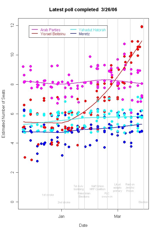
Israeli Election Polls Update (as of 3/26 polls)


Trends in party support leading to the March 28th Israeli election. (Hint: Click the figure and then click again for optimal resolution.)

This figure will be updated in place until the election. Updated commentary appears at the top of the post. Scroll down to read comments in reverse chronological order.

3/27/06: The last polls are in. Time to vote. Kadima continues down. Likud seems to be slipping a bit. Labor a little better. Yisrael Beiteinu continues to climb.

Here are my current estimates from the polls completed by March 26.

Kadima 34.7
Labor 19.5
Likud 14.9
Yisrael Beiteinu 11.0
Shas 10.3
Nat'l Union+NRP 9.5
Arab Parties 8.0
Yahadut Hatorah 5.8
Meretz/Yachad 5.3

Gil (the retired people's party) may pass the threshold to win 2 mandates but the polling on them is limited.

3/24/06: The final stretch is here, and Kadima continues to lose support. Kadima's support has been falling at a modest but steady rate since the Palestinian elections. Labor shows a very slight gain and Likud an even smaller loss. The big mover among the small parties this election is clearly Yisrael Beiteinu (Israel Our Home) which has climbed from under 6 mandates to nearly 10 in the latest polls. Other small parties are not moving.

The slide of Kadima from a high of 40.3 mandates (as estimated by my model) to the current 35.4, makes for a weaker party in coalition negotiations. While there are still numerous coalitions that Kadima might form, it is always better to have more seats than fewer when entering negotiations with other parties.

The current estimates are:

Kadima 35.4
Labor 19.6
Likud 15.7
Yisrael Beiteinu 10.3
Shas 9.9
Nat'l Union+NRP 9.4
Arab Parties 8.3
Yahadut Hatorah 5.7
Meretz 5.2


3/20/06: Support for Kadima has continued to decline over the past week, though with the slightest hint that the rate of decline may have decreased in the latest round of polls, all completed March 13-16. The estimated trend now puts Kadima at 36.1 seats, down from 36.3 a week earlier. That is less decline than the drop from 37.7 on March 1 to 36.3 on March 9. If there are political effects of recent events, they will need more polling to confirm them, and the election is just over a week away.

Labor has made a small gain to 19.4 mandates, up from 18.8 a week earlier. Likud has seen a slight decrease, to 16.1 mandates from 16.4 a week earlier. It should go without saying that these tiny changes are certainly not statistically significant.

Shas and the National Union+NRP coalition have 9.6 and 9.2 mandates respectively. That is a slight improvement for Shas from 9.2 a week ago and a small decline for Nat'l Union+NRP from 9.8 last week. Yisrael Beiteinu is the party with the greatest relative movement recently, continuing to improve its prospects. This week's estimate is 9.7 mandates, up from last week's 8.9. The other small parties remain unchanged, with Arab parties expected to take 8.4 seats, Yahadut Hatorah 5.8 and Meretz 4.9.

With eight days to go there has been little discussion of undecided voters and the question of turnout. At least one poll this week reported 30% undecided. Polls apparently ignore undecided when calculating mandates (otherwise there would be 38 unallocated seats, in this example!) but that seems a dangerous practice. At the least it means we are more uncertain where that undecided vote may land. If it lands disproportionately for one party, the polls could be quite a bit off.

Turnout is another unknown. From 1988-99, Israel saw between 75 and 80 percent of eligible voters cast ballots. That fell sharply to 66.7 percent turnout in 2003. There is speculation that this year's balloting might see even lower turnout. However, there has been little empirical evidence as to what turnout might be this time. Polls seem to rarely report this. Which parties will be helped and which hurt by a low turnout? Stay tuned.


3/9/06: The downward trend for Kadima has continued over the past week, while Likud has clearly developed a small but consistent upward movement. As of polling completed March 8 and 9, my trend estimate is 36.3 seats for Kadima, down from 37.7 seats as of March 1 polls. Likud has moved up to 16.4 from 15.9 over the same time. Meanwhile Labor has shown a very slight drift down, with a current estimate of 18.8 seats down from 19.1 a week earlier.

Shas and National Union+NRP have continued their modest and opposite trends: Shas has fallen to 9.2 seats from 9.7 while the National Union+NRP coalition has barely moved up to 9.8 seats from 9.7.

I've been remiss in not including reports on the smaller parties, especially since they can be crucial for coalition formation despite small numbers of seats. I confess that part of the reason for ignoring them is that they are somewhat harder to graph intelligibly because the data clump together in a small range (all are under 10 seats). That is a poor excuse. However, I can't ignore them any longer, so here is the first graph of how they are doing. Note that in order to improve readability I have added a small amount of random noise to each datapoint so that they don't fall on top of each other as much as the actual data do. All poll estimates are integer numbers, so these points differ from integers due to this added noise. The trend lines are based on the actual data without the noise added.


The graph makes clear immediately one reason I should not have been ignoring these parties: Yisrael Beiteinu (Israel Our Home) has made significant gains, from a fraction over 5 seats to a current estimate of 8.9 seats. Yisrael Beiteinu is supported primarily by immigrants from the former Soviet Union and has taken a secular position, favoring public transportation on the Sabbath, civil marriages, and separation of religion and state. It is also strongly right wing on security issues and negotiations with the Palestinians.

The gains for Yisrael Beiteinu coincide with the collapse of the secular centrist party Shinui. There was press speculation at the time that Yisrael Beiteinu was emphasizing its pro-secular policies in an effort to win over some former Shinui supporters. The polling data don't allow us to know where the new supporters came from, but the timing suggests Yisrael Beiteinu may have succeeded to some extent in winning at least some Shinui supporters.

Otherwise, the polling data show that the Arab Parties are expected to control 8 or 9 seats, with the current estimate being 8.8, up slightly in the last six weeks.

Yahadut Hatorah (United Torah Judaism), the ultra-Orthodox coaltion of the Hasidic Agudat Yisrael and the Lithuanian Degel Hatorah, has remained between 5 and 6 seats, with a current estimate of 5.7 seats.

Meretz, the leftist social democratic party, has hardly moved, with a current estimate of 5.0 seats.

So here are the current estimates: Feel free to create your own coaltions! Left-right, security, secular-religious: you figure out which tradeoffs will be made and what government might form.

Meretz 5.o
Labor 18.8
Kadima 36.3
Arab parties 8.8
Shas 9.2
Yisrael Beiteinu 8.9
Likud 16.4
National Union+NRP 9.8
Yahadut Hatorah 5.7

Total: 118.9 (There are 120 seats, so 1.1 seats are missing from these estimates.)


3/4/06: There has been some noticable downward movement in support for Kadima since the Palestinian Legislative Council Elections January 25th. Kadima has slipped from an estimated 40.6 seats on January 25 to an estimated 37.7 seats as of polling completed March 1. Labor and Likud have remained quite stable since the elections. Labor has risen from 18.8 to 19.1 estimated seats, while Likud has increased from 15.4 to 15.9 since the Palestinian elections. (See below for how the estimated seats are derived.)

There has also been a slight movement since National Union and the NRP announced on February 8th they would run together, as the trend line suggests. The gain so far has been from 8.8 seats on 2/8 to 9.7 seats on 3/1.

Shas has declined slightly in the mean time, from a maximum of 9.9 seats on January 11 to 9.7 on March 1.

The current estimated seats for the largest parties are:

Kadima 37.7
Likud 15.9
Labor 19.1
Shas 9.0
Nat'l Union+NRP 9.7


Estimation: These estimates are based on all polls completed since elections were called and use a local regression estimator, the trend line plotted in the figure above, to estimate the support for each party, eliminating the poll-to-poll variability. The estimates are in predicted number of seats for each party. Israeli pollsters are generally silent as to the margin of error of their estimates, or even how they allocate seats given some percentage of undecided voters. I ignore this and simply fit the trend of all polls taken together. The variation of points around my trend lines gives a good visual impression of the uncertainty across polls at each point in time.

Friday, March 03, 2006

New approval polls reduce doubt about CBS


Approval of President Bush's handling of his job now stands at 38-39% according to the model trend in the above graph. (Hint: Click on graph, then click again for optimal image quality.)

New polls from Fox (Approve 39/Disapprove 54), Gallup (38/60), LATimes/Bloomberg (38/58) and Quinnipiac (36/58) confirm the decline in President Bush's approval rating over the past 2-3 weeks. They also confirm the downturn that CBS News/New York Times polling found earlier, though none of the new polls match the 34% approval in the CBS/NYT poll. The result of combining the polls, however, is to remove any doubt that CBS was an outlier. The newly estimated trend line in the graph above is virtually unchanged whether CBS is included or not in the calculations. With the new data, the estimated approval based on my model is now 38.4% with the latest CBS poll included, and 38.9 without it.

The red line for the trend without CBS is considerably closer to the overall trend than it was earlier in the week before new data arrived. (See the previous graph and discussion here.) Even then the data did not suggest that CBS was an outlier relative to normal variation in polls. With the new data, the CBS poll is even less distant from the predicted value of the model.

In short, the new data confirm the trend that CBS indicated. The tendency of CBS to exhibit a "house effect" of -3.028% points lower approval of President Bush is also consistent with a trend of 38-39% approval. The CBS estimate of 34% plus the house effect of 3% would say that CBS adjusted for house effect predicts a model approval rating of 37%, within 1.4% of the model estimate. Since the model has a margin of error of 3.8%, this is well within the range we would expect.

Thursday, March 02, 2006

Partisanship across polls


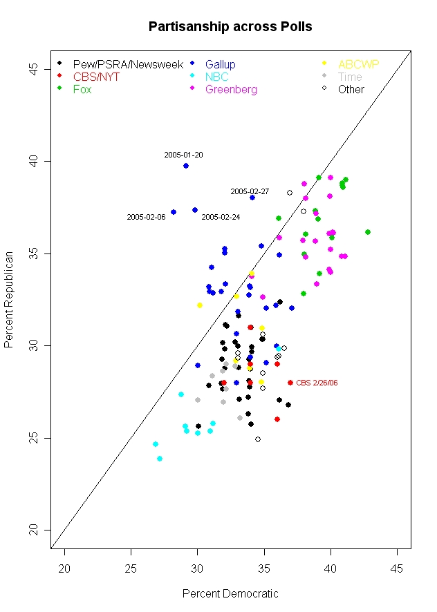
Partisanship generally varies more across pollsters than over time for a single pollster. This has implications for how we assess whether a poll has a reasonable partisan balance. (Hint: Double clicking on the figure gives a bigger image. Clicking on the image one more time magnifies it slightly, giving the optimal image quality, at least under Windows XP.)


The latest CBS/New York Times poll, 2/22-26/06, provoked a common criticism. Along with a low 34% approval rating for President Bush, the poll had a partisan split of 28.4% Republican, 34.2% Independent and 37.4% Democratic. Critics of CBS in particular were quick to seize on this as evidence of an "obvious" bias by CBS. But what should be the standard for partisanship against which we measure an individual poll? I expect that few commentators on this poll have a very clear picture of partisanship and how it varies across surveys. But such a perspective is crucial if we want to talk meaningfully about this topic. Starting with this post, and continuing for the next week or so, I will review some of the facts about partisanship in polls and compare the results across polling houses and over time. For today, we'll start with how partisanship varies across polling organizations, and put the new CBS poll in perspective.

The most compelling point of the figure above is that polls from a single polling organization tend to cluster but that the organizations themselves tend to differ substantially. NBC and the Wall Street Journal, for example, tend to get a Republican-Democratic split of about 25% Rep-29% Dem. (These are medians across 2005-2006 polling, using questions that do NOT include leaners in the party categories.) At the other extreme Fox gets 37% Rep-39% Dem. Greenberg et al, a Democratic pollster, actually closely matches the supposedly conservative Fox with a split of 36% Rep-40% Dem. For CBS and the New York Times, the split is 28%R-34%D.

In fact, the variation within each polling organization is much smaller than the variation across all polls. Taking account only of the organization that conducted the poll accounts for 77% of the variance in Republican identification, and for 76% of the variance in Democratic identification. These "house effects" are a little stronger with the measurement of independents, where polling organization accounts for 80% of the variation.

So is this the smoking gun that demonstrates pollster bias? Not quite. A lot of the variation has to do with how many Reps and Dems there are. But if we switch to the party balance, making the difference between Reps and Dems the dependent variable, the house effect is less than half as much: 29% of the variance in the Rep-Dem difference is explained by polling organization.

Part of what is going on here are differences in question wording and sample frame. If the sample is of either registered or likely voters (as compared to adults) the poll boosts both Republican and Democratic percentages by about 3-4%, and decreases independents by about 4.5-6%. This is presumably due to the greater political involvement of likely and registered voters which results in stronger partisanship.

Question wording is the area where polls vary substantially and a considerable amount of variation in the results can be laid at the door of question wording. Fox, for example, gets high percentages of both Republicans and Democrats because their question omits the independent option:
"When you think about politics, do you think of yourself as a Democrat or a Republican?"

Survey respondents are often sensitive to question wording. Options not offered are options less chosen. How big can this effect be? Princeton Survey Research Associates, which polls for Pew, Newsweek and other clients, usually asks partisanship with the following question, reasonably similar to Fox's, but with an explicit independent option:
In politics today, do you consider yourself a Republican, Democrat, or Independent?

The difference: The median percentage of independents for Fox in 2005-06 was 17.5%. For Pew the median was 31%. That means that Fox has about 14% more "independents" who are fitting themselves into one of the partisan categories than Pew does. The result is that Fox gets a median of 37% Rep- 39% Dem, while Pew has it 30% Rep and 33% Dem.

Variation in questions also extends to whether respondents are offered an option for "something else", "none of these" or (literally!) "or what".

Here Pew's pollster, Princeton Survey Research Associates, gives us a comparison. Their usual question is
In politics today, do you consider yourself a Republican, Democrat, or Independent?

But in a poll taken 4/1-5/1/05 they varied the wording:
In politics today, do you consider yourself a Republican, a Democrat, an independent, or something else?

The difference? When given the option of "something else", 11% took it. When not offered the option in a PSRA poll taken at the same time (3/31-4/3/05), less than 1% volunteered that they thought of themselves as "something else". In this case, the percentage of Independents was substantially affected: 24% when "something else" was offered, 33% when it was not. The Republican and Democratic percentages were little affected however, 29% ("something else") and 28% (no "something else") Republican and 32% Democratic in both cases.

But house effects are not just due to question wording. NBC/Wall Street Journal (whose polls are done by a Dem-Rep polling pair of Peter Hart and Bill McInturff) also offers a "something else" option:
Generally speaking, do you think of yourself as a Democrat, a Republican, an independent, or something else?

But their results don't produce the high "something else" results that PSRA got (or that Time gets with a nearly identical question). The median NBC/WSJ "something else" response is only 4%. Time's median is 10%, close the the one result from PSRA.

NBC/WSJ also get more independents than most pollsters, though there is nothing obvious about their question that would account for this. The median independents for NBC/WSJ is 39% while for all other polls the median is 29%. That higher percentage of independents drives the NBC/WSJ percentages for each party down, and you can see the result in the figure: NBC/WSJ is at the lower left of the figure with the lowest Rep and Dem percentages of any poll. So why does NBC/WSJ produce these results when similar questions produce fewer independents and more partisans? It's a mystery. Sometimes house effects are like that.

Gallup appears somewhat unusual in the figure because a number of their polls in 2005 found more Republican than Democratic partisans. As the dates added to the figure point out, most of these polls were taken early in 2005, and Gallup (as we'll see in a later post) experienced some decline in estimated Republican identification over the year. The median Gallup results produced a 33% Rep-33% Dem-30% Ind split. (The Gallup data here end in September 2005, so if there is a trend these results may differ when the entire year can be considered. See the data note at the bottom of the post for more details.)

And so where does CBS/New York Times fit within this? The CBS median split is 28%R-34%D, while all other polls have medians of 32%R-34%D. So while CBS doesn't tend to be higher than other polls on the Democratic proportion, it does tend to be about 4% lower on the Republican percentage. If we consider the Republican minus Democratic difference, CBS has a median difference of -6%, compared to -3% for all other polls. Here is how the polls compare.

CBS/NYT -6
ABCWP -4
Fox -2
Greenberg -4
NBC/WSJ -4
Pew -4
Newsweek -4.5
PSRA -4
Time -3.5
Gallup -1

So CBS/NYT does turn out to produce polls that are about 2% more net Democratic than the median for all other polling. In a world of 3% margins of error, that isn't a lot but it is a persistent house effect that should be considered when comparing polls.

But the bottom line problem is, what is the "truth"? Maybe CBS has it right and everyone else is biased in favor of the Republicans. Maybe Gallup has it right and everyone else is biased towards the Democrats. Maybe the median is right with a -4 gap and polls vary a bit around this. The crucial point is that when we talk about vote outcomes, there is an objective "truth" (subject to counting errors!) that we can compare polls to. But when we talk about partisanship there is no objective standard by which to judge the polls. At best we can make relative comparisons.

The figure above should make this point. Estimates of partisanship vary widely. Using a 90% confidence interval, you could say that Republicans are between 26% and 39% of the public, Democrats are between 29.4% and 40.6% and Independents between 17.4% and 36.6%. Those are widely varying estimates. They get pushed around by question wording, sampling frame, house effects and plain random sampling error. To pick any single value for the party distribution and claim it is "right" in some absolute sense is fantasy.

What we can, and should, do is analyze the data and base our conclusions on the evidence. The variability we see in the figure shows pretty strongly that the variation from one CBS poll to another (or one Fox poll to another) is small compared to the variation across polling organizations. Analysis that takes account of house affects when comparing across polling houses is essential if we want to make solid inferences. Comparison within organization over time is also a good way to make an apples-to-apples comparison. But comparing one organization to another without some estimate of the house effect is asking to be mistaken. (And that is exactly what happens when readers pick the 34% from CBS but fail to consider the CBS house effect and other polls.)

More on partisanship and polling in the next few posts.

Data: The data here are for 129 national polls taken during 2005 and 2006. The data were gathered from the Roper Center's iPoll database and in some cases from the pollster's website. Unfortunately the data are not uniformly available across polling houses. For example, the Gallup data ends in September. Models that include a trend term suggest that this is not a substantial problem. Likewise the CBS/New York Times data are for joint surveys only. CBS News does not appear to post full topline results for their surveys, or at least I could not find them except for very recent polls. If anyone knows different, please let me know. CORRECTION: CBS News DOES indeed post the complete marginals, including their party id marginals. In fact, they are the only poll I found that shows both the weighted and unweighted party id distribution. The "topline" (or marginals) are available in a link either in the body of the story, usually about 1/3 of the way in, OR in a box on the left. I could not find results prior to September of 2005 on the CBS poll page, however. MY THANKS TO CBS for helping me see the links that are actually clearly there. My bad.

The CBS/NYT data came from the quite complete New York Times polling site. (I've not altered the post here but stayed with the joint data as posted on the NYT site. The NYT marginals leave "DK/NA/Some other party" as a separate category, while the CBS topline folds these into the independent category. There are therefore some significant differences in the percent Independent between the NYT and CBS websites. However, the Republican and Democat percentages are either identical or very similar. In later posts I'll use the CBS data as well.)


Click here to go to Table of Contents