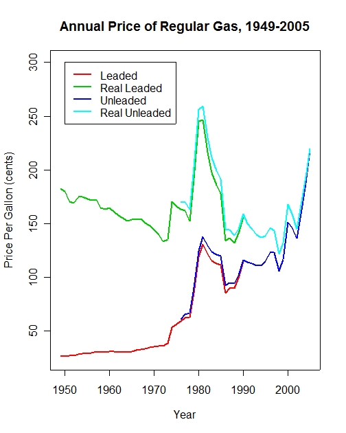
Annual gas prices, 1949-2005

Barry Burden's comment to the previous post drew my attention to a longer run gas price series (Thanks Barry!) and to a nice graph of the data by Professor Robert Sahr at Oregon State University. I've updated his graph to include 2005 prices (so far) and convert the real series to 2005 prices. I've also kept the distinction between leaded and unleaded, so you can see the modest differences.
That graph above shows the long run decline in real prices until 1998, with notable exceptions for the 1974 shock and the 1979-1985 period.
It is interesting to compare the 1974-1981 real prices with the 1998-2005 real prices. In both cases a short run-up, a modest decline and a large spike in prices. In real terms we are still a bit ahead of the $2.33 peak in 1981, with 2005 prices averaging $2.19 for the first 9 months of the year. But the dynamics of prices, and the political implications, remain interesting.
And of course the unanswered question is whether we will see the same sharp decline in real prices that the 1980s had.
By the way, note that the Sahr graph is very well documented. The source and technical notes are clear and the graph is less jumbled than my own. Perhaps more important for visual impression of the trends, compare his "landscape" graph with my "portrait" one. My narrower graph makes the up-and-down dynamics appear stronger. His wider graph, makes these trends appear less dramatic. Same data, so no "real" difference, but perhaps an important psychological effect that may matter for how we interpret the data. Mine is what those who point with alarm would like to stress, while his flatter graph suggests less reason to panic. Mine also looks more alarming because the price rise in 2005 makes the end point rise dramatically compared with his 2004 endpoint.
Here is my graph in a more landscape aspect ratio for comparison. Neither is "right" or "wrong" but we all need to be aware of how visual perception of the same data can affect our interpretations.

A "landscape" view of gas prices.
Data Source: Energy Information Administration AER Table 5.24 (bottom of the page). I adjusted the data for 2005 prices based on the June 2005 CPI, excluding energy and averaged weekly nominal prices for 2005 to get the annual estimate for 2005. That obviously will change over the rest of the year.