Friday, November 25, 2005

Weekly Gas Price Update (11/21/05)


Judging from the number of Google keyword hits on this site, the gas price graphs I posted in September (scroll down to the 2nd entry) remain of considerable interest. So here is an update of weekly price of regular gas in the U.S., in real (that is, adjusted for inflation) dollars (based on October 2005 CPI excluding energy). The weekly series begins 8/20/1990 and includes 11/21/2005.

As you can see, retail gasoline is now back to pre-Katrina prices.

While some have argued that gas prices have driven President Bush's approval ratings, the recent drop in price has not corresponded to a rise in approval, at least so far.

Data: The weekly price series is available from the Department of Energy's Weekly Petroleum Status Report here. The link is to the Excel file.

Prices were adjusted using the CPI, excluding energy prices, available from the St. Louis Federal Reserve here.

Tuesday, November 22, 2005

Cheney vs Bush Approval Ratings


Vice-President Cheney's approval ratings, while consistently lower than those of President Bush, have converged with those of the President, especially in the last year. The two ratings are very highly correlated (above .90) but the Vice-President's approval generally trailed that of the President by double digits in the first three years of the Bush-Cheney administration. The gap narrowed to under 10 points in 2004 and narrowed again to about 5 points in 2005.


(Note on the figure: The rectangles represents the 25th-75th percentiles of all polls in each year. The horizontal line inside the rectangle is the median of annual polls. The dashed line extends to indicate the extreme values in each year.)


The 2004 campaign and subsequent second inaugural appear to have marked the convergence of the two approval ratings. Since January 2005 both approval levels have fallen from around 50% to the low-to-mid 30% range. But both have dropped at about the same rate.

Earlier in the administration, the gap between approval ratings was much larger. Whether this is due to the President's extraordinary high standing in the wake of 9/11, the Vice-President's relative obscurity during this time, the common practice of giving Vice-Presidents the more partisan role, or the frequent criticism of the Vice-President in connection with Halliburton is uncertain.

In each of the major events which drove the President's approval rating (9/11, start of Iraq war, capture of Saddam Hussein) the Vice-President's ratings rose, but less so than those of the President. This is exactly what we would expect given the two men's roles.

I suspect the convergence is also due to the collapse of support from Democrats and the substantial fall in approval among Independents. With both Presidential and Vice-Presidential approval now resting primarily with the Republican base, there is less variation in support. When Independents and even a fair number of Democrats approved of the President, there was more room for these groups to provide lower levels of support for Cheney, thus creating a greater gap between Presidential and Vice-Presidential appoval. With Democratic approval now at or below 10% and Independent approval in the low 30% range, Republican identifiers are more likely to approve of both and hence produce the convergence we see.

While some commentators seem to believe that the Vice-President faces much lower approval than the President, the fact is that those days are substantially over. The linked fate of the two is now tighter than ever.


P.S. A reader commented that they would like to see the comparison for Gore and Clinton. Here it is for the modest amount of data available. I could not find Gore job approval prior to 1997. Harris did some polling then, but not enough for a very clear graph, so I also had to switch to Fox, which has a very good series starting in 1998. Fox uses the more common "Approve/Disapprove" question format.


P.P.S. Saddlebags12 and Robert both raise the important question of the don't know rate, which can affect this sort of an issue. In the case of Cheney and Bush, there are some effects, but not enough to reverse my point which is that Cheney is not dramatically less approved of than Bush. The figure below shows three things (responding the the comments):

1) The raw disapproval rate for Cheney was a bit higher than for Bush in the first term, not the other way around. In the second term the disapproval rates are nearly identical.

2) Despite 1, Cheney's don't know rate was considerably higher than Bush's in the first term. This dropped to near-parity during the 2004 campaign. In 2005 the Cheney don't know rate has grown a bit, but is still 1/3 what it was in most of the first term.

3) If we take out the Don't Knows, by recalculating approval based only on the (Approve+Disapprove) denominator, then we find that Cheney was below Bush in approval through the first term, with the gap narrowing considerably during the 2004 campaign and in 2005. Qualitatively this is the same story as I originally told above, though the numerical differences are a bit shifted. (The Disapprove figures are just the complement of the approve when the DKs are removed, so I just show the approve figure.)

4) Different polls might be more sensitive to this. For example, the Fox data I used for the Gore-Clinton comparison has a higher DK rate for Gore than the Harris data do for Cheney-Bush.

5) Don't Knows can bite you. They didn't change my argument here, but they can't be ignored without peril.


Data:
The Cheney-Bush data are from Harris Polls. Harris is the only organization to publish a substantial number of both Presidential and Vice-Presidential approval results. By keeping to a single polling organization, we also avoid making comparisons across different question wording and organizational practices that contribute to differences between surveys. The Harris approval question is a four-alternative version, unlike the most commonly used approval questions. Harris' wording is:

"How would you rate the job Vice President Dick Cheney is doing: excellent, pretty good, only fair, or poor?"


Excellent and pretty good are coded as approval, while only fair and poor are coded as disapproval. These differences in wording appear to have modest effects in approval levels compared to those of other wordings and organizations. The data are available at PollingReport.Com here for the Vice-President. Presidential approval is also available at PollingReport.Com here.

Monday, November 21, 2005

Approval of Handling of War, Johnson to Bush


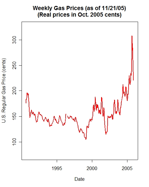
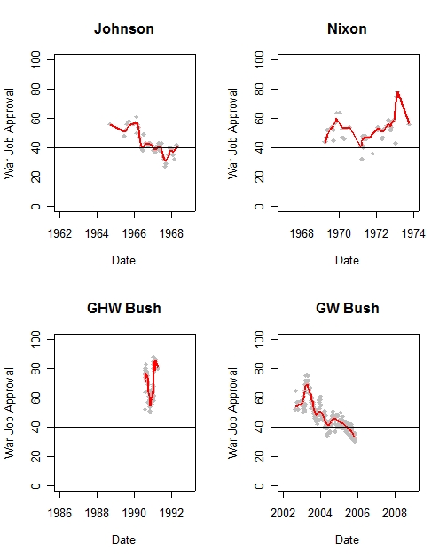
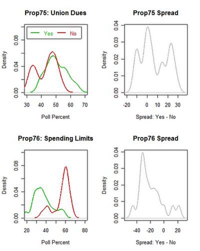
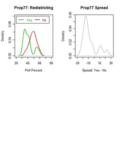
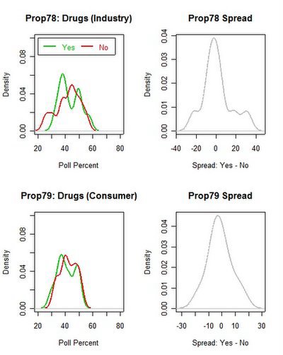
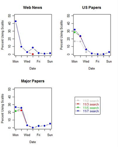
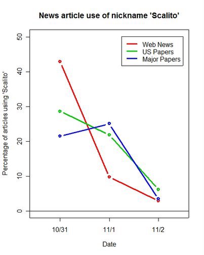
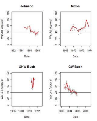
Approval of the job four presidents did in handling wars. The horizontal axis is scaled so the axes are comparable across presidents, which allows accurate visual comparison of the trends. Because of this, the scale may begin before a president takes office. Data are plotted only during a president's term.


President George W. Bush's approval ratings on handling the war in Iraq deserve to be put in historical perspective. It is likely that any president presiding over a long term war will suffer declining approval ratings. This would be especially so when battlefield victories of the World War II type are impossible due to the nature of the conflict. A challenge of presidential leadership is to maintain support for U.S. military and foreign policy in such circumstances.

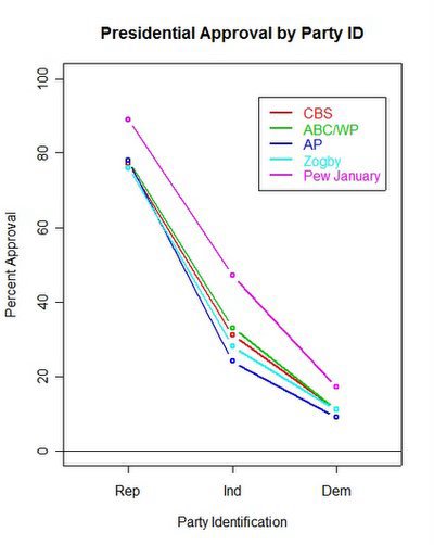
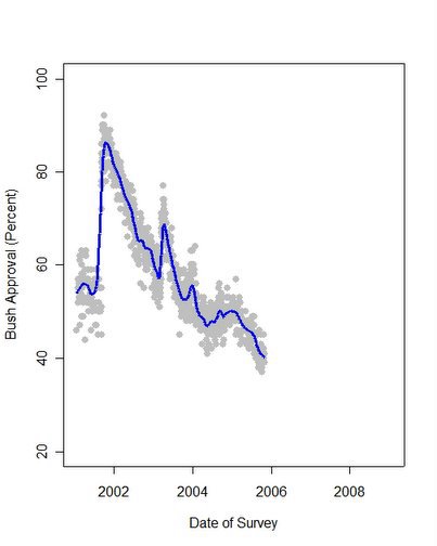
In comparison with three predecessors, President Bush's approval ratings more closely resemble those of Lyndon Johnson than those of Richard Nixon or the President's father, George H.W. Bush. While initial support for the Iraq war was a good deal higher than for Johnson's conduct of the Vietnam war, the subsequent decline in support is similar. Presidents Bush and Johnson both had approval ratings in the 60% range initially. In Johnson's case, the Tonkin Gulf Resolution and subsequent buildup of troops in Vietnam was not accompanied by a significant “rally effect” upturn in approval. President Bush, in contrast, enjoyed a large upturn in support in the early weeks of the Iraq war, with approval reaching 76% in Gallup's poll of 4/16/2003, a month into the conflict.

Subsequently approval for both presidents' handling of the wars declined to the 40% range. In Johnson's case, this approval remained relatively stable in the 40% range through the last 9 months of 1966 before dropping significantly in January 1967. Through 1967, approval of Johnson's handling of the war was mostly in the 30's, with a few polls as high as the low 40s and an all time low of 27% in August 1967. Approval appeared to improve a bit in early 1968 with Johnson's withdrawal from the presidential race and announcement of a bombing halt and a renewed effort at negotiations with North Vietnam, though the final reading was 41% in May of 1968. (No polling is available after that for Johnson's handling of the war.)

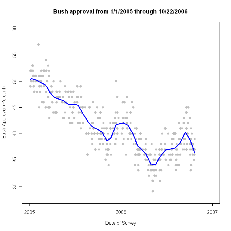
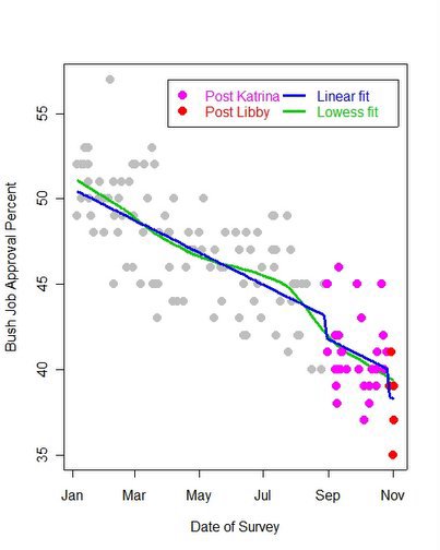
By comparison, approval of President Bush's handling of the Iraq war remained above 50% until September of 2003. During the fall of 2003, approval bounced around in the 45-50% range across various polls. This changed in December 2003 with the capture of Saddam Hussein, when approval rallied again to the 60% range. This again fell, and most of 2004 found approval varying in the 40-50% range, with some improvement to the high 40% range in most polls as the November 2004 election approached. Approval of President Bush's handling of the war has fallen steadily throughout 2005, to current levels in the low 30% range. These approval levels are now approaching the all time lows of the Johnson administration.

In contrast with Presidents Johnson and George W. Bush, President Nixon enjoyed rather strong support for his handling of Vietnam. Despite some general decline in support during his first term, fully three-quarters of the Nixon polls are above 46% approval, and only two polls throughout his term fell below 40% approval. Half of Nixon's polls find approval levels over 52%. Approval improved from a median of 52% in 1969 to 53% in 1970, then fell to a median of 46% in 1971. The all time low reading of approval for Nixon's handling of the war came in April 1971, at 32%. However, as is clear from the graph, that was an unusually low reading (ironically, as that poll was one conducted for President Nixon by Opinion Research Corporation). Average approval was still about 40% at that time. Nixon's approval ratings rebounded strongly throughout 1972 to a median of 54% as the Paris Peace Talks appeared to make progress, and topped out at a median of 65.5% in 1973 with the conclusion of the peace accords.

President George H. W. Bush enjoyed much stronger support for the brief Gulf War of 1991. In the immediate aftermath of the Iraqi invasion of Kuwait approval of his handling of “the situation with Iraq and Kuwait” (or words similar to that-- there was some variation across polls.) was very high, peaking at 83% in August 1990 shortly after Iraq's invasion of Kuwait. Support for Bush's handling of the situation then declined sharply until November 1990, bottoming out at 50% in a November 15 CBS poll. Subsequently, support increased as the U.S. diplomatic and military preparations for the Gulf War took on renewed urgency. Approval rose to the mid-60% range on the eve of the war, then surged to a high of 88% in a LA Times taken January 18, 1991. Approval remained in the mid-80% range though the end of the war. The last reading, taken April 9, 1991, also by the LA Times, was 80%. (Subsequent polling focused on post-war conditions and retrospective questions of whether military operations should have continued into Iraq and deposed Hussein. I've not mixed those questions in here with approval of handling of the war proper.)

If we can generalize at all from these results, I think it is that Nixon's “Vietnam-ization” strategy, combining negotiations, shifting fighting to Vietnamese troops, reducing U.S. troop commitments, even while maintaining heavy air support and bombing activity, won substantial approval from the public. (As an “approaching draft-age” high school student at the time, I was frankly surprised by these results. I remember a much less popular war which I had assumed had dogged Nixon's approval ratings. As the data show, one person's recollections aren't a very good measure of what the polls actually showed.)

If we assume the current administration is committed to continued troop presence in Iraq for the foreseeable future, the prospects for a recovery of President Bush's approval look bleak, barring a dramatic improvement in the Iraq insurgency situation. A shift to a clear “Iraqi-ization” of the war, in deeds as well as words, might possibly produce approval similar to President Nixon's. Or perhaps that has to wait for a new administration in 2009 to adopt a clear change in policy. The one important difference is that Johnson had only 16 months left in office when his approval ratings reached bottom. President Bush still has over 38 months remaining.

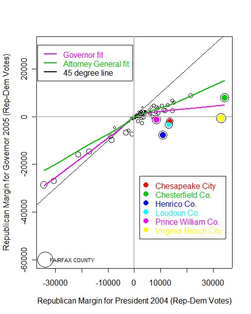
Data: I used all polls from any polling organization that asked questions that directly measured approval of a president's handling of the respective wars. Data are from the Roper Center's iPoll (subscription only) database.

Low Points:

Johnson, 27%, Gallup, 8/29/1967
Nixon, 32%, Opinion Research Corporation, 4/1/1971
GHW Bush, 50%, CBS/NYT, 11/15/1990
HW Bush, 30%, Newsweek/PSRA, 11/11/2005

Wednesday, November 16, 2005

Virginia Politics is (Mostly) Local


The Virginia gubernatorial election appears to reflect local forces more than a referendum on President Bush or demobilization of Republican voters. Republican margins in some of Virginia's larger counties and independent cities shrank substantially in the 2005 governor's race compared to the 2004 presidential election. But these margins shrank considerably less in the Attorney General's race, suggesting that rather than a uniform loss of Republican votes, the Virginia results were driven more by candidate and campaign specific forces.

Seven large Virginia counties and independent cities showed especially dramatic reductions in the Republican margin, as shown in the figure. Five larger counties/cities shrank from substantial Republican margins in 2004 to pro-Democratic margins in 2005. (Virginia Beach and Chesapeake cities and Henrico, Loudoun and Prince William counties.) Four of these had provided President Bush with margins over 10,000 votes in 2004, but shifted to 1,000 or more Democratic margins in 2005. Even where the Democrat, Tim Kaine, failed to win, the loss of Republican margin was damaging to Republican Jerry Kilgore. The Bush margin of over 34,000 votes in Chesterfield county was reduced to a Republican margin under 8,000 in the gubernatorial election. And in the Democratic bastion of Fairfax county a Democratic lead of 34,000 in the Presidential election was nearly doubled to a 60,000 vote advantage in the Governor's race.

In the figure, the purple line is the local regression fit between presidential and gubernatorial vote. The relationship flattens dramatically in counties/cities won by Bush. The Republican gubernatorial margin only modestly rises with Bush margin. In places won by Kerry, the relationship is much closer to the 45-degree line, representing equal margins in both elections. This shows that the Republican vote was much less strongly related to the Bush vote in those counties Bush won. On its face, this is consistent with a claim that Republican's failed to mobilize their voters, possibly because of disaffection with the President. That could be due to a weak President. It could equally be due to a weak gubernatorial candidate. Which is it?

Here the Attorney General's race (currently with a margin of some 410 votes) provides a crucial point of reference. If Virginia Republicans stayed home due to unhappiness with President Bush, then that effect should be clear across races. If on the other hand "all politics is local", then the Virginia vote is more a function of the appeal of the candidates and the short term campaign forces, and this should vary from race to race.

The Republican vote for Attorney General is much more strongly related to the 2004 Presidential Republican vote than is the case for the gubernatorial vote. The green line in the figure plots the local regression fit of Republican margin in the Attorney General race with the presidential vote. Among counties/cities won by Bush in 2004, there is a much stronger relationship between the AG vote margin and the presidential margin than was the case for the governor's race.

If Republicans had responded primarily to national forces, we'd expect the green and purple lines to run roughly parallel to each other. It is clear from the figure that this doesn't occur. The AG race margin is close to (but not quite) linear across all presidential margins. This contrasts with the strongly non-linear relationship of the governor's race margin. As a practical matter, the AG Republican candidate, Bob McDonnell, ran well ahead of gubernatorial Republican Kilgore's margins in the most Republican counties. McDonnell also did relatively much better in Fairfax county, losing by only about as much as Bush had in 2004, rather than twice as badly as did Kilgore. (I've not included the data points for the AG race in the figure because it makes an already complicated figure even harder to read. The AG margins cluster quite closely to the green fitted line however. In particular, the six highlighted counties/cities are considerably closer to the AG fit than they are to the governor's fit.)

There is still some modest evidence that Republicans suffered a decline in their voting base relative to 2004. Even in the AG race, the slope of the local fit is a bit smaller in Republican localities than it is among Democratic majority areas. The difference is not large, but could reflect some demobilization of Republican constituents, possibly due to President Bush's low approval ratings. However, the much larger declines in gubernatorial votes cannot be accounted for by this general decline. Most of that loss in Republican margin seems due to the candidates and the campaign. That effect could be due to a failure by Kilgore to mobilize his partisans or the effective stratgey of Democrat Tim Kaine to appeal to religious (and Republican leaning) voters. Thanks to the lack of exit polling we must be left to speculate about the reasons voters had for the votes they cast. But the county returns do cast serious doubt on the claim that Virginia's gubernatorial vote was primarily a repudiation of President Bush.

Data: The data are taken from the Virginia State Board of Elections website here.

Thanks to the "econometrician who must not be named" for helpful conversations, even if he/she didn't want to be associated with my analysis.

Saturday, November 12, 2005

Approval of President Bush in 2005 and 2006


Updated through polls completed 10/22/2006


2005-2006 estimate of approval of President Bush.

The blue line is the estimated support for the President at each point in time. The gray dots are the individual polls which vary randomly around the estimated support. Each poll will differ from the common trend due to sampling variation, question wording or order among other ideosyncratic factors. The estimated support is based on a local regression which can flexibly fit the trend in the polls.

Approval of President Bush, 2001-present


Approval of President Bush. Gray points are polls, blue line is my estimate of approval trend, using a local regression. The spread of gray around the line indicates how much variation there is across polls taken at the same time.

The vertical grid marks quarters, with January 1 in a darker shade. Tic marks on the horizontal axis are months.

This graph is at 768 x 768 resolution. Some readers may need to click or double click on the graph to see it at full resolution.

Presidential Approval in Historical Perspective

Updated: 11/8/07


Presidential Approval since Roosevelt. The blue vertical lines indicate midterm and presidential election dates.

This graph shows all presidential approval readings by the Gallup organization since Roosevelt. Gallup's long series and consistent question wording provide a useful historical comparison across Presidents. The data are freely available at the Roper Center web site at the University of Connecticut here.

The data are graphed here in exactly the same perspective across all presidents. This means that trends will look the same regardless of whether a president served two terms, one term or only part of a term. Visual comparisons of trends will be valid because of this constant perspective.

For example, compare the decline prior to the 1992 elections in President George H. W. Bush's approval with those of President George W. Bush. The elder Bush is a clear example of "free fall", the sharpest and largest approval drop since President Nixon's in 1973-74. President George W. Bush's decline more closely resembles the long-term decline of Jimmy Carter's approval than it does the free fall of either the elder President Bush or President Nixon.

Because the vertical scales are also equal, it is easy to compare the level of presidential approval across Presidents.

A more complete explanation of how the almost universal failure to keep perspective constant distorts presentation of polling results can be found here. Posted by Picasa

Thursday, November 10, 2005

Polling error distribution in CA propositions


Distribution of deviations between polls and final vote on seven California referendums, November 2005.

The several California referendums this week provide a good illustration of polling variability as well as a look at the average accuracy of the polls. Earlier I illustrated the distribution of the pre-election polls here. Now that we know the results, we can compare the outcomes with the estimates from the polls.

MysteryPollster has a comparison of the polls average accuracy across the referendums here. He focuses on the mean prediction error, while I focus on the “spread” of the distribution of errors. My concern is with the uncertainty we should attach to the polls as predictions of vote. The more spread there is, the greater our uncertainty. Because the prediction error also includes all non-sampling errors, these distributions are better measures of our practical uncertainty than is the sampling error alone.

It is worth admitting up front that proposition polling is unusually difficult from a technical perspective. MysteryPollster has addressed these difficulties here (and in related posts.)
I also address the issue raised here by “sennoma” to look at the change in the error distribution between early and late polling.

The figure above shows the distribution of errors, poll minus vote percentages, pooled across all the referendums. (I omit Proposition 80 which had few polls.) The dashed lines are for polls taken more than 10 days before the vote, while the solid lines are for polls taken in the last 10 days of the campaign. The reason to pool across polls and propositions is that we have no a priori reason to assume one poll is “better” than another and no reason to assume polling is easier or harder on any given proposition. Pooling allows us to maximize cases and assess our uncertainty prior to seeing any results.

The distribution of errors tightens for polls taken in the last 10 days. For “yes” responses the middle 90% of errors from more than 10 days prior to the election range from -16.5 to +17.1. For polls taken in the last 10 days the 90% range is -8.6 to +10.6. The median error shifts from +4.1 to +1.8, showing that the middle of the distribution comes closer to the actual outcome in later polling for the “yes” vote.

For the “no” responses, the 90% range is -20.1 to +6.5 for early polling, and -16.50 to +0.55 for the last 10 days. The median error is -12.5 for early and -8.5 for late polls, showing a systematic underestimate of the “no” vote.

Put another way, the 90% confidence interval for these distributions is 19.2% for yes votes and 17.1% for no votes. That range is quite large compared to the theoretical margin of error for sample sizes typical of these surveys, which are reported to range from 3-6% for a 95% margin of error. The empirical 90% range is +/- 9.6% for yes and +/-8.55% for no votes. This inflation of theoretical margins of error by a factor of 1.5 to 2.0 or more is typical of empirical estimates of survey accuracy as predictors of election outcomes. The inflation reflects sources of error in addition to those due to sampling, such as campaign dynamics, non-response, question wording effects and other sources of error. (And since I'm comparing 95% sampling margins to 90% empirical ranges, I'm being generous to the polls here.)

These results also demonstrate the problem of bias in the survey estimates. While the percentage of “yes” votes had a median error of only +1.5, the error for no votes was a rather large -8.5% median error, a quite large error. While smaller than for early polls, the median of the “no” distribution falls rather far from the actual outcome. One might chalk this up to “undecideds” who ultimately voted no, but this is a problem of modeling from the survey data to a prediction of the outcome--- something that few pollsters actually do in public polling. (MysteryPollster calculates the errors using the “Mosteller methods” that allocate undecideds either proportionately or equally. That is standard in the polling profession, but ignores the fact that pollsters rarely adopt either of these approaches in the published results. I may post a rant against this approach some other day, but for now will only say that if pollsters won't publish these estimates, we should just stick to what they do publish-- the percentages for yes and no, without allocating undecideds.)

The bottom line of the California proposition polling is that the variability amounted to saying the polls “knew” the outcome, in a range of some +/-9.6% for “yes” and +/- 8.55% for “no”. While the former easily covers the outcome, the latter only just barely covers the no vote outcome. And it raises the question of how much is it worth to have confidence in an outcome that can range over +/- 9 to 10%? In general, I'm pretty confident elections will fall between 40% and 60%. That's only slightly larger than the empirical uncertainty in these polls. If anyone would care to pay me for that prediction, I'm pretty sure I will be as accurate as these polls. (Apologies to my pollster colleagues. But don't worry, no one will pay me for my opinion!)

The next post below (I'm posting these in reverse order) looks at polling in the New Jersey, Virgina and New York City partisan elections. These are interesting to compare to the much harder to poll proposition issues I've focused on here. Posted by Picasa

Polling error distribution in NJ, VA and NYC


Distribution of polling errors in New Jersey and Virginia Gubernatorial elections, and New York City Mayoral election, November 2005.

As with the California propositions, we can calculate the variability of the errors for the New Jersey and Virginia Gubernatorial and the New York City Mayoral election polls. Again, there is little a priori reason to think the poll performance will differ across these, so I pool over the three elections and all the polls.

The figure above shows the variability of the errors and the shifts in the location of the distributions between early and late polls. For polls taken more than 10 days before the election, the middle 90% of poll errors is -10.70 to -0.67 and -9.04 to -1.65 for polls taken in the last 10 days of the campaign. The medians are -6.65% and -5.19 for early and late polls, a modest improvement but still a substantial underestimate of the final vote.

For the Republican vote, the 90% interval is -7.78 to +4.22 for early polls and -8.53 to -1.86 for the final 10 days. The medians are -2.78 and -2.39 for early and late polls.

These results show a modest decrease in uncertainty in late polls, and small shifts of the median estimates towards the true outcome. However, the median underestimates the Democratic and Republican share of the vote, even in late polls. As with the California proposition polling, these underestimates reflect the failure to allocate the undecided voters in the polls. But this begs the question of how such votes SHOULD be allocated and by whom. We can arbitrarily choose either of the Mosteller suggestions mentioned above: proportional or equal allocation of the undecideds. But the more reasonable method of allocation of undecideds requires access to the raw individual level data, which is not available in general and never before the election.

On the face of it, one might estimate the predicted probability of voting and of voting for each candidate among the undecideds, using the decided voters for the estimation, and from this estimate the final vote prediction. Pollsters are apparently unwilling to do this, preferring to simply report poll percentages rather than make modeling decisions as well. (This seems a reasonable business choice, even if it frustrates election prognosticators.)

The bottom line here is that the empirical margin of error for late polls in these three races is +/- 3.7% for the Democrats and +/- 3.3% for Republicans. Unfortunately, neither of these ranges covers the final vote percentage, so the bias in estimating the voter percentage is larger than the margin of error. Again, without the raw data, we cannot calculate an optimal allocation of undecideds which would reduce the bias estimate. (One can also calculate the “spread” between the candidates, which estimates who is ahead. Those calculations make the polls look a bit better in picking winners, but with still substantial variability, which is my story here, rather than prediction per se.) Posted by Picasa

Tuesday, November 08, 2005

Polling for the 2005 elections

Today's elections have produced a good deal of polling and considerable uncertainty as to likely results. MysteryPollster has done several excellent posts on this here, here, here and here. MP stressed the difficulty of polling on California's propositions, and provides a thorough discussion of the implications for poll variability.

Here I want to show you the variability across polls in the propositions plus the NJ and VA governor's races. I'm going to do this a little differently than you usually see it. Here's why.

We can think of each poll as a sample of the likely outcome. The uncertainty arises from both sampling errors, campaign dynamics and non-sampling errors such as non-response, question wording and a host of other polling demons.

It is common to toss out early polling and focus only on the last week or even days of polling. I'm not going to do this. Rather I want to show the total distribution of results across the polls. This reflects the uncertainty due to campaign dynamics, as well as the other factors. The reason I think that's worth doing is that changes over the campaign are unpredictable. What has gone down may come back up in the end, or vice versa. We place a lot of faith in the last week of polling (not wholy misplaced) but in representing how uncertain we are about the likely results, I think it makes sense to consider the total variability in polling. This provides more polls as part of the evidence as well.

Of course where there are clear trends in the polls, this may make the uncertainty appear greater than would be the case only with late polls. That matters if we are primarily interested in predicting winners. But if we want to represent uncertainty, I think my approach is preferable.

So in the graphs below I present the distribution of polls for each California proposition and for the NJ and VA governor's races. Where there have been clear trends, I mention them. But you won't find the usual time series plot here. That isn't my point. Rather look at where polls have been highly variable--- we should be very uncertain there. Where they have not been, we should be less uncertain.

The wide variability in percentages and in spread should be appreciated by readers of polls (and perhaps by pollsters themselves). Sampling error is only part of the story of uncertainty. These plots give a better sense of how much uncertainty comes from all sources, not just sampling.

The conclusions from most of these plots: don't place big bets based on the polls. (But do note that polls DO seem to provide clear evidence in some cases. The exceptions count too!)

Data: See RealClearPolitics.Com for the numbers and for the trends.

California propositions 73 and 74 polling


Polling on props 73 and 74 show a wide spread with no clear leader for either proposition.

Prop 73, parental notification for minors seeking abortions, has produced widely divergent polling results with alternating polls finding substantial leads for both sides. The distribution of the spread shows a range of over +/- 15%, a huge range of uncertainty.

Prop 74, modifying tenure rules for public school teachers, has also produced substantial variation in results. Some of these are due to trends over the fall. Early polling produced a number of "yes"-leading results, but the most recent polling has found "no" leading by single digits. Posted by Picasa

California propositions 75 and 76 polling


The polling on Prop 75, controlling the political use of union dues shows an interesting bimodal pattern. Much of the spread is concentrated around zero, a dead tie. But there is a second mode- centered around a 20% advantage for the "yes" side. Much, but not all, of that right tail comes from early polling, but even polls in the last week find results with both sides winning.

The proposal to limit state spending (and modify previous propositions regarding spending), Prop 76 seems likely to lose. This is a case where the simple "no" percentage has been polling well over 50%, rather than both options polling below 50%. Posted by Picasa

California proposition 77 polling


The redistricting issue might seem to be a juicy target for reform via proposition. It should be easy to paint the districting process as corrupt and that "simple honest effort" would make the process much more fair. And who would want to campaign in favor of gerrymandering? Yet the polling here is largely "No", though there is a little right-tail in the spread graph. But bet "no" on what might have seemed like a proposition with a real chance.

Polling also shows redistricting reform trailing in Ohio, faced with strong opposition from Republican officials (who stand to lose control over the current redistricting process.)

"Fair redistricting" is a lot harder than proponents suggest, so there is a lot of oversimplification of the issue. But I remain surprised that this issue hasn't been welcomed by voters. Posted by Picasa

California propositions 78 and 79 polling


Support for these drug discount propositions have produced polls that are both evenly divided and very spread out. One might speculate that "duelling propositions" such as these, which are common in California propositions, produce very large uncertainty among voters which is reflected in the polling. These typically produce competing propositions claiming to "solve" some problem but with each backed by different interest groups. Not only must voters discover the implications of the proposition, but they must also decide which of the alternative proposals might best accomplish their goals. Result: uncertainty.

There are also fewer polls available for these propositions than for the others, which further increases uncertainty. Bottom line on these two: who knows! Posted by Picasa

NJ and VA Governor's race polls


Based on the polling, the Virginia governor's race looks impossible to predict. The New Jersey Governor's race polls have generally given both candidates less than 50% but virtually all show Corzine leading Forrester.

Other races to come. Posted by Picasa

Monday, November 07, 2005

Cases mentioned in Alito coverage


Number of articles appearing in "Major Papers" discussing cases involving Judge Samuel Alito.


When discussing legal issues, news coverage has focused overwhelmingly on abortion cases in reporting on Judge Samuel Alito's nomination to the Supreme Court. In the week since Alito was nominated, 79 articles discussed Alito's position in relation to Roe v. Wade, with 70 articles discussing Alito's position in Planned Parenthood v. Casey. The next most mentioned Alito opinion appeared in only 10 articles. That case, United States v. Rybar, involved issues of federalism in regulating gun sales. The fourth most mentioned case, Bray v. Marriott Hotels, appeared 7 times and involved employment discrimination. No other case was mentioned in more than four articles.

During this period, 10/31-11/6, a total of 528 articles appeared in the Lexis/Nexis "Major papers" database. Of these, only 92 (17.4%) discussed specific cases in which Judge Alito was involved. An additional 50 (9.5%) articles mentioned Roe v. Wade but no other case involving Alito. The remaining 386 (73.1%) articles on the Alito nomination failed to mention any case by name. It is possible that some of these 386 articles discussed the substance of cases without naming the case. To the extent this is widely true, the estimates here will understate the prominence of cases in the coverage.

The disproportionate coverage of abortion related cases reflects the emphasis that both conservative and liberal groups have placed on the Roe decision as a factor in Supreme Court nominations. It probably also mirrors the public's limited awareness of issues before the Court with the exception of the most highly visible cases, of which Roe is the premier example.

Nonetheless, the reporting demonstrates a very narrow appreciation by reporters of the legal issues that are relevant to the Court and to the appointment process. While the public appetite for detailed legal analysis may be limited, the press is falling short in informing the public on the range of issues which define the differences between judicial conservatives and judicial liberals. Instead, the differences are reduced to abortion and only occassional mentions of other issues.


Data: The data are a result of a search of the Lexis/Nexis "Major Papers" database, covering 89 mostly US sources. The search terms used were distinctive parts of case names, rather than the full formal name. Thus "Casey" rather than "Planned Parenthood v. Casey". The list of searched cases was developed by examining all articles that appeared to cite a case (as determined by a search for " v. " or " v ". The list of cases is as follows, with the number of articles found in parentheses.

United States v. Allegheny Ludlam (1)
Baker v. Monroe Township (1)
Blackhawk v. Pennsylvania (1)
Chittister v. Department of Community and Economic Development (1)
Cruz v. Chesapeake Shipping (1)
D.R. v. Middle Bucks Vocational Technical School (1)
Doe v. Groody (1)
United States v. Igbonwa (1)
Pennsylvania Coal Association v. Bruce Babbitt (1)
Public Interest Research Group v. Magnesium Elektron (1)
Saxe v. State College Area School District (1)
Specter v. Garrett (1)
W. R. Grace v. EPA (1)
Zubi v. AT&T (2)
Child Evangelism Fellowship of NJ v. Stafford Township School (3)
Fraternal Order of Police v. Newark (3)
Elizabeth Blackwell Health Center v. Knoll (4)
Planned Parenthood v. Farmer (4)
ACLU v. Schundler (4)
Sheridan v. E. I. Du Pont de Nemours (4)
Bray v. Marriott Hotels (7)
United State v. Rybar (10)
Planned Parenthood v. Casey (70)
Roe v. Wade (79) Posted by Picasa

News coverage of Alito nomination, part I


Use of "Scalito" in news coverage of Alito nomination with multiple measurements.

Initial coverage of the nomination of Judge Samuel Alito to the Supreme Court relied heavily on the "Scalito" nickname to convey the Judge's conservatism and possible similarity to Justice Antonin Scalia. That usage declined rapidly after the second day of coverage, falling to well under 10% of all articles by Wednesday, November 2. In last week's post here, I wrote about this, based on searches of web news sources via Google, and Lexis/Nexis searches of US papers and major papers (as defined in the Lexis/Nexis database.) The current results are updated through searches of Monday, November 7, and confirm the rapid decline in the use of "Scalito" and the continued low level of usage.

In response to the earlier post Robert Chung raised an important question concerning how fast these databases are updated, and hence how reliable searches taken no more than a day after the source appeared might be. These data give us a nice chance to answer that question here.

In the graph above, I've plotted the results based on searches done on four different days: 11/2, 11/3, 11/5 and 11/7. For searches of Google News, the four searches produced nearly identical results, reflecting the very rapid updating of Google's data. In the figure, only the blue line (from 11/7) shows up, but that is because all four searches produced identical results, with the exception of the 11/3 search of news from 11/3, precisely when we would expect some lag in Google's indexing (or in web posting of articles, for that matter.) The implication is that Google searches of news within 24 hours of the date of publication appear to be quite stable.

For the Lexis/Nexis data, the delay in updating is apparent, though there is rapid convergence to stable search results as well. The Major papers database appears to update slightly faster than the US Papers database. In either case, within 48-72 hours of publication the database is quite stable. One reason for the US papers variability is that this database contains some non-daily publications, hence longer lags, while the Major papers data are all daily publications.

So the bottom line is that we should be careful about using searches without verifying them a couple of days after publication. On the other hand, the search sources are quick enough that, at least in this case, the conclusions we reach are unchanged.

For whatever reason, the Web news sources used "Scalito" in over 40% of their initial stories. Print used it in 20-30% of their Monday and Tuesday stories. After that, all sources dropped the use of the term to well under 10% of articles. Language Log has a nice discussion of this from a non-quantitative perspective here.

What did the press write about instead? Stay tuned. Posted by Picasa

Friday, November 04, 2005

Presidential Approval by Party Identification


Presidential approval by party identification in four post-indictment polls compared to results from January 2005.

Barry Burden posted a comment here asking if approval has begun to drop among Republicans. That seemed a good enough issue to deserve a post of its own. He points out that Republican support has been running over 80% which has provided a strong base that would support President Bush despite declines among independents and Democrats.

The answer is that support has declined among Republicans as well as Democrats.

In these latest four polls, the approval rate among Republicans is 77, 78, 78 and 76%. In a January 2005 Pew poll the Republican support level was 89% (and an AP poll from December 2004 put the rate at 91%.) At the same time the Democratic support rate was 17% among Democrats while it is now 11, 11, 9, and 11 in these late polls. So there has been an approximately 12% decline among Republicans and a 6% or so decline among Democrats. Among Independents, there is more variation in support: 31, 33, 24 and 28. This compares to 47% in the January Pew poll, a fall of some 17%. Thus the rate of decline has been strongest among Independents, then Republicans and least among Democrats (who had less room to drop.)

The Pew Center for the People and the Press has a very nice graph of this in this report from early October. Their graph is nice because the comparison is all between their own polls, avoiding the house effects that are present in my comparison here. The salient paragraph in their comparison is

The president continues to draw strong support from Republicans, 81% of whom approve of the job he is doing. But that number reflects an eight-point decline since January, with most of that drop occurring in late summer. Among independents, a plurality of 47% approved of Bush's performance in January; now just 34% do so. Approval among Democrats is now in the single digits (9%), down from 17% in January.


There has been some discussion concerning “how low can approval go”. MysteryPollster has a nice discussion here and here. Some have argued that there is a floor for President Bush due to his exceptionally strong support among Republicans. But that only holds if his base remains constant in their strong support. These data suggest that base has been eroding at an alarming rate. While the level is still high, it is not as stable as other commentary would suggest.

A related concern for the President is the percentage of Republicans in the public. There is evidence that this has been declining modestly over the course of the year. See this piece by Alan Abramowitz at the Cook Political Report. See figure 3 on page 4.

The declining support among Republicans and the modest decline in Republican identifiers suggests that while it is way too early to panic, there is a significant possibility for further erosion in support for the President. Those who think there is a hard floor of support may be overestimating partisan loyalties. Posted by Picasa

Presidential Approval since the Libby Indictment


Presidential Approval since January 1, 2005 with estimated trends and model fits.


President Bush's approval rating has fallen in the first six public polls taken after the indictment of Vice-President Cheney's Chief of Staff Lewis “Scooter” Libby on October 28. Based on a model of approval that takes into account the year-long decline in the President's approval rating, the effect of Hurricane Katrina and variation across polling organizations, I estimate the immediate decline since the Libby indictment as -1.59%. This compares with an estimate of -1.28% for the effect of Hurricane Katrina.

During the week that included the Libby indictment other events occurred which may have also contributed to the decline in approval. The press widely reported the 2000th U.S. military death in Iraq and the President accepted the withdrawal of his second Supreme Court nominee, Harriet Miers. Further, some of these polls interviewed respondents after the President nominated Judge Samuel Alito to the Supreme Court on October 31. It is not possible to separate out the effects of each of these individual events which all may contribute to the -1.59% estimate.

Since January 1, 2005, the President's approval has declined at a rate of -.031% per day. The immediate post-Libby indictment effect thus amounts to a 51 day drop in approval (-1.59/-.031). This compares to a drop equivalent to 41 days due to Hurricane Katrina and its aftermath.

While the decline of 1.59% is statistically significant, it is considerably smaller than the sudden drop of some 20% following the Iran-Contra revelation in the Reagan administration and the 10% drop in the Clinton administration during the Monica Lewinsky scandal. Both of those declines, however, occurred when approval was over 60% for both Presidents Reagan and Clinton. The estimated approval for President Bush as of October 27th was 40% in my model, suggesting that sharp declines may be somewhat less likely than for the previous presidents.

The recent polling results, along with previous polling, are available at PollingReport.com.

My model includes estimates of differences in approval across the various polling organizations. The estimated effects of Katrina, Libby and the long term trend are only slightly affected by ignoring these effects, though the inclusion of the “polling house” effects reduces the uncertainty of the estimated effects considerably.

One of these days I'll get around to posting on the house effects estimates. In the mean time, see Robert Chung's excellent pages on estimating these effects. His results and mine differ only modestly, though our estimation techniques are somewhat different. In my case, when looking only at the 2005 data, as here, I use a simple linear regression model with variables for date, post-Katrina and post-Libby plus indicator variables for each polling house. When modeling the entire Bush administration I use a different approach, closely related to the one Chung uses, though the approaches were developed independently of one another.

The model is based on 143 national polls by 17 different polling houses. There are 40 polls post-Katrina and 6 post-Libby. Three of these post-Libby polls are partially or completely overlapping at 39% approval in the figure. The six post-Libby polls included here are Associated Press-Ipsos poll Oct. 31-Nov. 2, 2005
ABC News/Washington Post Poll. Oct. 30-Nov. 2, 2005
Zogby America Poll. Oct. 29-Nov. 2, 2005
CBS News Poll. Oct. 30-Nov. 1, 2005
CNN/USA Today/Gallup Poll 10/28-30/05
ABC News/Washington Post Poll. 10/28-29/05
Posted by Picasa

Thursday, November 03, 2005

Initial News Coverage of Alito


Initial news coverage of the nomination of Judge Samuel Alito frequently repeated the nickname of "Scalito" to compare the nominee to Supreme Court Justice Antonin Scalia. Web based news sources were especially prone to use this nickname in articles appearing on Monday, October 31, the day President Bush announced the nomination of Judge Alito. Print papers made less, but still substantial, use of the term in their Tuesday coverage. In the small number of Monday print articles, "Scalito" was used about as much as in the much more extensive Tuesday coverage.

In the second day of coverage, however, news articles made much less use of this nickname. Web article use fell below 10% by Tuesday with print articles falling to under 7% on Wednesday, their second day of substantial coverage. Web use of the term fell to a mere 2.8% by Wednesday.

This illustrates the problem of initial interpretation in news coverage and raises the question of the impact such coverage has on public understanding of Judge Alito (or other newly visible figures.) As a memorable phrase, "Scalito" adds color to a news story while also conveying the writer's fundamental point: "(Alito) has been called "Scalito" for a judicial philosophy akin to that of Justice Antonin Scalia" (Steve Lash, The Houston Chronicle, May 26, 2000, the earliest published reference I could find.) To the extent this phrase is an accurate short hand for a complex argument it serves to inform the public in much the same way that saying Judge Alito is "conservative" or "right-leaning" or "a strict constructionist" might also do.

However, there is another element to this, and that is the tie to a figure (Scalia) who carries not only informational but emotional connotations. It is unlikely that many average citizens can cite in any detail at all the opinions expressed by Justice Scalia, but both liberals and conservatives may have a stronger emotional response to him as a symbol of judicial conservatism. Because this emotional response is quite available for politically aware citizens, even if the legal details are absent, then the "Scalito" nickname may serve to orient readers to Alito in ways that less personalized descriptions of his legal views may fail to do. If so, we might expect readers exposed to the "Scalito" reference to form stronger and more extreme views (positive or negative) of Judge Alito than they would had they only read about his opinions or his legal philosophy.

The news media relied substantially on the "Scalito" shorthand in their initial reporting but have moved away from it dramatically in subsequent reporting. This may reflect the pressure of deadlines. When the nomination was first announced, few reporters could have had the time or the background knowledge to produce an overview of Alito's judicial writtings and so the immediately available shorthand of "Scalito" was used to convey the general orientation of the Judge. With more time in an aditional news cycle the reporting turned to other (one might hope more detailed) reports of Alito's past rulings and philosophy and the use of the nickname was dropped. (Or it could just be pack journalism at work on day one of the story.)

None the less, the use of shorthand labels such as this may affect readers' first impressions of new public figures. In this case, the "Scalito" moniker would seem likely to both inform readers as to Judge Alito's philosophy but also to increase polarization of views because liberals might be expected to react more negatively to Alito when he is explicitly identified with Scalia, while conservatives might welcome this as a sign that the new nominee is what had been hoped for. Initial polling does in fact suggest that opinion towards Alito is a bit more polarized than for either Miers or Roberts, though it is impossible to know how much to attribute this to the "Scalito" nickname.

Subsequent coverage has dramatically reduced the use of the "Scalito" term. Whether the public learns more from this new and more detailed coverage, or is more shaped by initial impressions is an interesting question.

(Data for the figure are from a Google News search of web news sources using "Alito and Scalito" or "Alito and Not Scalito" for each of the three days. The U.S. and Major papers counts are from Lexis/Nexis searches using the same search criteria. The "US News Sources" include 374 publications, though many of these are not daily papers and would not have been available in the search done on November 3. The "Major Papers" include 89 daily publications, a modest number of which are outside the US.) Posted by Picasa

Tuesday, November 01, 2005

Presidential Approval as of 11/1


Presidential approval polls (gray dots) with local regression trend (blue).

In the aggregation of 1014 polls taken by various public polling organizations during his administration, President Bush remains near the low point of his public approval rating. The blue trend line is an estimate of approval that pools across all survey organizations using a "lowess" fit. The gray dots represent each poll and their spread around the line gives a sense of how much variation there is across polls around the trend.

The trend line does not reflect public reaction to the CIA Leak indictment or to the withdrawal of the Harriet Miers nomination or her replacement by Judge Samuel Alito. As such, this is a good point to take a deep breath before plunging into what comes next-- the post-Katrina, post-indictment, post-Miers, post-Alito phase of the Bush administration.

Gallup and ABC/Washington Post Polls taken after Miers withdrew and after the "Scooter" Libby indictment showed insignificant changes from previous results. However, a good deal more polling will be needed to gauge the impact of these events. More on that as results come in.

Why does the graph go through 2008? When we judge the rate of change in approval or the range of approval, we need a constant visual perspective in the plot. All polling organizations I know of do not understand this. As a result their trends change shape as new data are added (and sometimes old data removed.) When looking at approval over an administration, it is important to maintain the same perspective. My graph above will grow to the right as time passes, but the trend shown will look exactly the same in future graphs as it does today. For a more extended example of how misleading other presentations of these data can be, see my paper here. Posted by Picasa

Second term presidential approval trends


Estimated linear trends through October of post-war second term presidential approval.

President Bush has started his second term with falling approval ratings. In this, he is not significantly different from Truman or Eisenhower in the rate of decline through October of their second terms. However, President Bush started his second term at a lower overall approval rating of any second term president since opinion poll data have been available.

To clarify the differences between administrations, I estimated the simple linear trend in approval through October of each second term. This deliberately ignores the details to focus on the broad trend and not the bumps and wiggles.

Four of the six presidents began their second term with a decline: Truman, Eisenhower and Bush with declines of -1.1, -1.7 and -1.3% per month respectively. Nixon's Watergate problems produced by far the most dramatic rate of decline, -4.4% per month.

Two presidents gained support in the first 9 months of their second terms: Reagan at a +0.38% per month rate, and Clinton at +0.34% per month.

From this perspective, President Bush's rate of decline is not at all exceptional. Where he does suffer is from a lower initial approval rating combined with the negative trend. Truman started his second term 5% above Bush's 52% estimated approval. Clinton started his second term insignificantly more popular than Bush, but his postive trend improved his standing over time.

(The estimates presented here are linear trend estimates from Gallup Poll data for the various presidents. The data are available free of charge at the Roper Center here. Because these are linear trend estimates, the actual percentage support at the beginning of the Bush second term (estimated at 52%) differs from any single poll taken near that time.) Posted by Picasa

Second Term Jinx, part II


First and second term approval since 1945. The vertical line marks the second inauguration.

Each president has ups and downs. The figure above plots the first and second term approval in the Gallup poll since Truman. The data are available free at the Roper Center here. Scroll to the bottom of the page for presidents prior to Bush. The Gallup Poll web site also has a Presidential Approval Center page here (subscription required) which has party breakdowns and the trend for President Bush. I'm sure they have the data for past presidents also, but I couldn't find them in a quick check.

As I showed in an earlier post here, the second term approval rate has been worse on average than the first for three of the five two term presidents in the post war period (not counting Bush who still has 39 months to go before we know the answer to this.) Of these, Nixon and Truman had uninterrupted declines. Eisenhower had a bad first two years of his second term, then rebounded only to decline somewhat towards the end of his term.

Reagan's second term had two years of bliss--- steady and high approval. Then the Iran-Contra scandal hit, and you can see the nearly instantaneous drop of some 20 points right after the 1986 midterm election. Reagan only slowly recovered from this, trending up until the very end of his term when he enjoyed a final lift in approval to his old levels.

Clinton, by comparison, enjoyed long term positive gains in approval. When the Lewinsky scandal struck he suffered only a 10% approval decline. Even impeachment had only a modest effect on his approval ratings, which remained near 60% in his last two years. The contrast with Nixon is, of course, striking. Nixon was driven from office by collapsing ratings and the threat of impeachment. Clinton was impeached, but never lost the support of the public, and of course was not convicted by the Senate.

Another aspect of the second term is its variability. Despite their second term scandals, Reagan and Clinton has less variation in their second term approval ratings than in their first. Reagan's standard deviation was 7.6 in the first term, 6.7 in the second. Clinton's were 5.6 and 3.9. Truman also had a smaller standard deviation in the second term, but that came from the highly erratic trace of his first term rather than any good news in the second term. Not surprisingly, Nixon's second term was far more variable than his first (standard deviations of 5.1 and 12.0 in the first and second respectively.) And Eisenhower was only a bit more variable in the second term, 5.1 and 5.8 in first and second.

So, if the second term is not generally worse than the first in mean or median approval, and the second term is not generally more variable than the first (2 of 5 are more variable), and if in the face of scandal some presidents can rebound (Reagan and Clinton), though others resign (Nixon) I think we should say that, at least when it comes to public opinion, there is precious little evidence to support commentary which presumes a systematically worse second term than first.

If President Bush suffers in the polls, or if he rebounds, it is a matter of the politics he makes and the circumstances he faces, not a systematic tendency for second terms to go badly. Posted by Picasa