Thursday, July 27, 2006

Feingold at home: no censure/withdrawal reaction


Wisconsin Senator Russ Feingold has gained a good deal of national publicity with his March 12 call for the censure of President Bush, and more recently with the Kerry-Feingold resolution for withdrawal of U.S. troops from Iraq. These positions have gained Feingold visibility and considerable enthusiasm from Democrats who think the party has been wimpy in response to the war and other administration initiatives. I wrote a while back about the considerable bounce in fundraising for Feingold's PAC following the censure proposal here and here.

In today's Milwaukee Journal-Sentinel, Washington correspondent Craig Gilbert writes about the effect of Feingold's actions on his support at home. Gilbert asked me to comment on the trends for Feingold, so naturally I had to make a graph. I also thought it would be good to compare Feingold with Wisconsin's other Senator, Herb Kohl who has not been so outspoken on these issues. The result is the graph above. The data are from Strategic Vision and from SurveyUSA's 50 state tracking poll. The period covered in May 2005 through July 2006.

The bottom line is that Feingold and Kohl track each other very closely in job approval. Feingold has averaged 54.5% approval and Kohl 56.1%. Feingold's disapproval is a bit higher at 36.1% while Kohl's is 31.6%. But the important point is that there is no evidence at all that Feingold's censure proposal or subsequent outspoken calls for troop withdrawal has had any effect, either positive or negative, on his approval back home. The trend in Feingold's approval is about as close to flat as it can be, and that doesn't change after the March 12 censure call. There is a statistically insignificant shift down after March 12, by -1.8% but that has been made up by an equally tiny and equally insignificant positive trend in approval after that. The simple story the data tell is that the best fit to this trend is a flat line at 54.5% approval.

Feingold's disapproval rate has shown a very slight upward trend, not statistically significant, but not so far from it as with approval. But again, there is absolutely no evidence that that trend shifted at all after March 12.

Kohl's trends similarly show no systematic shift. His approval has a non-significant slight upward trend but no evidence that this changed when his junior colleague made his proposals. If anything, it is striking how similar Kohl and Feingold's approval records are. Feingold has faced serious electoral competition while Kohl has faced generally weaker opponents, yet Kohl is not much more popular than Feingold.

So not much effect. But let's also look at it another way. In the rest of the country, Feingold has benefited significantly from his outspoken positions, at least among liberal/progressive Democratic constituencies. His possible bid for the presidency hasn't soared to first place, but he has moved out of the low single digits into the high sigle digits in many polls. And his blogosphere support seems to have risen substantially. So given that, why isn't there any impact back home?

My guess is that here in Wisconsin we've had 14 years to get to know Feingold. Many Dems love him, and many Reps hate him, but both sides know him well enough to no longer be surprised by his positions or his willingness to speak out when others are more timid. The rest of the country is just beginning to know who this guy is, and for them, the signals Feingold is sending are entirely "new" information. The result is some modest but meaningful change in polling in primary states or in national measures of presidential preferences. So far, at least, that has worked to Feingold's advantage nationally as at least a small share of progressive Democrats have been taken by him. Of course there is also considerable opposition to his positions, but that hasn't hurt him nationally, at least not yet, and apparently not back home either.


Click here to go to Table of Contents

Basic Trends: Right Direction/Wrong Track


After presidential approval, no polling indicator seems to get more attention than the "right direction/wrong track" question. Many polls open the survey with this question and almost all include it in some form or another (though there are a variety of wordings.)

The AP/Ipsos version of the question is reasonably representative:
"Generally speaking, would you say things in this country are heading in the right direction, or are they off on the wrong track?"
Gallup, Pew and Newsweek use a "satisfied/dissatisfied" variation:
"All in all, are you satisfied or dissatisfied with the way things are going in this country today?"
(There is variation within each of these two types, but these are representative of the major differences.)

The question is, presumably, intended to guage optimism or disappointment with the state of the nation in some general sense. No mention of political leaders, parties or events is used to structure the question. Over the past five and a half years, the mood of the country has been decidedly down-hill by this measure. The "right direction" option got a huge boost from 9/11 but fell below 50% by mid-2002 and has rallied over 50% only once, at the start of the Iraq war. Since early 2004 over 50% of Americans have said we are "off on the wrong track." There was some improvement in right direction during the 2004 election campaign, but not enough to get back to a positive net balance of right direction over wrong track. Since 2005, the indicator has trended to a decidedly worse state. In 2004 it averaged 41% right, 53% wrong. In 2005 that moved to 36% right and 58% wrong. So far in 2006 the averages are 30% right, 64% wrong. If this trend predicted votes, someone would be in trouble.

But it isn't clear that the right direction/wrong track is actually a very good harbinger of political change. In 2004, for example, President Bush won reelection while averaging a net -12.4% on this measure. By comparison, Al Gore managed to only just break even in the popular vote while enjoying an amazing +19.2% net reading. Republicans did well in in the 2002 midterm despite a net of only +0.7% in the second half of the year. So as a predictor of electoral shifts, the right direction/wrong track variable doesn't have an obviously strong track record.

During the Bush administration, the right direction response has closely mirrored President Bush's approval rating. The figure below shows the parallel rise and fall of both approval and right direction. Approval has averaged 11.7 points higher than right direction, but the two trends are near mirrors of each other-- the correlation between estimated trends is +.94. That doesn't leave much room for independent variation.


Because of this very high correlation, we can't gain very much from using the right direction/wrong track measure rather than the more obvious presidential approval. While there are clearly some people who approve of the president's handling of his job while still thinking the country is off on the wrong track, the two series are essentially carrying the same information. If we were to predict midterm vote with the right direction measure, we wouldn't do any better than if we used presidential approval instead. Likewise, there is no evidence here that one of these indicators shifts before the other. If one did, that would be a potential leading indicator of things to come. Alas, they seem to both respond to the same things and at the same time. What could that be? I'd bet presidential leadership and the odd random event.

The interest in the right direction/wrong track indicator seems unlikely to go away. Pollsters and their clients seem fascinated with the measure. Newspapers and other media report the results. But what the answers actually mean, other than reflecting good and bad presidential performance and conditions in the country is a bit of a mystery. My preference is for items that measure reactions to "real" objects, such as the president or congress or your senator or a particular issue. While this item has its defenders, the evidence in the Bush administration at least is that it isn't really distinct from presidential approval.


Click here to go to Table of Contents

P.S. I've been planning the "Basic indicators" section for a while. There will be several, and they will be updated in place. So come back to check on future trends of this and other favorites.

My thanks to "Anonymous" who posted a question about the right direction/wrong track question today. Unfortunately, I can't seem to find that comment on any of the posts. I don't know where it was posted, and Blogger doesn't seem anxious to report which item a comment is attached to. So my thanks for the nudge to finally get something up about this. I'm sorry to not be able to reply to the comment (wherever it may be) but I hope this answers the question.

Bush Approval: Hotline says 38%


Just as I finished this post on new approval data, the Hotline released their new poll finding approval of President Bush at 38% with disapproval at 59%. The Hotline numbers come in between NBC/WSJ's 39% and CBS/NYT at 36% and the Gallup poll earlier in the week at 37%. That's a lot of consistency, and it all points to an approval level in the 37-38% range. My standard trend estimate is 37.7% with the addition of the Hotline result. (It was 37.6 before adding Hotline.)

See the earlier post here for a discussion of how the new polling affects my estimates of the trend in approval. Bottom line is that it looks like it has been pretty stable since June 11, despite three polls that reached 40% or more. While my standard blue trend sees some slight continuing increase, the more responsive red line estimator sees flat and a very slight recent decline. But I mean VERY slight. None of these estimates is clear enough to be willing to declare a trend has begun either way. The revised estimates do, however, argue that the rise in approval never actually reached as high as I thought (and the estimators estimated) in early July.

It has been a good week for polling after a long drought. Maybe we'll see a couple more by early next week. Maybe they will help determine what is happening to the trend. Maybe.


Click here to go to Table of Contents

Bush Approval: CBS/NYT 36%, NBC/WSJ 39%


Approval of President Bush is up in two new polls, compared to those poll's previous readings, but the trend across all polls is essentially flat. That contrasts to data earlier in the week that suggested approval had started to decline. In short-- it remains a puzzle.

The NBC/Wall Street Journal poll taken 7/21-24/06 found approval at 39%, disapproval at 56%. That is a 2 percentage point increase from the NBC/WSJ poll of 6/9-12. The CBS/New York Times poll of 7/21-25/06 registered approval at 36% and disapproval at 55%. That was a 3 percentage point increase from their 6/10-11 poll. So both these readings are modest rises from previous polls by the same organizations. So approval is up, right? Well... maybe not.

Between the two June readings and now, however, were three polls that suggested approval had reached 40%, and for one brief moment my trend estimate reached 40.009% on July 11, which promptly fell below 40 with the next poll on the 13th. With all subsequent polling the trend estimate has been revised down to it's current level of 37.6%. The revisions imply that the high for the trend was never actually much above 37%. Close inspection of the figure below shows that when several polls came in at or above 40%, these were balanced by a number of other readings in the 35-38% range. With all those data taken into account, the blue trend line estimates that approval was actually around 37% with scatter above and below that. Since early July, the standard blue trend line has remained on a very slight upward path, but a better reading would be "flat" for the last 3 weeks.


But what about the less conservative "red line" estimate, that was telling us two days ago that approval had started to decline? With the addition of these two new polls, "hasty red" isn't so sure anymore. There is still a slight downturn in the red trend, but it is considerably less than it was on Tuesday. Then the red-line estimate of approval was 36.2% but with these two new polls "red" thinks 36.7% is more like it. That's still a bit lower than "old blue" at 37.6%, but the shift shows that the more sensitive estimate is being buffetted about by the polling, rather than detecting a clear trend that the conservative blue line estimate can't yet see. A fair characterization of their stories would be that both see approval within +/- 1 point of 37% and have had it there since about June 11. There may be as much as a 1 point trend in that period, but it is clearly a flatter period than in the month from mid-May to mid-June.

I've fussed over the differences between the sensitive red-line estimator and the conservative blue-line quite a bit. In this case, the recent history isn't that affected by how sensitive an estimate I use. The figure below shows a number of red-line estimates that vary from extremely sensitive to almost as conservative as the blue line. What this shows is that the sensitivity doesn't really tell a very different story here. Compare that to the variation at some earlier points, especially in the bottom of approval in late 2005 and the peak of approval just before January 2006. There the red lines differ a good bit from the blue line when we make them most sensitive. By contrast, the variation in May and now is rather small.


So in this light, the peak of approval was probably significantly over-estimated when some polls passed 40%. Even the most sensitive estimate doesn't produce a trend now that would reach that level. The improvement in approval between mid-May and mid-June now looks to have been about 3-4 percentage points, a significant improvement, and an important reversal of the previous trend. But this now looks like it was comparable to the November-December 2005 rally. Earlier it looked to have considerably surpassed that earlier run. With all the data now in hand, it looks at most like the polls over 40 were very brief spikes in approval, or more likely they were simply random draws from the high end of the error distribution.

All of which leaves open the question of what will happen next? Is this really a plateau of approval, or is it the beginning of a decline? Or might events produce another rise? Wait and see.

FLASH: Hotline just came in with approval at 38%. That more or less splits the difference between CBS and NBC so won't change the estimates above by very much. But it does add to the sense that approval has flattened out. I'll post on this late this afternoon, after a meeting.


Click here to go to Table of Contents

Tuesday, July 25, 2006

Bush approval in decline? Gallup at 37%


President Bush's approval ratings appear to have ended an upswing that began May 15, though the jury is not yet unanimous. The latest USAToday/Gallup poll conducted 7/21-23/06 finds approval at 37% and disapproval at 59%. The previous Gallup approval reading was 40% on 7/6-9. Since then we've seen AP at 36%, Fox at 36% and Harris at 34% (though those were small increases from previous AP and Harris results, a decline for Fox.)

With the addition of the new Gallup data, approval has clearly changed its upward trajectory, though by how much remains to be seen. My standard, conservative, estimate shown as the blue line has noticably reduced the upward slope, though continuing to suggest a rise. That estimate is 37.8% approval as of 7/23. This estimate is deliberately slow to believe what new polls are saying, and takes some 6-10 new polls to be convinced of a change in trend. The current shift in slope is a "leading indicator" that the trend is shifting and that eventually the estimator will acknowledge it.

Meanwhile, my hasty, impetuous and sensitive red-line estimate is ready to declare that approval is on the way down, and that indeed the decline started in mid-to-late June (the current estimate being June 19th, but let's not be too hasty about that! This will change as new data accumulate. There were three polls in the 40-41% range in the second or third weeks of June, and I'd bet that ends up being the peak when we get enough data for "old-blue" to sniff out the date of the maximum reliably.) The red-line estimate is currently 36.2% approval, down from a peak of 37.4%.

As a believer in conservative statistical estimates, I'd still say we need more data to develop a reliable estimate of where approval is, and where it is headed. But after two months of good polling, the White House needs to brace for some less good times to come. The general lifting of Republican pessimism recently must now adjust to uncertainty as to where Presidential approval is headed and how that will play in November's elections. The Gallup survey finds that evaluation of the President's handling of the Israel-Lebanon-Hezbollah conflict (37-56, the question is actually about "the situation in the Middle East") is no better and no worse than his overall approval rating. So at the moment that is a wash. Secretary Rice's current trip could possibly change that, either way. But given the limited likelihood for a diplomatic breakthrough, this doesn't look to be a big help for the President.


Click here to go to Table of Contents

Thursday, July 20, 2006

WI Gov: Pollster (and sample) still matters most


Three recent polls in the Wisconsin Governor's race continue to conflict with one another but all can agree that not much has changed. The new polls are the UW-Survey Center/Badger Poll 6/23-7/2, a Rasmussen Report's robo-poll done 7/12 and a Strategic Vision survey conducted 7/14-16.

I wrote about the considerable differences we have been seeing across pollsters in the Wisconsin race, and those differences remain clearly visible in the plot above. The Badger poll of adults, using conventional telephone methods, finds Doyle at 49% to Green's 36%. That result is right in line with other conventional phone polls of adults, most notably the Wisconsin Policy Research Institute's mid-June poll at 49-37 . The new Rasmussen automated interview poll of likely voters finds Doyle at 47% and Green at 41%, a narrower margin, but one that is almost unchanged since Rasmussen's previous April poll at 47-43. Today Strategic Vision checked in with a conventional poll of likely voters finding Doyle at 43% to Green's 42%, a modest shift from their 45-46 result for 6/2-4 (though a psychological, if statistically meaningless, shift of lead.)

So it is a tossup, a modest lead or a comfortable margin, all depending on which pollster you care to read, just as we saw before. The graph above also makes clear that support for Doyle is quite stable across the polls. It is the Green vote that varies substantially. Also, note that the green line (pun intended) of adult samples shows a modest but steady trend up for Green. We'll return to that below.

We can shift the focus to "who's ahead?" by comparing the Doyle minus Green margin in each poll. Once more we see that pollster matters most.


The clearest comparison here is between the green line for samples of adults and the blue line for Strategic Vision's samples of likely voters. All these polls use conventional telephone interviews with live interviewers, though there are several different survey organizations represented in the green line. Despite that, both blue and green lines maintain their differences of about 10 percentage points on the Doyle-Green margin. This difference is substantially due to the differences between samples of adults and of likely voters. ("House effects" are also part of it, but we lack enough polls to estimate how big that effect is in this case.) The greater interest and political knowledge of likely voters (meaning they are more likely to be aware of Mark Green), and the modest tendency of Democrats not to turn out at as high a rate as Republicans, makes the likely voter sample appear much more competitive than the sample of adults.

One might assume that voters at the polls will determine the outcome in November, so sampling likely voters would be the obviously correct thing to do. However, it introduces some perils of its own. The most important is the difficulty of determining who is likely to vote, especially this far from election day. Some pollsters rely on just the respondent's report of whether they voted last time. Others ask a battery of questions about registration status, past voting, and certainty that you will vote in the upcoming election. (Strategic vision, like many pollsters, does not describe their method of selecting likely voters on their website.) But it is clear that motivation to vote can change over the course of a campaign, so variation in who is a likely voter can lead to differences in poll results regardless of changes in preferences between the candidates. In some cases, shifts in the likely voter pool may dwarf shifts in preferences, resulting in instability of the poll results due mostly to shifting classification of likely voters. And that classification is, of course, also subject to measurement error, resulting in random movement.

Moreover, if interest in the campaign rises over time and results in initially uninterested potential respondents coming to be classified later as likely voters, we can build in an artificial trend by accident. If those who are activated to vote by the campaign have a partisan bias, then their inclusion in later samples will result in an apparent trend in the direction of their bias. In one sense this is absolutely correct-- as recent campaigns have shown, elections are as much about mobilizing your supporters as winning new converts. But so long as the classification of likely voters is subject to fluctuation and trend there will be shifts in measured support that we might not want to confound with opinion change in the population.

Samples of adults don't face these problems of definition of the pool of voters. Thus trends in adult samples are generally not confounded with changes in interest in the race or motivation to vote. That's useful if we want to follow the process of activation and candidate persuasion.
For example, at this stage of the race, I'm most interested in Mark Green's progress as he introduces himself to the electorate. Current vote estimates will obviously be a poor reflection of his ultimate strength at the polls because many people are just getting to know who he is (if they are yet aware of him at all.) Trends in impression of Green (his name recognition and favorability towards him, perceptions of his issue positions) over time would be very important to observe without any chance of confounding these trends with the growth of motivation to vote, which would affect samples of likely voters. If I'm working for Green, I want the best estimate of that trend as a measure of our progress in reaching voters. I don't want it confounded with changing the denominator by including more (or fewer) "likely" voters. Remember that green line in the top figure? It shows that Green has had a positive trend in vote support among adults. For a challenger who is not yet advertising, and so is relying on free ("earned") news coverage and personal appearances, this is a good trend. As an estimate of his November vote, it is, of course, far too low. But it does reflect both his current standing and the modest but steady upward trend. That will move more rapidly as both candidates put up their ads.

We can also learn more from an adult sample than a likely voter one. If I have a sample of adults I can always estimate who is more or less likely to vote, and calculate an unbiased vote estimate from that, discounting the preferences of those less likely to turn out. If all I have are "likely" voters, I can never use that sample to estimate the potential for mobilization because by definition I excluded those not yet motilized from my sample.

Of course, campaigns may prefer to rely on "likely" voter samples to minimize survey costs from talking to too many respondents who are clearly unlikely to turn out. But for analysis of what is happening in the campaign, samples of adults have considerable advantage over samples that exclude some potential voters right off the bat. Likewise news organizations or others who are just interested in the "bottom line" of the horse race may not want to engage in analysis of the survey and for them the sample of likely voters gives them a simple number to report without having to explain how "likely voter" was defined, and how much that might matter as the campaign moves along.

Given good analysis, you should be able to learn everything from a sample of adults that you can learn from a sample of likely voters. But you can also learn OTHER things from adults that can't be estimated at all from samples of only likely voters. Adults are easier to sample accurately and the population of adults only changes at a glacial pace. The cost of a larger sample of adults versus a smaller sample of likely voters is the primary reason to prefer likely voters. It also takes more work to get the greater information out of the adult sample than if you just place your (somewhat blind) faith in the poll's ability to identify "likely voters".


Click here to go to Table of Contents

Wednesday, July 19, 2006

Public support for stem cell research


The Senate voted on Tuesday (July 18) to broaden the range of stem cell lines that would be eligible for federal funding. President Bush has indicated he plans to veto the legislation (passed last year by the House of Representatives). The House is expected to vote promptly on a possible veto override, but there is no expectation that such a vote will pass. The willingness of both houses of congress to pass such legislation in the face of a presidential veto threat is quite interesting. What are the public attitudes that set the stage for this vote?

ABC News and the Washington Post provide handy survey data with which to address this question. The ABC/WP poll asked a simple "do you support or oppose stem cell research" question in polls of 7/26-30/2001 and 6/2-5/2005. The first of these was taken before President Bush announced his limitation of federal funding for stem cell research to a few cell lines created before his decision, effectively banning federal support for the creation of new stem cell lines. (There is little polling available on stem cells in 2006. However, I think there is little reason to expect substantial change in opinion since 2005.)

The question wording is different between these questions, but the marginal distributions are all but identical. The question in 2001 was prefaced by a lengthy introduction to stem cells:
Sometimes fertility clinics produce extra ferilized eggs, also called embryos, that are not implanted in a woman's womb. These extra embryos either are discarded, or couples can donate them for use in medical research called stem-cell research.

Some people support stem-cell research, saying it's an important way to find treatments for many diseases. Other people oppose stem-cell research, saying it's wrong to use any human embryos for research purposes.

What about you--- do you support or oppose stem-cell research?

In contrast, the 2005 question simply asked, with no introduction:
Do you support or oppose embryonic stem cell research?
Despite the differences in wording and a gap of four years, the two items produce remarkably similar readings of public support for stem cell research:

In 2001, 65.7% supported stem cell research, in 2005 it was 63.9%.

So one might be tempted to conclude that nothing had changed over this period. But a look at the data tells another story.

I pool the data from the two surveys in 2001 and 2005 and estimate the change in structure of support for stem cell research. The most powerful result is that party identification had absolutely no role in structuring opinion about stem cells in July of 2001. Whether we look at the simple percentages by party, or use a more sophisticated model controlling for several other variables, the simple fact is there is no discernable effect of partisanship in 2001. By 2005 this is dramatically different with Republicans much more likely to oppose stem cell research than Democrats.

Catholics and born-again believers became substantially more opposed to stem-cell research between 2001 and 2005. The non-religious population had been more supportive than average in 2001 but by 2005 no longer differed from "mainstream (non-evangelical) Christians. African-Americans who were skeptical in 2001 appear to have moved to open opposition by 2005. The only strong regional effect is that the northeast is the region most likely to support stem cell research. Age played no role in 2001 but became significantly and positively related to support in 2005. For the obsessive in the house, here are the estimated parameters of the model. Survey is coded 0 for 2001 and 1 for 2005 and is allowed to interact with all terms in the model. This effectively allows the fit to be independent between years.

The most striking thing about the second figure above is that the Republican party is indeed divided on this issue. The "right hump" in the figure betrays the possibility that Republicans are quite divided on this issue.


The top two figures show the magnitude of these changes. In 2001, there was little difference betwen the parties, and the three distributions clearly overlap far more than they differ. By 2005, the parties are far more differentiated, with approximately half of the Republican identifiers in the ABC/Washington Post poll opposing stem cell research while something close to 90% of Democrats support this research.

The top figure shows the distribution of probability of supporting stem cell research in 2001. The overlap of the party distributions is striking. Below that is the estimate based on interviews conducted in June 2005. The Democrats have moved stikingly to the right, that is into increased support for stem cell research. The Republicans have clearly shifted to lower probability of support, with an important increase in bi-modality. Independents are between these two extremes.

In the lower panel we see the problems facing Republican's on this issue. While there is a substantial anti-stem cell contingent in the Republican party, there is also a substantial group that resembles independents more than anything else. Indeed, the "right hump" of the Republican distribution could actually "blend" into the independent support for stem cells without much trouble (at least as we've measured things here.)


Meanwhile Democratic attitudes have become more homogeneous with strong support for stem cells. To be sure there is a long left tail to the Democrati distribution, but the vast majority of this distribution is to the right in the figure.

So the bottom line is that despite the seeming stability of the marginals, there has been considerable shifting of preferences within parties and in largely opposite directions.

In 2005, ABC also asked if respondents wanted to see federal funding extended or remain restricted acording to the Presidents previous policy. Here the results largely mirror the opinion on stem cell research more generally. There is considerable spread, and Republican bimodality.


The most powerful contributor to that bimodality is religion. Born again Christians are quite strongly opposed to stem cell research, and became even more opposed in 2005. Catholics also increased their opposition to stem cell research.


We can see the gross dynamics of opinion by using the model to estimate individual change over the four years between 2001 and 2005. The gist of the statistical model is to estimate the factors affecting support for stem cells in 2001 and use those parameters to estimate for 2005 respondents what we should expect their attitudes to have been in 2001. My two-stage auxiliary instrumental variables technique (2SAIV) shows that such a method can produce reliable inferences over time even without panel data, which interviews the same people.

What we see in the figure below is that Democrats almost all increased their support for stem cell research. Republicans, on the other hand, show more heterogeneity. SOME Republicans, between about .6 and .8 in probability of support in 2001, increased their support over the four years. In contrast, those at the lower tail of estimated support became dramatically more opposed, as did those towards the high end of support. Independents shifted more or less randomly, with little evidence of stong effects.


Democrats would appear to have a chance to split the Republican coalition between the two "humps" in the stem cell support distribution. Doing so would divide those who are already close to the independents in these data from those Republicans who could be labeled "extreme". The trick for Democrats is finding issues that reveal important divisions in the Republican party. On the issue of stem cells, it appears the Republicans themselves have brought up the opportunity.


Click here to go to Table of Contents

Friday, July 14, 2006

AP finds Bush approval at 36%, matching Fox


The new AP/Ipsos poll is out, taken 7/10-12/06. The AP poll finds approval at 36% and disapproval at 63%. The 36% approval matches the results of the Fox poll completed 7/11-12. This is a 1 percentage point increase from AP's previous poll of 6/5-7.

The four most recent polls have checked in at 35% (Time, 6/27-29), 40% (Gallup, 7/6-9), 36% (Fox) and 36% in this AP poll. Three of these are below my estimated trend, with only Gallup above the trend. (My estimated trend is the blue line in the figure.)

With the AP and Fox polls added to the dataset, the revised approval trend estimate of 7/12 stands at 38.6%. That's revised down from 39.4% yesterday (before adding AP) and down from 40.0% after Gallup's 40% result on Tuesday. With these revisions the blue trend line is still estimated to be continuing up, but clearly the two new polls reduce the estimated approval fom 40.0% to 38.6%.

The recent polls raise the question of whether the upturn in approval that began May 12 has now flattened or even turned down. The blue trend line doesn't suggest a downturn yet. However, as I've explained before, it takes between 6 and 12 polls before the blue trend is "convinced" that the change is real. For a more sensitive but also more gullible estimate, we turn to the red line estimate. That uses fewer polls in the estimate, so it is more sensitive to short term change. It also is more easily fooled by random noise. Since we now see three out of four polls below trend, it is time to bring the red line back to the analysis.

The red line estimate does show a very modest but clear downturn. The red line peaks at 37.9% on 6/29. It declines to 37.6% on 7/12 with the inclusion of both Fox and AP polls, a decline of 0.3%. For comparison, the blue line estimate is 37.7 and 38.6% for those two dates respectively. So the discrepancy between the two estimates is one percentage point as of today. That's not close to a statistically distinguishable difference. But the qualitative difference is important: the rougher red line fit suggests a downturn has begun while the more robust but less sensitive blue line says the improvement in approval that began in May continues.

At this point there is not enough data to be at all confident as to what is happening. The lack of polls in early July (due perhaps to the holiday on the 4th rather than the mainstream media conspiracy to suppress polls) has given us less leverage than we'd like to detect a change of trend. Some can't wait for an answer, but I'm content to see if blue and red lines continue to diverge over the next 6 or 8 polls. If so, or if blue turns down, then the President has lost his momentum. If red turns back up, then we probably just got a couple of low values by chance and old reliable blue has again shown it is better not to jump to conclusions. Alas patience is required in either case to know what is happening to approval.


Click here to go to Table of Contents

Thursday, July 13, 2006

Fox poll has Bush approval at 36%


A new Fox poll conducted 7/11-12/06 finds a surprising 5 point drop in approval of President Bush, to 36%, with disapproval at 53%. The drop is quite substantial compared to typical poll-to-poll changes we see and comes in the face of a steady, substantial, and sustained upturn in approval based on all polls incorporated into my approval trend estimate. That trend is revised to 39.4% with the Fox data, down from 40.0% prior to the Fox poll. However, with this revision the trend estimate continues to estimate approval is increasing, though less rapidly than estimated on Tuesday when the latest Gallup poll became available (showing a 40% approval rate.)

Dems were quick to claim that the post-Zarqawi "bounce" is now over if "even Fox" finds approval down. That's a serious misunderstanding of how polls work, and of the dynamics of public opinion. At the same time, we do have to wonder how long the upward trend in approval can be sustained. It is now both longer than, and substantially greater than, the increase we saw in November-January. Then approval recovered only 3.7%. The current estimated increase is now 5.6%. Only during the 2004 election campaign have we seen a sustained upward trend in approval of President Bush. Can this one last?

The Dems are wrong to take this Fox poll as vindication (just as Reps are wrong to take Fox's upticks as vindication.) Both sides have rather studiously ignored polling that goes against them. Let's take a look at the evidence for a moment.

The graph shows that the current Fox downturn is both large and counter to trend, in the Fox poll itself and the blue estimated approval trend line. Does this mean approval cannot have leveled or even started down? No. But at the moment the downturn is counter to other data. Therefore we should treat this result with special caution because it goes against the accumulated weight of other evidence. Second, the shift is SUBSTANTIAL, at a time when there seems to be little ready explanation for such a turn down. Over the past week or two there is no readily discernible event that would "obviously" be a negative for the White House. Indeed, judging from the news of the President's trip to Chicago and Wisconsin, the generally good economic news (granted the budget deficit reduction is a large portion of spin) and the current European trip, there hasn't been much news that would make you think the President should suddenly take a 5 percentage point hit. Especially when the normal movement, EVEN IN BAD times of 2005 was on the order of 1 or 2 percentage points a month. So this large a movement, in the past week's news environment, is not credible.

So there may be movement, but not this large. The much more likely explanation is that Fox got a goodly bit of random variation below the expected value. The poll isn't so discrepant as to qualify as a statistical outlier, but it is still a ways below trend, -4% in fact. So imagine that approval is right where my trend estimate stood before adding Fox: 40.0%. Normal variation around that estimate is +/- 6.5 percentage points. Given that range (observed over five and a half years and 1167 polls) a discrepancy of -4% is small potatoes.

Fox's previous two polls were also noticeably ABOVE trend as well. So even if Fox's latest sampling had simply returned to trend we would have seen some downturn in their approval numbers. I pointed out here then that Fox was about 3 points above trend in their last poll (which was at 41%.)

So before Dems celebrate or Reps sulk, be aware of what poll dynamics are really like. Random draws of +/- 6.5 percentage points around the trend. The trend is what to watch and celebrate or worry about. The random noise around it is a distraction that makes fools of those who try to interpret it. This week's random low will be followed by a random high. If you are serious about political analysis, then you'll ignore that. Don't let the partisan rhetoric cloud your judgment. Your party will be better off if you are a rational analyst than if you are a giddy cheerleader. Both parties have too many of the latter and not enough of the former.


Click here to go to Table of Contents

Tuesday, July 11, 2006

Bush approval passes 40%, and rising.


The Gallup/USAToday poll taken 7/6-9/06 finds approval at 40%, with disapproval at 55%. This is the first time approval has been as high as 40% in the Gallup poll since Feb 9, 2006. My estimated approval trend (the blue line) also stands at over 40%: 40.009% to be specific. The last time the trend was that high was Feb 16.

The current rally in approval of President Bush has now gained 9 percentage points from the Gallup low of 31% on May 7. My trend estimate has seen a gain of just over 6 points from it's low of 33.98% on May 12. For comparison, the President lost 8.37 percentage points between January 5, 2006 and May 12. The current movement has erased about three quarters of that loss.

The current rally is also impressive for outpacing the November 11-January 5 increase which amounted to only a 3.7 percent increase over a similar length of time, based on my trend estimate.

Republican enthusiasm seems to be on the upturn as well. The President is in Wisconsin today raising money for Republican Gubernatorial candidate Mark Green (the incumbent from the 8th congressional district). One interesting question is how much Green and Bush will appear together. In recent months, the President has been welcome to visit and do fundraisers but Republican candidates have seemed reluctant to do joint campaign appearances. With the approval momentum going up, that may change. In Wisconsin we have the interesting circumstance of BOTH parties welcoming the President's visit. Democrats seem convinced that Bush's still low approval rating will hurt Republican candidates and will help them "nationalize" the race as a referendum on Bush. Republicans seem to be responding to the trend rather than the absolute level of approval and welcome the President's visit as a strength of their campaign. Part of the proof of that will be how much film appears of Rep. Green and President Bush together in the same picture. (I'm out of state at the moment, so don't know what's happening on that count.)

The White House announced this week that the President will be traveling the country for much of the summer, spending relatively little time in Crawford. It will be very interesting to see if those efforts support and sustain the current upturn in approval. If so, the fall elections look rather different than they will if approval stabilizes or starts down again.


Click here to go to Table of Contents

Sunday, July 09, 2006

WA Sen: Cantwell-McGavick getting closer?


The Washington Senate race that looked stable until May now looks like it may be a close contest. Incumbent Maria Cantwell won in 2000 by a "comfortable" 2,229 votes out of 2.4 million cast, defeating incumbent Slade Gorton. Now Cantwell faces Gorton's ex-chief of staff and (more recently) Safeco insurance CEO Mike McGavick.

McGavick has climbed slowly through the 30s over the past year while Cantwell has held steady in the high 40s (but consistently below 50%.) The latest two polls taken by Strategic Vision show a notable upturn for McGavick and a smaller but still noticeable downturn for Cantwell. The key question is whether this is a real shift in the trend or just two slightly aberrant polls by a single polling firm. (See the Cook Report and The Fix for expert opinions.)

In the figure above, I fit a local trend to all the polls for each candidate (the solid lines.) I also fit a linear trend (dashed lines) to show a more conservative view of trends in the campaign. Both show some tightening, but the local fit shows a clear hint that the two trends are converging and will do so if the recent trend continues. In contrast, the linear trends suggests that the last two polls have diverged from the general trend. The linear trend suggests a close race but one with Cantwell expected to continue to lead.

From a pure polling perspective, it is a bit risky to put too much emphasis on just these last two polls. While they may signal a significant move in McGavick's campaign momentum, they could also be short term "noise" in the polling. We could be more confident if there were more polls available and from a variety of firms. Alas, Washington has produced few polls. The Elway Poll has reported only two surveys, and they stand out as unusually low readings for McGavick. (One must admit Elway could be right and Strategic Vision wrong, but then the pundits who see this as a close race must also be wrong.) The McGavick campaign is getting into full gear, so some upturn in response is not an unreasonable expectation.

Cantwell must also take some caution from remembering a similar situation six years ago, shown in the figure below. The challenger that year remained in the 30s throughout the summer of 2000, emerging into the 40s and real competition only late in the year. That challenger was Maria Cantwell. Then-incumbent Gorton appeared more vulnerable in June and July of 2000 than Cantwell does today. Gorton consistently polled in the low-to-mid 40s, as opposed to Cantwell's consistent high 40s, a comparative plus for Cantwell this year. Still, Cantwell's late surge demonstrates that challengers can and do move rapidly (especially when spending the kind of money Cantwell had in 2000.) Presumably McGavick will be similarly well funded this time.


Cantwell's job approval numbers have also been hovering around 50%, depending on who asks the question. (Mean approval=49.1%, inter quartile range=(47-51.5)) . SurveyUSA's 50 state tracking poll (using recorded interviewer voices and response by touch-tone, you have been warned!) finds approval generally above 50% but with a good bit of movement from month to month. Strategic Vision (with genuine live interviewers) finds approval consistently below 50%, but not by much. Neither series seems to show a clear trend, and if anything there has been a slight rise in Strategic Vision over the past 19 months. If we cut SurveyUSA in half, the last seven months have shown a decline while the first six showed a rise. Put them all together and there isn't much trend left. Cantwell does suffer a bit in comparison with Washington's other senator, Patty Murray, whose approval numbers have consistently been a bit higher (mean=54%, inter quartile range=(53-55)) than Cantwell's in both SurveyUSA and Strategic Vision polling.


There has been a good deal of discussion about Cantwell's record on the war and the potential for her refusal to call for a pull-out date to reduce turnout among lefty-Dems. Cantwell needs large margins in the Seattle area, something she accomplished against Gorton, who dominated the vote in less populous eastern Washington. McGavick's home is in Seattle, however, so he may win some moderate votes there that went to Cantwell last time. Judging from his web site, McGavick is trying hard not to appear too far to the right, while at the same time not reducing his vote among conservatives. It may be as hard for him to pull that off as for Cantwell to turn out enthusiastic lefty Dems. Both parties may suffer pains in their extremities.


Click here to go to Table of Contents

Thursday, July 06, 2006

CT Sen: Lieberman down with Dems but not out


It is incredibly rare to see a Senator more popular among opposition partisans than within his own party. Yet that is increasingly the case for Connecticut Senator Joe Lieberman. Since late in 2005, Lieberman's approval rating among Democrats has dropped from around 70%, to the mid-50s. In two early June polls, Lieberman fell again, to under 50% approval among Democrats. This was after Democratic primary challenger Ned Lamont's strong showing at the CT Democratic Convention, but before Lieberman made public his plans to run as an independent should he lose the primary. (The data in the graph are taken from Quinnipiac University polls and from SurveyUSA's 50 state tracking poll in Connecticut. The two polling houses track each other reasonably well in CT, so I've pooled the data and won't focus on differences between the two polling organizations here.)

While slowly trending down recently, Lieberman's job approval among Republicans remains in the upper 60s, while job approval among independents has fallen to the mid-to-upper 50s, as has overall approval.

Much of this has to do with opposition to the war and Lieberman's support of it, and an angry and vocal group of Democratic activists and bloggers. Of the 34% of CT Democrats who say Lieberman does not deserve to be reelected, the largest group (30%) cite his support for the war as the primary reason. Most CT Democratic voters tell the Quinnipiac University pollsters that they would be casting a vote against Lieberman (78%) rather than for Lamont (19%). (Quinnipiac poll, May 31-June 6, 2006.)

But hiding in that last paragraph is the reason Lieberman may not be as badly off as the hype might suggest. Only 34% of Democrats said Lieberman should not be reelected. Of those, 30% cited the war. Thus only 10.2% of Democrats appear to be primarily reacting in opposition to Lieberman's war position. Another 13% say he is too conservative and 11% more say he's "too close to Bush". Adding that in amounts to 58% of the 34% opposed to reelection citing ideology and support for Bush or the war, a total of 19.7% of Democrats. That is undoubtedly an intense and activated 19.7%, and in the primary they may have substantial say. But it remains well shy of a majority of Democrats in Connecticut, 56% of whom still say Lieberman deserves reelection and 57% of whom say they would vote for Lieberman in the primary against Lamont. (Lieberman leads with 55% among "likely Democratic primary voters" in the Quinnipiac poll.)

Lieberman's numbers are down substantially from last winter, but Lamont must still overcome very low name recognition numbers. In the June poll, 73% of Democrats said they didn't know enough about Lamont to have a favorable or unfavorable impression of him, and those that did offer an opinion split 11%-6%, not a great start with just two months until the primary (at the time the poll was conducted.) And in a three way general election, Lamont received only 33% support from Democratic voters. Lieberman got 52% (and 56% overall, to Lamont's 18%).

Yet Lamont has risen to 40% support among likely primary voters, despite his low name recognition. Among the larger group of registered Democrats, he trails 32-57. Among self-identified liberal Democrats he narrows this to a 41-49 deficit, almost doubling his 22% support among liberal Dems in May. But even in Connecticut moderate Democrats outnumber liberal Democrats by about 2-1. Among moderate Dems, Lieberman leads 61-26, down from 67-18 in May, but still a very strong lead.

Still, Lieberman has suffered more losses in job approval and especially favorability than he has (as of early June) in vote support or reelection percentage. The figure below shows these trends through the first six months of 2006.


While Lieberman might well take heart on the "reelect" and primary vote percentages, his declining job approval and especially his favorability ratings, raise the possibility of a rapid decline in personal standing with Democratic voters. (The figure above shows results among Democratic voters only.) While vote support has been a bit slow to follow, the declines in personal evaluations may be leading indicators of further vote erosion.

As we enter the last month before the August 8th primary, Lieberman's embrace of an independent run for reelection may well have hurt his standing among Democrats more. (We should have some more polls next week to help answer that.) Even though he has done well in hypothetical three way races, talk of bolting the party after a primary defeat will likely further erode Lieberman's favorability rating, and perhaps bring more Dems to consider Lamont seriously. Perhaps Lieberman's embrace of the independent option reflects his private polling which possibly shows a situation grown much more dire since the last Quinnipiac poll of May 31-June 6. The SurveyUSA poll of job approval taken June 9-11 found approval at 46% compared to Quinnipiac's 49%. I'd be inclined to write that off to random noise or house effects, but perhaps Lieberman has suffered more in June than these two early June polls indicate.

In any case, it is ironic that Democrats are locked in a fight over the renomination of a Senator who looked like a shoo-in six months ago. It would be ironic indeed if Democrats pick up the six Republican seats they need to take back the Senate, only to have forced one of their own out of the party. An independent Joe Lieberman might possibly decide which party controls the Senate in 2007. Wouldn't that be interesting.


Click here to go to Table of Contents

Sunday, July 02, 2006

Approval at new low-- for President Truman


(Click graph twice for best resolution, depending on your screen settings.)

A small footnote to history. President Truman holds the dubious record for the lowest approval rating ever registered in the Gallup poll. But exactly what was that record low? During the low point of President Bush's approval decline this spring, this began to look like a question of some contemporary relevance. And that is when it became clear that this record was not as certain as it appeared.

There was wide agreement that Truman held the record, but was it 23%, as Gallup routinely reported? Gallup's columns, based on the information in Gallup Poll: Public Opinion 1935-1971, explained that Truman's low of 23% occurred in consecutive polls, Nov. 11-16, 1951, and Jan. 6-11, 1952. The latter also registered the all time high of disapproval, 67%, a neat symmetry.

When I wrote a piece in early March on how low approval can go, I ran into a discrepancy in the data. I developed my approval database using data from the public (and free) data at the Roper Center at the University of Connecticut. When I analyzed those data, I found Truman's low to be 22%, not 23%. That low was found for a survey conducted 2/9-14/1952, a month after Gallup's reported low. I added a note to my original post pointing out the uncertainty about the record low, and did a little research.

First, I checked the original data. The Roper Center is an invaluable archive of historical polling data, available to researchers through University memberships with Roper. Thanks to the University of Wisconsin's membership, I was able to download the original Gallup survey from 2/9-14/52 and reanalyze the raw data. That showed that indeed, the approval rating was 22%, or 22.23% if you really want to be picky. Disapproval was 64.56% with 13.21% undecided.

But if the data were clear (and Roper had in fact listed 22% on it's website as well) why did Gallup still report 23%? I consulted the printed source of Gallup data from that period, Gallup Poll: Public Opinion 1935-1971, which turned out be be the source Gallup used as well. It clearly reported that the February 9-14, 1952 poll showed 25% approval, making the earlier November and January data the record, at 23%.

At that point I thought I had reached an impasse, so I contacted Frank Newport, the Editor in Chief of the Gallup Poll and laid out my evidence. He and colleagues at Gallup investigated and reported back that they concurred with my evidence, the dataset from Feb. 9-14, 1952 appeared to be the best evidence, and their analysis of that poll agreed with my results. It appears the printed volume is in error, and was the source of their use of the 23% low figure. Newport explained the process they went through on his Editor's Blog at the Gallup site here. (This is a free section of their otherwise subscription only site.)

What remains a bit of a mystery is why the published volume got the data wrong in the first place. Newport notes some possibilities in his posting. One he doesn't mention but which appeals to me is that the poll between the 23% on 1/6-11 and the 22% on 2/9-14, is in fact a 25% approval rating. It would seem an easy mistake when compiling the Gallup printed volume to have misread the data for the 2/9-14 poll. We can't know, but if this was read from a list of polls and their approval ratings, a slip of only one line would produce the 25% in the printed volume.

So let the record show that the all time low for presidential approval was 22% on Feb. 9-14, 1952.

My thanks to Frank Newport and colleagues for their help and their willingness to go to some trouble to confirm my suspicions. The openness and collegiality of the Gallup folks is a model for the opinion research profession, one that in my experience is widely if not universally shared.


Click here to go to Table of Contents

Saturday, July 01, 2006

Approval at 35% in Time poll


A new Time Magazine poll taken 6/27-29/06 finds approval of President Bush at 35%, with disapproval at 59%. Time's poll is the second lowest of the 13 polls taken since Iraq Al-Qaeda leader Zarqawi was killed June 8th. In that time, polls have ranged from 33 to 41 percent approval, with a median of 37% and a mean of 37.7%. With the addition of the Time poll, my approval trend estimate is revised down to 38.59%, from yesterday's 38.98% prior to the Time poll.

Because the Time poll comes on the heels of three polls at 41%, the question of whether this is a sign of the end of the upward trend in approval is being widely discussed. Or is the Time poll a fluke? Or is it simply within the normal range of variation given my estimate of approval?

The short answer is that it is well within the usual range of variation around my trend estimate. At -3.59% below the estimated trend, the Time poll is not even close to being a statistical "outlier". In all polls since President Bush took office, 18.7% have fallen farther from the estimated trend than this. The Time poll IS the 5th largest deviation of 23 Time polls, but that doesn't make it outlandishly large either at the 21st percentile. Time polls in fact have shown somewhat less variability around the estimated trend, with a standard deviation of 1.94% vs 2.45% for all polls.

So while this poll is a bit lower than my approval estimate would have expected, it is not close to being "dubious". At the same time it fails to signal a likely change in the approval trend, though it does contribute to a small lowering of the estimated approval.

What is completely dubious and outrageous is the Time article on the poll posted to their website here. It is a perfect example of the failure of journalists to bring even a modicum of intelligence to their analysis when they choose to ignore all other polling and write myopically based solely on their own polls. I wrote at length about this here, but Time has now provided a superb example of this failing.

Time's last poll was conducted March 29-30, a month and a half before approval reached bottom on May 12. A lot can, and has, changed in the THREE MONTHS between Time polls. Let's see how much awareness the article shows of that:

Web Exclusive| Nation

Poll: Good News Fails to Boost Bush's Job Approval

In a new TIME survey, Americans say the President is performing poorly and that the country is increasingly on the wrong track

By LISA TAKEUCHI CULLEN

Posted Friday, Jun. 30, 2006

A spate of good news at home and abroad has so far failed to boost how Americans feel about President Bush's job performance. Bush's approval rating slipped to 35% in a TIME poll taken this week, down from 37% in March (and 53% in early 2005). Only 33% of Americans in the survey said they approved of Bush's handling of the situation in Iraq, vs. 35% in March, and 47% in March 2005. His management of the U.S. economy lost supporters, too, as 36% approved, compared with 39% three months earlier. Bush's handling of the war on terror saw a slight gain in support, from 44% to 45%.

Bush's poll numbers remain stuck in a rut despite several high-profile victories scored recently by the Bush Administration. Earlier this month, U.S. forces killed al-Qaeda leader Abu Mousab al-Zarqawi in an air raid in Iraq. Also this month, Karl Rove escaped indictment in the CIA leak investigation. And the Commerce Department reported today that the U.S. economy grew 5.6% in the first quarter of 2006, the fastest growth in more than two years.

(Click here to read the full text)

Every single comparison is made over a three month period with no sense that events other than those most recent ones might have mattered. No notion is introduced that IF Time had seen fit to conduct polls in the interval they might have found somewhat different trends. Rather the notion is that Time has two data points, so that must define the trend.

No mention is made of other polls taken during this time that show a clear continued downward trend for six weeks after the March Time poll, followed by six more weeks of upward trend before Time decided it was time to check back in with public opinion.

Yes, 35% is below 37%, but a lot happened while the Time poll analysts were sleeping.

Let's see what Time MIGHT have known if they had done more regular polling. (This is a particular irony because Time did excellent and regular polling from January through March, especially focusing on the immigration issue. Then as the issue came to votes in congress, Time was AWOL with it's polling, losing a significant advantage it had gained in the first quarter when it provided some of the best analysis of a critical issue. I guess they just lost interest as the votes loomed.)

The figure above shows the sequence of Time polls over 2005-06 as the purple line and points. These points do a good job of tracking my estimated trend in approval, with some deviations here and there but overall an excellent agreement. Then that loooong three months without a poll comes along. What MIGHT we have seen if Time had continued polling on a regular basis? The red line in the figure answers that. I regressed Time's actual polls on my estimated trend to predict the trend of Time polls IF they were conducted every day. (The regression uses all Time polls, not just those from 2005-06.) What we see is that Time would have found approval levels falling to a low almost 2 points below my estimated trend, then rebounding to about a half a point below my estimate.

So how might the Time article have read if they had done polls in April or May or June? Almost certainly Time would have found that approval continued to fall from their late March poll through April and into May. If they did a late May poll, they would have found a small change in direction, with approval moving up a bit. A mid-June poll would have confirmed that movement up. Then the story might have given a reasonable picture of what approval had done over the past three months. It would have noted moves both down and up. And it would not have staked its journalistic reputation on concluding there was "no effect" of three events occuring in the last 21 days of a 90 day period between polls.


Click here to go to Table of Contents

When the pollster matters most: WI Gov 06


Go to this link for a more recent update of the Wisconsin Governor's race polling. 7/20.

UPDATED 7/11 with new UW/Badger Poll data. See update at the bottom of the post.

Here in Wisconsin we have a barnburner of a tight Governor's race. Or, the race is close enough to be interesting but not neck-and-neck. Or the incumbent is well ahead. Which is it? Depends almost entirely on which pollster you read.

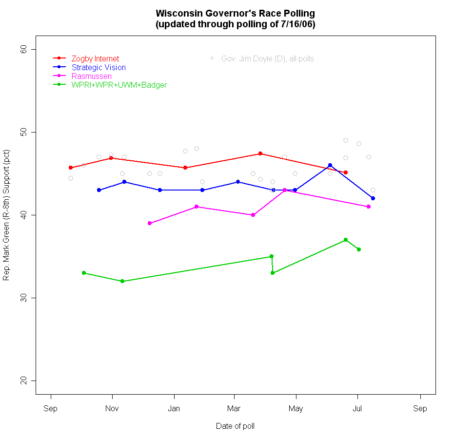
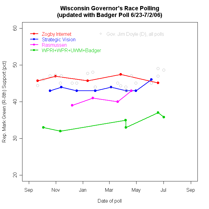
The graph above shows the polling since Sepember 2005. The Wall Street Journal/Zogby Interactive poll shows it nip and tuck. Zogby averages 46.10%-46.16%, with challenger Rep. Mark Green (R) ahead by 0.06% over incumbent Gov. Jim Doyle (D). That's inside the margin of error, by the way.

Georgia polling firm Strategic Vision sees the averages as 45.0-43.6, with Doyle slightly ahead.

Robo-pollster Rasmussen has it averaging 46.25-40.75, a decent lead for Doyle.

And everyone else averages 45.4-34.0, the incumbent in a walk. ("Everyone else" here includes St. Norbert College for Wisconsin Public Radio (WPR), Diversified Research for Wisconsin Policy Research Institute (WPRI), and the University of Wisconsin, Milwaukee.)

It isn't unusual for different pollsters to produce consistent differences in repeated surveys on the same subject. These are called "house effects" and they arise from differences in sampling, question wording, interviewer training and whatever else the organization does consistently but differently from what other houses do. Still, it is rare to see differences this large that persist over some 9 months of polling. The trends for each organization are quite stable with little sign of convergence (with the possible exception of Rasmussen.)

The differences are almost entirely about Mark Green, rather than Jim Doyle. The Doyle percentages are tightly concentrated between 43% and 49% regardless of polling firm. For Green, they range from 32% to 47.4%. That large range dwarfs the modest trend upward in Green support.

We might expect this to happen with a challenger. While Green is a well known (and well liked) incumbent in the 8th congressional district around Green Bay, he is not so well known in the rest of the state and, as every challenger, must compete against a much more visible incumbent. The lesser known candidate might be expected to show greater house effects. Subtle differences in question wording or order are less likely to matter with a candidate voters have had four years to make up their minds about. But for a candidate they are just learning about you would expect small differences in wording to matter more. The most obvious case is a vote question that fails to identify the party of each candidate, or worse, one that offers a "or haven't you made up your mind yet" option. But those kinds of differences don't seem to be present here. The question wordings are

Zogby: If the election for governor of your state were held today, for whom would you vote? (Zogby doesn't say so, but I presume the candidates are then listed. Zogby Interactive polling is done over the internet so it is hard to imagine this question not being followed by a list of options to pick from.)

Strategic Vision: If the election for governor were held today, and the choice was between Jim Doyle, the Democrat and Mark Green, the Republican, whom would you vote for?

Rasmussen: Thinking about the 2006 election for Governor, suppose that Republicans nominate Mark Green and Democrats nominate Jim Doyle. If the election for Governor were held today, would you vote for Republican Mark Green or for Democrat Jim Doyle?

WPR/St. Norbert: If the election for Wisconsin governor were held today, and the race were between Democrat Jim Doyle and Republican Mark Green as the major party nominees, would you be more likely to vote for Democrat Jim Doyle, Republican Mark Green, or an independent/third party candidate?

WPRI/Diversified Research: If the election for Wisconsin governor were held today between Mark Green for the Republicans and Jim Doyle for the Democrats, for whom would you likely vote?

UW-Milwakee: The press release oddly did not include the question wording of the vote for Governor question, though it included all other question wording. The release mentions a large percentage of undecided, suggesting that might have been an explicit option. Regardless, the UW-M survey does not appear out of line with WPR/St. Norbert or WPRI/Diversified.

So on the face of it, these questions don't appear different enough to account for the wide spread and the huge house effects we see for the Green vote.

The nature of the sample and the polling technology may be a better explanation.

Zogby's polling for the Wall Street Journal uses a pool of volunteers from the internet rather than a random sample of telephone numbers. The results are weighted by demographic and partisanship characteristics and is supplimented by a small number of phone calls as well. (See his explanation for his methodology here.) There is a good deal of effort being devoted to developing reliable methods of internet-based surveys but the jury is still very much out on the question of how reliable they are. At the very least they cannot rest on the strong theory of random sampling that is the basis for all conventional polling. In the case of political polling, they are also likely to recruit respondents who are much more interested in politics than would be the case in a representative random sample. The result would seem likley to advantage the challenger, since a more interested and involved set of respondents is more likely to know and have opinions about a less well known candidate. And indeed, Green does best in the Zogby internet based poll.

Strategic Vision uses conventional telephone polls but samples "likely voters" rather than all adults or registered voters. Again, we would expect this to produce a more informed and involved group of respondents compared to samples of adults, to the advantage of the challenger.

Rasmussen also samples "likely voters" but uses a recorded voice to ask questions that respondents answer by pushing buttons on their phones. The sample is based on a random sample of phone numbers (avoiding the volunteer respondent problem of the internet) but the response rate is extremely low compared to conventional telephone surveys with live interviewers. We might expect this to drive up interest as well, but there is also some reason to think that the effect might not be as great as with the internet based polls. There is some good evidence that people agree to participate (or more often NOT participate) in polls based on "spur of the moment" factors: I'm in a good mood, surveys are fun, or "I'm bored" versus the baby's crying, supper is on the stove, I've had a hard day. So long as the reason to participate isn't correlated with vote choice, even a low response rate doesn't necessarily bias the results. If respondents participate or not BEFORE they find out this is a political survey (and don't hang up when finding it is) then the Rasmussen poll method could produce reliable results. Since it is a sample of "likely voters", it should resemble Strategic Vision in terms of more interested and informed respondents.

WPR/St. Norbert and WPRI/Diversified Research both sampled "adults" without screening for registered voters or for likely voters. That should produce a sample that is most representative of the state but not necessarily representative of November voters. Certainly these respondents should be on average less involved with politics than the samples of "likely" voters from Strategic Vision or the Zogby internet panel or Rasmussen's "likely" voters. That should hurt the lesser known Green in these samples, and indeed he performs worst in these polls.

The UW-Milwaukee survey sampled "residents who intend to vote". Based on the results they appear not too different from the adult samples of WPR and WPRI.

So the "house effects" appear to line up pretty well with the nature of the sample and the likely effect of sample selection on the level of information and interest in the set of respondents. The challenger does best when the sample is more interested and less well when the sample more nearly captures the adult population.

Of course, this begs the question "which is right"? The Green campaign should prefer Zogby while the Doyle folks should like WPR and WPRI. Unfortunatley, we don't have a lot of DIFFERENT polls to choose from or to compare. Zogby and Strategic vision have done the most with 5 and 8 poll respectively. Rasmussen has done 4 and no one else more than 2. This means that the sample selection effects that appear to account for the differences are also heavily confounded with any other house-specific effects, including the internet vs robo-phone vs conventional phone technologies. This makes it harder than it might be to estimate a "best fit" across all the polling. If we had a range of phone polls from different organizations, all sampling likely voters, we would be in a better position to sort out the house effects from the "real" underlying support for each candidate.

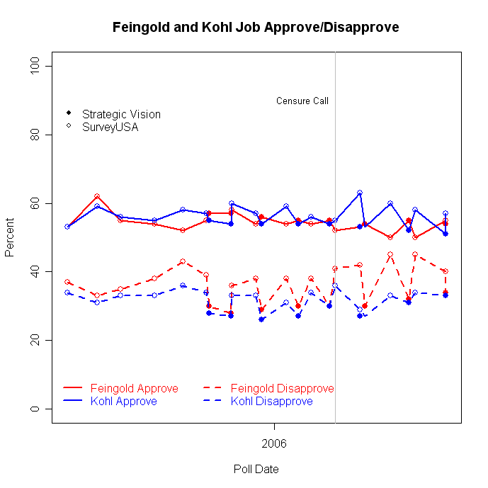
The house effects are not limited to vote choice either. When it comes to approval of the job Jim Doyle is doing as governor, there is a striking divergence as well. The figure below plots these trends.


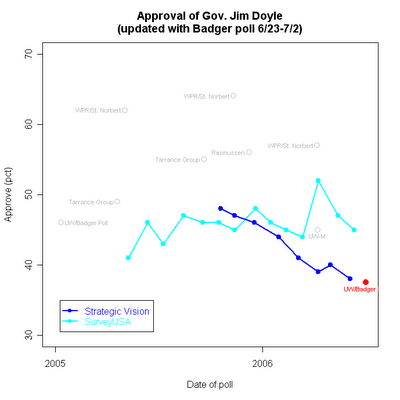
Here the striking comparison is between the substantial negative trend in approval in Strategic Vision surveys vs the generally flat trend in the monthly SurveyUSA samples. (SurveyUSA, like Rasmussen, uses a recorded interviewer.) And as before, we see that the "other" survey organizations produce divergent approval ratings, much higher than those of either SurveyUSA or Strategic Vision.

While it was clear why samples with more interested voters would be more aware of Mark Green, it is less obvious why the "adult" samples of WPR/St. Norbert produce strikingly high approval ratings compared to SurveyUSA's samples which are also of "adults". It may be that there is a pro-Republican advantage among likely voters which could account for some differences in the level of approval. But that doesn't seem able to account for downward trend in Strategic Vision surveys compared to the flat SurveyUSA trend.

A further puzzle is that while Strategic Vision has found approval of Doyle declining, they have not found a decline in the Doyle vote, or an increase in the Green vote (except for their most recent poll). We might expect these two series to move in tandem, but so far not so much.

Survey "house effects" and sample population effects are common, but rarely do we see them as clearly defined as in the Wisconsin Governor's race polling. The potential for such effects to cause confusion and conflicting claims about the race is compounded by the concentration of polls among a handful of firms and methodologies, at least two of which (Zogby and Rasmussen) are open to serious methodological questions.

The lack of regular polling by independent media organizations in the state compounds the problem. No Milwaukee or Green Bay or Madison news organization currently sponsors regular, professional and high quality readings of public opinion, with the exception of the widely spaced and small samples from WPR polling. That means not only citizens but reporters and editors as well are left to pick among the widely varying polls that are available because someone else sponsored them for their own purposes. Not, perhaps, the best state of affairs for journalism in Wisconsin.

(Full disclosure: I serve on the advisory committee of the UW Survey Center which previously conducted the "Badger Poll", which was sponsored by the Capital Times in Madison and the Milwaukee Journal Sentinel. That sponsorship ended last year. Other than my (unpaid) advisory committee duties, I have no ties to the Badger Poll or to the UW Survey Center. Likewise I have no connections to any survey firms.)

Update 7/11: A new UW-Madison/Badger Poll was conducted 6/23-7/2 though curiously not published until today, 7/11. Those data fit very nicely with the story told above, and from a new source not previously part of the data. The Badger Poll has been added to the graphs above, as the last data point in the horse race graph, and with a red highlight in the approval graph.

The Badger poll finds support for Gov. Doyle at 48.6% and for Rep. Green at 35.8% with 15.6% undecided. That is entirely in line with the green line in the top figure for "other polls", a group including Wisconsin Public Radio/St. Norbert College, Wisconsin Policy Research Institute/Diversified Research, and UW-Milwaukee. Those polls have averaged 34.0% support for Green and 45.4% for Doyle. So the Badger results fit right in. What Badger has in common with these others is conventional telephone random sampling (with live interviewers) and a sample of adults, rather than likely voters.

News reports seem to be leading with "double digit lead" but I think that's a questionable interpretation of the data. As the data show, Mark Green is still very much an unknown in the state, outside the Green Bay area of his 8th congressional district. The Badger poll found a whopping 58.7% unable to say if they had a favorable or unfavorable impression of Green. That makes perfectly good sense at this point in the race, though political junkies find it hard to believe how little candidates penetrate the consciousness of the general public this far from election day. Even Doyle, after nearly four years as Governor, cannot be rated by 23.8%.

So realistically, how well can ANY candidate be expected to do when nearly 60% of the public has no impression of him? I'd say doing 35.8% support is pretty good. That support has to be based on a combination of partisanship and dissatisfaction with Doyle, and not a lot because of the attraction of Green. As Green gets better known, he will attract support on a personal basis as well, but that isn't a large part of his support as of today. NOR should we expect it to be at this stage of the race.

The polls that are closer, especially Strategic Vision which uses the same telephone methodology but selects "likely voters" finds a much closer race. But that makes excellent sense. The more interested likely voters are also more likely to have formed an impression of Green, adding that element to their vote choices. Hence a closer race in Strategic Vision.

So why should the news reports NOT lede with the "double digit margin"? Because it is an artifact of name recognition (or lack thereof) rather than a sign of a weak challenger.

If I wrote the lede, it would be "Gov. Jim Doyle, while leading in the horse race, faces an electorate in which 56.6% disapprove of his handling of the job of Governor. Only 37.5% approve of the job he is doing. " Those are remarkably bad job approval numbers for an incument seeking reelection, and provide the basis for a challenger to rise substantially in the polls once the campaign commences. To emphasize the horse race margin is to miss the serious vulnerability the poll reveals.

There is, however, one very puzzling result. While Doyle's job approval is pretty dismal, his favorability rating is a relatively good 46.7-29.5. It seems odd that Doyle gets a favorable rating from nearly half the sample when only 38% approve of his job performance. These two need not track exactly, but that is quite a gap. Perhaps this favorability provides a reservoir of support that is helping overcome the poor job approval numbers.

The job approval also looks bad broken down by party. Dem approval is only decent at 57%, but Independent approval is a disappointing 37.1% and Republicans a predictably low 23%. You certainly can't win Wisconsin with only Democratic support, so Doyle needs to win over a lot of independents who are currently not very impressed with his performance.

One might question whether the approval rating is believable, given the gap between vote (49%) and favorability (47%) and approval (38%) . But here the Strategic Vision polls show a downward trend in approval that ends at a level quite close to the Badger Poll. SurveyUSA's automated polling finds a higher approval as have other polls, though a good bit earlier. At the least, this is a quite unsettling finding for the Doyle folks and source of hope for Green.

Put that together, and the bottom line is that a "double digit lead" doesn't mean much for the fall. Doyle may well win reelection, but it seems very unlikely to be by a wide margin. The nice irony here is that the polls showing a currently close race are most likely wrong, AS OF TODAY, but are probably about right as forecasts of where opinion is heading once the campaign starts activating and informing voters.


Click here to go to Table of Contents