Showing posts with label party id. Show all posts

Friday, June 13, 2008

Trends in Party Identification in Wisconsin


This week my colleague Ken Goldstein and I conducted a Wisconsin statewide survey sponsored by the UW Department of Political Science and WisPolitics.com. So fair warning that I'm a party to this survey rather than an independent observer.

A number of people have commented on the party identification balance in the survey: 38% Dem, 24% Rep, 29% Independent (37% Independent when "no preference/other" are allocated to independent. When this group is asked how they "lean", very few insist on some other party, so this allocation makes sense.) See Alan Reifman's blog on weighting and party id for a good example and discussion of broader issues of weighting to party id.

I want to point out two things here and put our data in the context of other polls in Wisconsin.

The chart above shows party identification trends since 2000 using data from three sources that have done frequent polling in the state. What we see is a relatively stable Dem/Rep parity from 2000-2004, with Dem ID falling a bit around 2004 while Reps moved up slightly.

Starting in 2005, however, there is an initially slow but then sharper shift in partisanship. Republican ID declines from about 30% to about 24% today, while Dem ID rises from about 30% to nearly 40%. After an initial surge of independents, that group has recently fallen off a bit. (You have to squint a bit to see WPRI and Badger after 2005, but they are close to the trend lines during this period, so the changes are not just a matter of house effects or phone vs ivr methods. WPRI, for example, has Rep ID moving from 33% in 2004 to 28%, 26% and 25% in 2005-2007. Their Dem ID rises from 30%-33%-34% then falls to 29% over the same period. The final 29% is a large discrepancy from the trend, of course.)

We did not weight our survey to party identification, and these trends help explain why we have reservations about doing that. While relatively stable, party id does move over time, and by a fair bit, as you can see here. But that said, our unweighted results turn out to be quite close to the estimated trends in partisan categories in any case.

The second point is to compare these trends with those in exit poll measures of party id. In 2000, the VNS Exit poll put Wisconsin pid at 37% Dem, 32% Rep and 31% Ind. This shifted in 2004 to 35% Dem, 27% Ind and 38% Rep. But in 2006 the exit polls found that the balance was 38% Dem, 34% Rep and 27% Ind. Those values all show a smaller share of independents at the polls on election day compared to the polling trend, but that is to be expected given differences in turnout between partisans and independents. The size of the party ID groups grows as a result, but the balance between them is in line with what we see in the trends in the polls, though certainly not an exact match. The polls, after all, are of either adults or likely voters, while the exits are by definition a measure of who actually showed up on election day.

For 2006, the Dem exit percent and the Dem trend estimate are a close match. Republicans gain in the exits, by about 6 points over the 2006 trend estimate. If that holds for 2008, we might expect an electorate more like 38% Dem and 30% Rep. Of course both parties will have very active "ground games" and GOTV efforts to try to change those numbers.

While I'm certainly happy that our party id balance is so close to the trend in all the other polling, the more important point is that party id in Wisconsin has shifted quite a bit over the past four years. The coming campaign may alter that, possibly bringing disappointed former Republicans back home, for example. Likewise a Republican advantage in turnout could bring the exit polls back to closer balance. But as the data show, today the GOP is at the worst disadvantage the state has seen in over eight years.

Let me conclude with a bit of description of the polls used here.

Wisconsin Policy Research Institute ("WPRI") has done some of the longest running polls in the state, usually two a year. Their data here is taken from their annual estimates, which I assume pool the two surveys though they don't say so explicitly. WPRI describes itself as "Wisconsin's Free Market Think Tank".

The "Badger Poll" is conducted by the UW Survey Center. They did more extensive polling in 2002-04 but now do about two polls a year.

SurveyUSA is a well known national pollster that uses "Interactive Voice Response" (IVR) automated interviews. SurveyUSA has done monthly polling in the state since 2005, providing some of the best data on state trends in approval of elected officials and as a byproduct have an excellent data series of party ID.

Finally, there is our new Department of Political Science/WisPolitics poll. Ours uses a commercial call center, not the UW Survey Center or undergrads in a class calling for a grade. WPRI, Badger and our poll all use live interviewers, SurveyUSA uses IVR. Most of these surveys are in the 500-600 respondent range.

Monday, May 07, 2007

Partisan variation in 2007 polling


The Newsweek poll released this weekend was quickly criticized for under-representing Republican partisans. For the adult sample, Newsweek had 22% Republicans and 35% Democrats, while for registered voters their numbers were 24% and 36% for Reps and Dems. Independents were 36% of adults and 37% of registered, with 7% of adults and 3% of registered refusing or unable to answer the question.

How out of line are these results? The graph above shows the distribution of party id for all polls taken since January 1, 2007. The groups are for three populations (Adults, Registered Voters and Likely Voters) and for whether the party ID question is "leaned", that is does it include those who say they "lean" to one party or the other, after first saying they are independent or non-partisan. In the legend for the graph A.N is adults, not leaned, RV.L is Registered Voters, Leaned, and so on.

It is clear that the distribution of Republicans, Democrats and independents depends quite a bit on the population and the question wording. For the adult, not leaned, sample that Newsweek used for presidential approval, the 22% Republican they found is at the low end of samples in 2007, where the median is 25%. Among registered voters, not leaned, the median in 2007 is 29%, compared to Newsweek's 24%. For Democrats, the Newsweek sample at 35% for adults compared to a median of 35%, while among registered voters their 36% compares to a median of 35%.

So the Newsweek results are a bit low (-3%) for adult Republicans, and a bit lower (-5%) among registered voters, but quite close to the median for Democrats. While the adult Republican number is the lowest of the year in comparable samples and questions, it is only 3 points from the median. That is indicative of the relatively low spread of estimates of Republicans in the adult population this year, where half of all polls fall between 24% and 28% and only 3 of 24 polls fall above 30%. Among registered voters with unleaned questions, half of all polls fall between 27% and 32%, with four polls above 32% and six polls below 27%. Newsweek's registered voter sample is the second lowest reading for Republicans of this group.

The relationship between percent Republican and percent Democrat is not terribly strong within categories of population and question wording, as shown below.


If anything, there is a positive correlation of the two partisan groups, ranging from .44 to .81 for adults and registered voters. (The four cases of likely voters have little variation and produce negative correlations, and I discount this.) The positive correlation is a good indication that what is at work with partisanship is that some questions or survey organizations produce more or fewer independents, driving down or up both Reps and Dems simultaneously.

The variation we see above is a reminder that party identification is a central concept, but subject to quite a lot of variation in measurement depending on population and question wording (and probably "house effects" due to survey organization, a topic ignored in this post.)

Given the sample size of each partisan group, the range of variation we see across polls is not surprising, and that raises an important point. One of the first things we ask about a poll is what its partisan split is. That is an important diagnostic to have available, and Newsweek deserves to be praised for openly disclosing this bit of data. All pollsters SHOULD release this information but a number do not. The current criticism of Newsweek is exactly the disincentive these organizations have for such release. If your party id is even a bit off, it becomes an immediate target for criticism and partisan cries of "fraud". Such is an uninformed view. Normal sampling variation will produce a range of party id estimates, and the data above show that in general this variation is well behaved, doing about what we'd expect given the sample sizes involved. But it does provide a tempting target for anyone unhappy with a particular poll.

This is not to say we should not scrutinize pollsters based on their data. That is entirely what we do here, of course! And I think I was the first to point out that the latest Newsweek poll appears to be an outlier on presidential approval. But that conclusion was based on a great deal of evidence from over 1400 polls and a consistent methodology I apply to every new poll regardless of source and regardless of results.

Finally, it is easy to overstate the impact of the distribution of party id on other survey estimates, such as presidential approval or horserace results. While party id is a powerful individual level predictor of those things, a discrepancy of 3-5 percent in partisanship, as in this case, does not translate directly into a similar discrepancy in every question with partisan overtones. Partisans are not completely homogeneous in their views, so the impact of variation in party id is mitigated by the variation within partisan category in approval or candidate preference. If we want to analyze a poll's results, it is better to focus directly on the question of interest, rather than on another variable like party id which may influence but not entirely determine the result we care about.

For further analysis of variation in party id across pollsters see here, and for variation over time see here.

Thursday, February 01, 2007

Party ID in States Shifted in 2006


Democrats gained an average of 3.4% and Republicans lost 3.0% in partisan identification between 2005 and 2006, according to a new Gallup estimate based on over 30,000 interviews conducted throughout 2006. Gallup aggregated polls throughout the year to create estimates of party identification at the state level, as they did in 2005 and previous years. Gallup's report of the results is here.

The plot above shows how uniform the shift in Democratic and Republican partisanship was across the states. The colors of the points reflect the Democratic minus Republican balance in 2005-- the darker the blue the more net-Democratic identifiers and the darker the red the more net-Republican identifiers. Light or pale points are closely balanced states, as of 2005. The size of the points is proportional to the size of the state.

There is no apparent pattern to the shifts in partisanship: regardless of partisanship or partisan balance in 2005, states shifted by about the same amount in 2006. Likewise, Republican losses shifted uniformly. The +3.4 percentage point shift for the Democrats, and the -3.0 point shift against the Republicans produced a net -6.4 point loss for the Republicans in the balance of partisanship. The lower left figure in the plot shows that independents shifted more or less randomly between 2005 and 2006.

These shifts could, in principle, represent a non-trivial gain for the Democratic party. Recall that after the 2004 election there was considerable talk in Republican circles of establishing an "enduring Republican majority", a goal that seemed within the party's grasp though certainly not assured. That hope is clearly out of reach at the moment.

Before Democrats go wild with joy, there remains a question about the electoral impact of these partisan shifts. Party identification is the strongest single predictor of vote choice at the individual level. But the shifts in partisanship in the Gallup data do not predict the shift in voting for the U.S. House in 2006.

The bottom right figure above shows that the Republican U.S. House vote shifted more or less uniformly across states as well. However, when we look at the relationship between party id shift and vote shift across states, there is no relationship at all, as seen in the figure below.


Controlling for both Democratic gains and Republican losses doesn't add to the relationship. So the conclusion here is that both partisanship and vote shifted against the Republican party in 2006, but the variation in shifts appears to have been essentially independent between partisanship and vote.

Democratic gains and Republican losses in partisanship may affect the 2008 prospects in the House (and other) elections. But in 2006, it appears both vote and partisanship responded to conditions in the country without a clear impact of changes in partisanship on changes in vote.

Tuesday, August 01, 2006

Bush Approval: Cook/RT at 39%


The new Cook Political Report/RT Strategies poll taken 7/28-30/06 finds approval of President Bush at 39%, with disapproval at 51%. This poll is of registered voters. The 39% approval is up two points from June 4th and up three points from April 30, near the low point of my estimated approval trend. The addition of this poll puts my trend estimate at 37.96%, so let's call that 38%. The blue trend line continues up, though at a noticably slower rate than in May and early June. Since mid-June approval has risen by about 1%, while it climbed by 3 points the previous month (May 15-June 11).

If I use my more sensitive "red line" estimate, then approval appears to have been flat since mid-June. I didn't plot that this time. "Hasty red" is clearly having a tough time deciding what the trend should be. Last week it was a bit down, and I wrote a piece asking if Bush was again in decline. All the polls since then have reduced that estimate to where it now stands at no change. This is an example of "hasty red" suggesting something that seems to have been too much response to a couple of polls. My standard "blue line" estimate meanwhile has continued to show a mild gain since mid-June. For now, I'm sticking with it-- but always watching for Red to give us a hint. Right now, that hint isn't very convincing!

With events in the Middle East plus the summer doldrums at home, I'm not making any bets which way approval is going to move next. You can make cases for either direction. So I'll stick to the thing I do have confidence in-- "old blue".

It has been a while since we looked at approval by party identification, and the Cook/RT poll gives us a nice comparison. They include strength of approval, which many others do not do. That lets us look a little deeper than the simple dichotomy, and by party id categories.

The graph below divides approval into seven categories: strongly approve, somewhat approve, lean towards approval, (neither, not sure, mixed, don't lean either way), lean disapprove, somewhat disapprove and strongly disapprove. The rows of the figure correspond to these categories from top to bottom. The columns are the three party identification categories.

The thing that jumps out of this figure is the very large strongly disapprove group among independents. Fully 46% of independents strongly disapprove of the President's handling of his job. That compares to 59% among Democrats. Just visually comparing the independent with the Dem columns of the figure shows how much independents resemble Democrats at this point. They certainly don't evenly split the difference between Dems and Reps. And that isn't just mild disapproval-- by far the largest single category among independents is strongly disapprove.


The two partisan camps are approximately symmetric: 78% of Reps approve strongly or somewhat, while 76% of Dems DISapprove strongly or somewhat. What tips the balance against the White House is the large group of unhappy independents: 56% of whom disapprove strongly or somewhat. Only 27% approve strongly or somewhat.

As we come into the fall campaign, I wonder if these disapproving independents can be persuaded to back Republican congressional candidates. These folks are not natural supporters of Dems but they seem so put out with the President that I'm not sure a campaign based on anti-terrorism can win them over again. Despite a first ever veto (and failure to override) I'm not sure there is much daylight between the Republican congress and the White House. I expect a number of districts will swing one way or the other on the votes of these unhappy independents. Can they be won back? How? And the flip side of that question: Can Democrats capitalize on this dissatisfaction when the congressional race is between two particular candidates, and not just a referendum on Bush's performance? We know the generic ballot has been favoring the Dems for a while, but then it has done that most of the years since 1994 without a change in control of congress. Any evidence? Yes, thanks to the Cook/RT poll.

The Cook/RT poll uses the following question on preference for control of Congress, rather than the usual "generic ballot" house vote:
Now, thinking about the election for U.S. Congress in November, regardless of how you might plan to vote in your own district, which party would you like to see in control of Congress after the congressional elections in November: The Democrats or the Republicans? (If not sure:) Well, which way do you lean, more towards the Democrats or the Republicans?
This item may or may not predict individual House votes well, but it does give us a measure of preference that lets us look at how independents split on this question of control compared to their substantial disapproval of President Bush.

The categories shown as rows run from "Prefer Rep Control", "Lean Rep", "Undecided", "Lean Dem" and "Prefer Dem Control", as we go from top (Red) to bottom (Blue).


That dissatisfaction among independents translates only partially into support for a Democratic congress. While 45% of independents say they prefer a Democratic Congress, this pales by comparison to the Democrats where an overwhelming 90% say the same. That's not at all surprising, but while Independents disapprove of Bush in numbers not too far behind those of Dems, this doesn't translate as strongly into a preference for Congressional control.

Republicans can hardly rest easy from this figure, however. They would need to capture all the undecided and leaning independents in order to break even on the control question. Barely a quarter (26%) of independents say outright they prefer a Republican Congress, while 45% pick the Democrats. That is a lot of ground to pick up for Republicans.

Finally, Republicans have often been more loyal to their party than Democrats. In this figure, there is a small deficit in Republican loyalty: 80% of Reps want a Republican Congress, 10 points less than the Democratic preference among Dems.

Everyone should know the dangers of using this or other "generic ballot" questions to forecast actual votes, let alone swings in seats. But the data do speak to the difficulties Republican's face in the fall elections. Approval shows a massive deficit among independents, and the preference for control suggests that at the very least the Republican party has to win over the vast majority of wavering independents. (At least given this kind of "national level view". If you want district by district analysis, go to the Cook Political Report!)


Click here to go to Table of Contents

Monday, March 20, 2006

Partisanship moves


(Click the figure, then click it again to see the full resolution.)

Partisanship is a moving target over time and exhibits considerable variation across pollsters. The combination of both over time and across pollster variation makes simple comparisons of partisan balance across polls potentially misleading and agreement on a single partisan distribution difficult at best.

Between January 1, 2005 and March 12, 2006, Republican partisan identification declined by an estimated 3.6%. The percentage of the adult population calling themselves Independent rose by 4.6%, and the percentage of Democrats declined by a statistically insignificant 0.4%. These changes are important for polling methodology and also present a politically important shift in the partisan balance.

In the first post of this series on partisanship (here), I showed that pollsters differ substantially in the percentages in each partisan group their polls typically find. In this post I turn to change over time. While much more stable than many political attitudes, party identification is not immune to systematic variation over time. This makes the party id distribution for any pollster a moving target, while posing the problem of how to know what the target is at any given moment. This is particularly an issue for those who think polls should be weighted to a constant distribution of partisanship, or even to a moving average of previous polls. Perhaps more importantly it means that those who judge a poll's merit on the basis of it's partisan balance need to be much more aware of how much variation there is, even over the relatively short span since President Bush's reelection. Differences between polls that are pointed to as signs of at best “bad samples” and at wost malignant bias by pollsters are in fact well within the range of variation typically found across polls and over time.

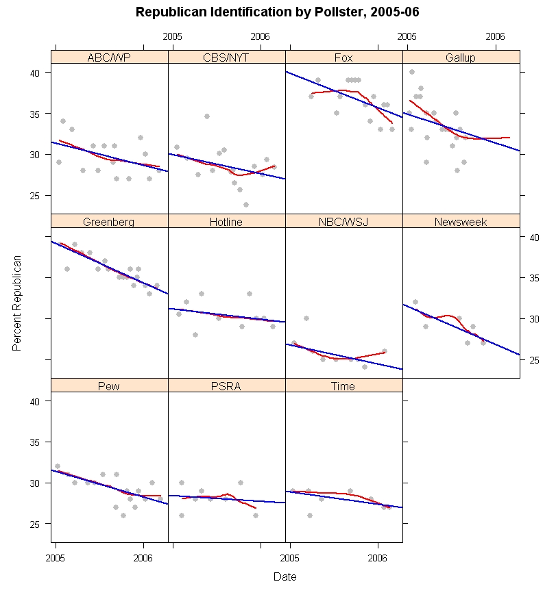
In the figure above, I plot the trends in Republican identification through 2005-06 for all pollsters for whom I have sufficient observations to make reasonable estimates. (The AP is omitted because their results are generally only available in a “leaned” form, with Independents who lean to either party included in the party totals. The data here are only for “unleaned” question formats.) The “house effects” are clear in the range of vertical variation across pollsters. Fox is quite high (they are also high on percent Democrats) while NBC/WSJ is quite low (they are also low on Democrats.) And the others vary between these extremes. As we saw in my previous post, most of the variation across polls is related to the percentage of Independents. Fox gets few Independents, and is thus high on both Reps and Dems. The Fox question wording does not offer an explicit “Independent” alternative, which surely accounts for this difference. NBC/WSJ is quite high on Independents, and so is low on both partisan groups. There is no obvious question wording that would explain this consistent house effect.

More importantly, however, all of the pollsters show a downward slope over the course of the 14+ months included here. While there is substantial variation in what the percentage of Republicans is at a given moment in time, all the polls agree that this percentage has fallen since January 2005. The straight line in each panel is the linear estimate of trend over time. The red curved line is a local regression that can provide a non-linear fit to change. While the trend is somewhat non-linear for Fox and Gallup* in particular, and a bit off of linear for CBS/NYT and perhaps NBC/WSJ, in most panels the trend is pretty close to linear regardless of which estimator is used. Also the slope varies across the polls, but not hugely. A statistical model that allows the slopes to vary (along with house effects) is not statistically distinguishable from a model that assumes equal linear slopes (but with different house effects for the level of Republican identification.)

(*Gallup data requires explanation. Gallup does not routinely release the partisan breakdown on their polls, at least not that I've been able to find. They do list partisanship breakdowns for all polls on their subscription only website. The data I display here is taken from the Roper Center at the University of Connecticut's “iPoll” database, which is available to subscribers and which includes permission to publish results of research based on the data. My university is a subscriber. Those data end in September 2005. As an individual, I am a long time subscriber to the Gallup website but do not wish to publish data they do not consider available without fee to anyone on the web. I've therefore used their data through March 2006 in my statistical analysis, and in the fitting of the regression and local regression lines in the above figure, and those that follow. However, to honor their desire to protect their data from release, I've suppressed the plotting of data points in the Gallup series after September 6, 2005, the last data available to me from the Roper Center. As is clear from the figure, Gallup data show a Republican decline through September 2005, but this flattens out after that. I believe it would be misleading not to show the trend based on the entire dataset so I've included the linear and non-linear trend lines estimated on the full dataset but have not plotted the data points themselves after early September. You will have to take my word for it that the Gallup data after September scatter more or less randomly around the non-linear trend line. The linear fit is not terrible but does under-estimate Republican identification for the Gallup poll late in 2005 and in 2006.)

By pooling the data across polls, and fitting a linear model with dummy variables to capture house effects, I estimate that Republican identification was 34.6% on January 1, 2005 and 31.0% as of March 12, 2006. That is a small change compared to shifts in presidential approval over the same period, but is a statistically and substantively significant shift in the relatively more stable partisanship measure.

Paradoxically, the loss of Republican identifiers should be helping President Bush's approval rating among “the base”. If those shifting out of Republican and into Independent are very marginal Republicans, then their support for the President should be less than that among stronger identifiers. By leaving the party, they avoid dragging down presidential approval among the remaining GOP identifiers. For example, in recent Gallup polls approval among Republicans has been around 80%, and about 30% among Independents (roughly speaking). If we added back to the GOP the 3.6% they've lost, and if they behaved like other Independents, then approval among the GOP would be only 74.8%, not the current 80%. So that isn't a huge amount, but it is noticeable. (Of course, the 3.6% might not be typical of other Independents, so the effect could be less. But you get the idea.)

These estimates are based on samples of adults. The 2004 exit polls estimated a Republican share of 37% among actual voters, a modest advantage for Republican turnout. Election day was 59 days before January 1, so my estimate would be 35.1% Republican on election day, if the trends in 2005-06 extended back to election day 2004, within 2% of the exit poll estimate.

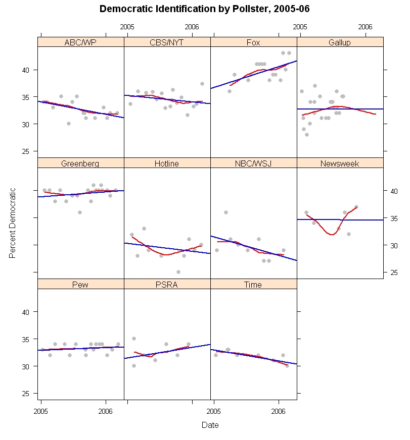
In contrast to Republican identification, the percentage of Democrats has remained quite stable in most polls since January 2005. The figure below shows the trend in Democratic identification using the same methods as for Republicans above.
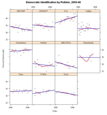


The variation in slopes over time are generally modest, with the exception of Fox and NBC/WSJ. Once more a statistical test fails to find convincing evidence that the trends differ significantly across polls. (The Fox upward trend is likely related to the question wording. I discuss this below.) When pooled across polling houses, and taking account of house effects, the estimate is that Democratic identification is statistically flat over this time period, with a non-significant decline of 0.4%. By these estimates, Democrats made up 32.9% of the adult population on January 1, 2005 and 32.5% on March 12, 2006. Here the gap with the 2004 exit polls is larger. The exit polls estimated that Democrats and Republicans both made up 37% of the voters on election day. Based on these 2005-06 polls, the Democrats were about 4% lower than this in the population, at least as of January 1, 2005. In the last 14+ months, the Democrats appear essentially unchanged, despite the bad times for President Bush and the losses suffered by the Republican identifiers. So what about Independents?
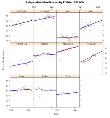


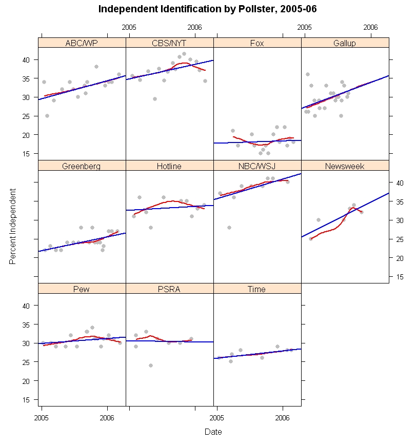
Independents have grown in size across most of the polls. PSRA (Princeton Survey Research Associates) has them flat, and Fox has a small slope but every other poll shows small to substantial gains in Independent identification over the last 14+ months. The gains are essentially linear, as the local regressions lie very close to most of the linear fits. And a statistical model again finds that a model in which Independents gain at a common rate across polls cannot be rejected (with house effects for level but not for slope.) Based on the model, Independents have moved from 29.2% at the start of 2005 to 33.8% as of March 2006, a 4.6 percentage point increase.

There is a considerable debate in political science over how malleable partisan identification is. I belong to the camp that argues for significant responsiveness of party id to the policy positions of the parties. Others (Morris Fiorina, and the team of Bob Erikson, Jim Stimson and Mike MacKuen, for example) argue that party identification responds to government performance of one kind or another. We all agree that partisanship can shift in non-trivial ways over relatively short periods of time. There is another side, led by Don Green and colleagues who argue that party id is actually very, very stable and except for some random measurement error is really not responsive to other political forces. We'll leave that discussion for another day.

When shifts occur in party id, it is reasonable that those most likely to shift categories on the partisanship question are those in or near to independence. (There are arcane academic debates on exactly why this is, but in the big picture it seems reasonable enough that those with the weakest attachments to parties would be most likely to shift when given a reason.)

So how does that help us with the data before us? In 2004 the presidential election favored President Bush who won by a small but comfortable margin in the popular vote. If we assume this is because short term forces favored the Republican candidate, it is reasonable that some people who are near the dividing line between independence and Republican identification were moved to shift a bit to their right, into declaring themselves “Republican” when asked “In politics, as of today, do you consider yourself a Republican, a Democrat, or an Independent?”, the Gallup form of the question. In 2005 and so far in 2006, the balance of forces has been against the President and the Republican party. The result should be that those who were moved a little into the Republican category during 2004 are now likely to move out and into independence. The result is a downturn of Republican identifiers and a growth in the proportion of Independents.

What about the Democrats? The 2004 election was one of the most polarizing elections in the last 60 years. It would seem plausible that some Independents who lean towards the Democratic party were convinced to declare themselves “Democrats” as a result of this polarization. When the election period was over, we might normally expect these people to drift back into independence as well, resulting in some decline in Democratic as well as Republican identification. However, the bad year for President Bush has produced political forces consistently disadvantaging the Republicans, and hastening the departure of especially weak identifiers. At the same time these forces should act to hold the most marginal Democrats in the party, keeping them from drifting against the tide of partisan forces over the last year or so.

Of course, we don't have individual level data, so this is a plausible explanation, not one that is beyond debate. We would need to see which individuals shifted to be confident that my story is correct. With only these aggregate data it is possible that some other, more complex, interchange among the three partisan groups has occurred. The net effect, however, is not in doubt: fewer Republicans, more Independents, about the same number of Democrats.

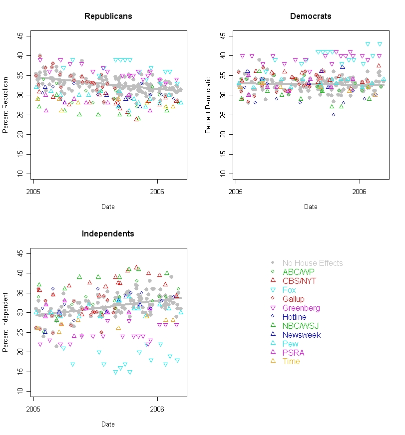
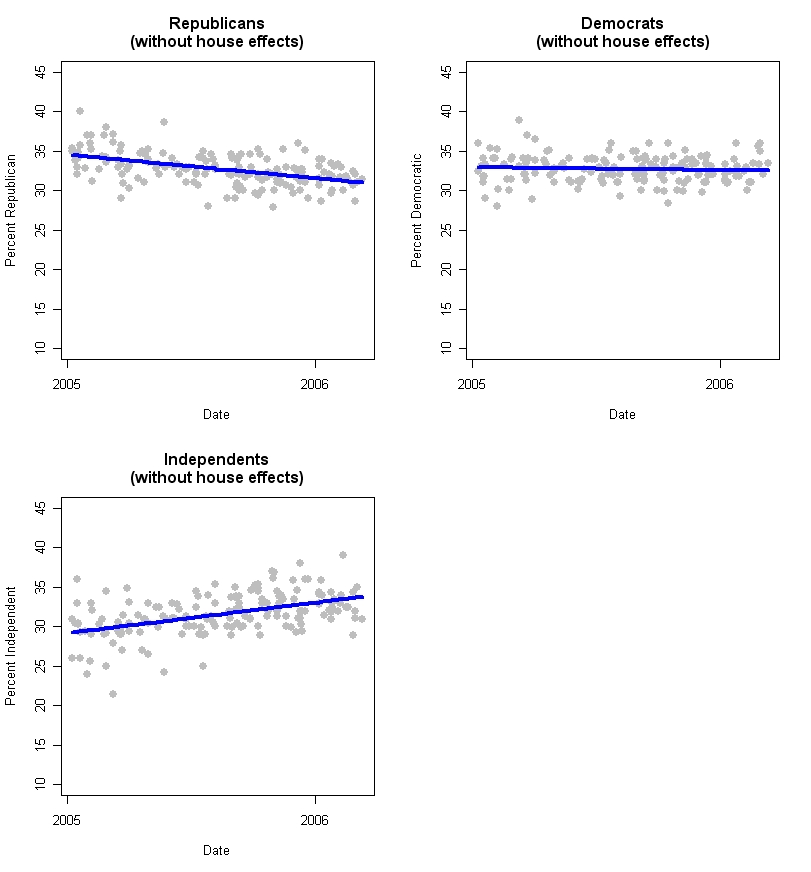
But how much spread is there across polls, and what happens if we take out the house effects to our view of partisan trends. The figure below shows each partisan group over time, with the observed data and with a trend (in gray) of what we would estimate partisanship to be having taken out the house effects using my statistical model.
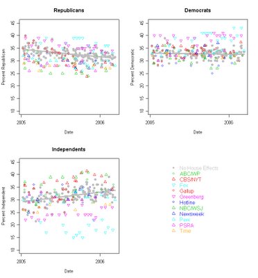


The spread of partisan estimates is considerably larger than the spread of estimates with house effects removed. This is especially striking for the Independents, where the house effects are huge. The very low percentage of Independents in the Fox poll is undoubtedly due to their question wording, “When you think about politics, do you think of yourself as a Democrat or a Republican?” The lack of an explicit “Independent” option would be expected to drive down that category, and it clearly does. While not quite as extreme as the results from allocating partisan “leaners” to a party, the Fox question results in a distribution that appears much more partisan for both parties than other polls. NBC/WSJ has the opposite result. Their question is seemingly innocent, “Generally speaking, do you think of yourself as a Democrat, a Republican, an Independent, or something else?” They don't get many “something else's”, only about 4%, yet their Independent group is quite large relative to other polls. This could be due to interviewer training, I suppose, but the large number of Independents is something of a mystery to me (unless interviewer's encourage “something else” respondents to choose Independent before recording the response. Based on other polls with a “something else alternative, this could add 6-8% to the Independent category. Still, that wouldn't explain the low numbers of Dems and Reps that NBC/WSJ get.) The result is that NBC/WSJ is consistently low on both Republicans and Democrats. Other polls fall between these extreme house effects.

The gray dots and trend line shows what the distribution of partisanship would be if we remove the house effects but keep the common trend over time. The distribution is reasonably tight about the trend, certainly compared to the raw polls.

These figures should make clear why comparing party identification across different pollsters and/or at different times is a dangerous business. It is certainly true that house effects differ and they differ substantially. So compared to Fox, everyone else has too few Republicans. Of course, they have too few Democrats as well! The problem is there are house effects but more importantly we don't have any single “correct” value for party identification. The figures here demonstrate that there is great variation, yet who is to say that any one of these pollsters is “right” and the others wrong? The technology of polling is essentially shared by all. I deny that anyone seeks to intentionally ask biased questions. Rather question wording variation reflects the purposes of the survey organization, and these may differ for legitimate reasons, as when Fox leaves out an Independent option, or when some pollsters offer a “something else” alternative or stress “Generally speaking...” as opposed to “In politics as of today...”. These produce different results, but none is clearly better or worse than the others.

So if we can't agree on a single standard, what can we do? We can estimate the house effects, and compute a pooled estimate normed to a single survey house. This figure appears below (and in gray in the figure above as well.)
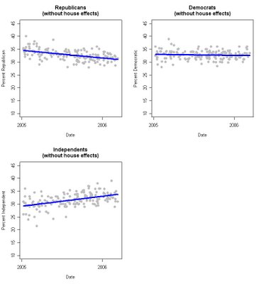


Here (and throughout this analysis) I've used Gallup as the reference pollster simply because Gallup does more surveys than anyone else in my dataset and it makes sense to use the house with the most cases as the base. This does not mean that Gallup has the “right” measure of partisanship. It is merely convenient.

If we wanted to weight datasets to a fixed partisan distribution, this figure shows the problems we encounter, even after pooling across 165 surveys. First, there is a trend. Weighting to ANY static values for partisanship will be wrong if partisanship actually moves, as the data here demonstrate. If instead you use a moving average of past polls, you'll always have estimates behind the current point on the trend line. So you could use the regression estimate for the current party balance, which still uses the past but requires a good fit to the trend. As it happens we do have a good fit to the linear trend here, but there is no reason to think that is guaranteed in the future. And while these trends are not extremely sharp, they do imply a shift of 3.6% down from Republicans and 4.6% up among Independents. Some strong words have been used to describe polls as “biased” for differences of this magnitude compared to what the antagonists think are the “right” numbers. So that is a non-trivial issue.

Second, the variability around these regression lines suggests uncertainty of about +/-4% even when we leverage all our data as much as we can. My estimate of current Republican identification is 31.0%. But I can't say with any confidence that it is not 28% or 29% or 33% or 34%. Or maybe even 27% or 35%. And this is after taking out all house effects and allowing for change over time.

Some argue for weighting to the exit polls, which is ironic in light of all the criticism of exit polls after the last three elections!

My point here is not to take sides on the weighting to party id issue (though my analysis is relevant) but rather to point out how difficult it is to have a target party distribution that is precise enough to have absolute confidence in (which is what you need if you are going to weight to it.) We are pretty darn sure what the percentages by education, sex, race and region are in this country. Those make good weighting criteria. Not nearly so good an idea for party, no matter how you care to measure it.

Finally, there are some that argue that even the variation around the trend line in the figures is evidence of systematic response to political events. While I cannot distinguish this from random noise, it is possible that some of this variation is “real”, but very short term, change Weighting to an unrealistically stable target might avoid partisan criticism but would also distort the actual variability of public opinion.

To conclude this look at party over time, as Galileo said, “it moves.” Right now that is working to disadvantage the Republicans, but not so much in favor of the Democrats. The rise in Independents may itself change if they are pushed more strongly towards one party or the other.


Click here to go to Table of Contents

Thursday, March 02, 2006

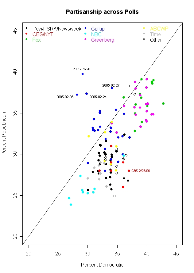
Partisanship across polls


Partisanship generally varies more across pollsters than over time for a single pollster. This has implications for how we assess whether a poll has a reasonable partisan balance. (Hint: Double clicking on the figure gives a bigger image. Clicking on the image one more time magnifies it slightly, giving the optimal image quality, at least under Windows XP.)


The latest CBS/New York Times poll, 2/22-26/06, provoked a common criticism. Along with a low 34% approval rating for President Bush, the poll had a partisan split of 28.4% Republican, 34.2% Independent and 37.4% Democratic. Critics of CBS in particular were quick to seize on this as evidence of an "obvious" bias by CBS. But what should be the standard for partisanship against which we measure an individual poll? I expect that few commentators on this poll have a very clear picture of partisanship and how it varies across surveys. But such a perspective is crucial if we want to talk meaningfully about this topic. Starting with this post, and continuing for the next week or so, I will review some of the facts about partisanship in polls and compare the results across polling houses and over time. For today, we'll start with how partisanship varies across polling organizations, and put the new CBS poll in perspective.

The most compelling point of the figure above is that polls from a single polling organization tend to cluster but that the organizations themselves tend to differ substantially. NBC and the Wall Street Journal, for example, tend to get a Republican-Democratic split of about 25% Rep-29% Dem. (These are medians across 2005-2006 polling, using questions that do NOT include leaners in the party categories.) At the other extreme Fox gets 37% Rep-39% Dem. Greenberg et al, a Democratic pollster, actually closely matches the supposedly conservative Fox with a split of 36% Rep-40% Dem. For CBS and the New York Times, the split is 28%R-34%D.

In fact, the variation within each polling organization is much smaller than the variation across all polls. Taking account only of the organization that conducted the poll accounts for 77% of the variance in Republican identification, and for 76% of the variance in Democratic identification. These "house effects" are a little stronger with the measurement of independents, where polling organization accounts for 80% of the variation.

So is this the smoking gun that demonstrates pollster bias? Not quite. A lot of the variation has to do with how many Reps and Dems there are. But if we switch to the party balance, making the difference between Reps and Dems the dependent variable, the house effect is less than half as much: 29% of the variance in the Rep-Dem difference is explained by polling organization.

Part of what is going on here are differences in question wording and sample frame. If the sample is of either registered or likely voters (as compared to adults) the poll boosts both Republican and Democratic percentages by about 3-4%, and decreases independents by about 4.5-6%. This is presumably due to the greater political involvement of likely and registered voters which results in stronger partisanship.

Question wording is the area where polls vary substantially and a considerable amount of variation in the results can be laid at the door of question wording. Fox, for example, gets high percentages of both Republicans and Democrats because their question omits the independent option:
"When you think about politics, do you think of yourself as a Democrat or a Republican?"

Survey respondents are often sensitive to question wording. Options not offered are options less chosen. How big can this effect be? Princeton Survey Research Associates, which polls for Pew, Newsweek and other clients, usually asks partisanship with the following question, reasonably similar to Fox's, but with an explicit independent option:
In politics today, do you consider yourself a Republican, Democrat, or Independent?

The difference: The median percentage of independents for Fox in 2005-06 was 17.5%. For Pew the median was 31%. That means that Fox has about 14% more "independents" who are fitting themselves into one of the partisan categories than Pew does. The result is that Fox gets a median of 37% Rep- 39% Dem, while Pew has it 30% Rep and 33% Dem.

Variation in questions also extends to whether respondents are offered an option for "something else", "none of these" or (literally!) "or what".

Here Pew's pollster, Princeton Survey Research Associates, gives us a comparison. Their usual question is
In politics today, do you consider yourself a Republican, Democrat, or Independent?

But in a poll taken 4/1-5/1/05 they varied the wording:
In politics today, do you consider yourself a Republican, a Democrat, an independent, or something else?

The difference? When given the option of "something else", 11% took it. When not offered the option in a PSRA poll taken at the same time (3/31-4/3/05), less than 1% volunteered that they thought of themselves as "something else". In this case, the percentage of Independents was substantially affected: 24% when "something else" was offered, 33% when it was not. The Republican and Democratic percentages were little affected however, 29% ("something else") and 28% (no "something else") Republican and 32% Democratic in both cases.

But house effects are not just due to question wording. NBC/Wall Street Journal (whose polls are done by a Dem-Rep polling pair of Peter Hart and Bill McInturff) also offers a "something else" option:
Generally speaking, do you think of yourself as a Democrat, a Republican, an independent, or something else?

But their results don't produce the high "something else" results that PSRA got (or that Time gets with a nearly identical question). The median NBC/WSJ "something else" response is only 4%. Time's median is 10%, close the the one result from PSRA.

NBC/WSJ also get more independents than most pollsters, though there is nothing obvious about their question that would account for this. The median independents for NBC/WSJ is 39% while for all other polls the median is 29%. That higher percentage of independents drives the NBC/WSJ percentages for each party down, and you can see the result in the figure: NBC/WSJ is at the lower left of the figure with the lowest Rep and Dem percentages of any poll. So why does NBC/WSJ produce these results when similar questions produce fewer independents and more partisans? It's a mystery. Sometimes house effects are like that.

Gallup appears somewhat unusual in the figure because a number of their polls in 2005 found more Republican than Democratic partisans. As the dates added to the figure point out, most of these polls were taken early in 2005, and Gallup (as we'll see in a later post) experienced some decline in estimated Republican identification over the year. The median Gallup results produced a 33% Rep-33% Dem-30% Ind split. (The Gallup data here end in September 2005, so if there is a trend these results may differ when the entire year can be considered. See the data note at the bottom of the post for more details.)

And so where does CBS/New York Times fit within this? The CBS median split is 28%R-34%D, while all other polls have medians of 32%R-34%D. So while CBS doesn't tend to be higher than other polls on the Democratic proportion, it does tend to be about 4% lower on the Republican percentage. If we consider the Republican minus Democratic difference, CBS has a median difference of -6%, compared to -3% for all other polls. Here is how the polls compare.

CBS/NYT -6
ABCWP -4
Fox -2
Greenberg -4
NBC/WSJ -4
Pew -4
Newsweek -4.5
PSRA -4
Time -3.5
Gallup -1

So CBS/NYT does turn out to produce polls that are about 2% more net Democratic than the median for all other polling. In a world of 3% margins of error, that isn't a lot but it is a persistent house effect that should be considered when comparing polls.

But the bottom line problem is, what is the "truth"? Maybe CBS has it right and everyone else is biased in favor of the Republicans. Maybe Gallup has it right and everyone else is biased towards the Democrats. Maybe the median is right with a -4 gap and polls vary a bit around this. The crucial point is that when we talk about vote outcomes, there is an objective "truth" (subject to counting errors!) that we can compare polls to. But when we talk about partisanship there is no objective standard by which to judge the polls. At best we can make relative comparisons.

The figure above should make this point. Estimates of partisanship vary widely. Using a 90% confidence interval, you could say that Republicans are between 26% and 39% of the public, Democrats are between 29.4% and 40.6% and Independents between 17.4% and 36.6%. Those are widely varying estimates. They get pushed around by question wording, sampling frame, house effects and plain random sampling error. To pick any single value for the party distribution and claim it is "right" in some absolute sense is fantasy.

What we can, and should, do is analyze the data and base our conclusions on the evidence. The variability we see in the figure shows pretty strongly that the variation from one CBS poll to another (or one Fox poll to another) is small compared to the variation across polling organizations. Analysis that takes account of house affects when comparing across polling houses is essential if we want to make solid inferences. Comparison within organization over time is also a good way to make an apples-to-apples comparison. But comparing one organization to another without some estimate of the house effect is asking to be mistaken. (And that is exactly what happens when readers pick the 34% from CBS but fail to consider the CBS house effect and other polls.)

More on partisanship and polling in the next few posts.

Data: The data here are for 129 national polls taken during 2005 and 2006. The data were gathered from the Roper Center's iPoll database and in some cases from the pollster's website. Unfortunately the data are not uniformly available across polling houses. For example, the Gallup data ends in September. Models that include a trend term suggest that this is not a substantial problem. Likewise the CBS/New York Times data are for joint surveys only. CBS News does not appear to post full topline results for their surveys, or at least I could not find them except for very recent polls. If anyone knows different, please let me know. CORRECTION: CBS News DOES indeed post the complete marginals, including their party id marginals. In fact, they are the only poll I found that shows both the weighted and unweighted party id distribution. The "topline" (or marginals) are available in a link either in the body of the story, usually about 1/3 of the way in, OR in a box on the left. I could not find results prior to September of 2005 on the CBS poll page, however. MY THANKS TO CBS for helping me see the links that are actually clearly there. My bad.

The CBS/NYT data came from the quite complete New York Times polling site. (I've not altered the post here but stayed with the joint data as posted on the NYT site. The NYT marginals leave "DK/NA/Some other party" as a separate category, while the CBS topline folds these into the independent category. There are therefore some significant differences in the percent Independent between the NYT and CBS websites. However, the Republican and Democat percentages are either identical or very similar. In later posts I'll use the CBS data as well.)


Click here to go to Table of Contents