Showing posts with label house effects. Show all posts

Sunday, October 12, 2008

Tracking Poll House Effects


There are six daily tracking polls currently reporting data, up from just two (Gallup and Rasmussen) during most of the year. How are they doing?

Compared to our Pollster.com trend estimate based on all public polls, not too bad. The trend based on trackers only is close to that for the all polls trend, with an average difference of just 0.35 percentage points, a very slight under-estimate of the Obama minus McCain margin. Recently the difference has been negligible, with most of this difference coming early in the year.

A bit of visual inspection shows the GW Battleground poll seemed more out of line until they shifted their party weighting plan after a few days. Likewise Hotline had a couple day "hiccup" but has returned to trend.

What about house effects? The range is moderate, from +4.3 points on the margin for Daily Kos, to -4.2 points for Zogby, though the latter has only just started polling so the confidence interval is wide.


Sunday, August 24, 2008

How Pollsters Affect Poll Results


Who does the poll affects the results. Some. These are called "house effects" because they are systematic effects due to survey "house" or polling organization. It is perhaps easy to think of these effects as "bias" but that is misleading. The differences are due to a variety of factors that represent reasonable differences in practice from one organization to another.

For example, how you phrase a question can affect the results, and an organization usually asks the question the same way in all their surveys. This creates a house effect. Another source is how the organization treats "don't know" or "undecided" responses. Some push hard for a position even if the respondent is reluctant to give one. Other pollsters take "undecided" at face value and don't push. The latter get higher rates of undecided, but more important they get lower levels of support for both candidates as a result of not pushing for how respondents lean. And organizations differ in whether they typically interview adults, registered voters or likely voters. The differences across those three groups produce differences in results. Which is right? It depends on what you are trying to estimate-- opinion of the population, of people who can easily vote if the choose to do so or of the probable electorate. Not to mention the vagaries of identifying who is really likely to vote. Finally, survey mode may matter. Is the survey conducted by random digit dialing (RDD) with live interviewers, by RDD with recorded interviews ("interactive voice response" or IVR), or by internet using panels of volunteers who are statistically adjusted in some way to make inferences about the population.

Given all these and many other possible sources of house effects, it is perhaps surprising the net effects are as small as they are. They are often statistically significant, but rarely are they notably large.

The chart above shows the house effect for each polling organization that has conducted at least five national polls on the Obama-McCain match-up since 2007. The dots are the estimated house effects and the blue lines extend out to a 95% confidence interval around the effects.

The largest pro-Obama house effect is that of Harris Interactive, at just over 4 points. The poll most favorable to McCain is Rasmussen's Tracking poll at just less than -3 points. Everyone else falls between these extremes.

Now let's put this in context. We are looking at effects on the difference between the candidates, so that +4 from Harris is equivalent to two points high on Obama and two points low on McCain. Taking half the estimated effect above gives the average effect per candidate. The average effects are at most 2 points per candidate. Not trivial, but not huge.

Estimating the house effect is not hard. But knowing where "zero" should be is very hard. A house effect of zero is saying the pollster perfectly matches some standard. The ideal standard, of course, is the actual election outcome. But we don't know that now, only after the fact in November. So the standard used here is the house effect relative to our Pollster Trend Estimate. If a pollster consistently runs 2 points above our trend, their house effect would be +2.

The house effects are calculated so that the average house effect is zero. This doesn't depend on how many polls a pollster conducts. And it doesn't mean the pollster closest to zero is the "best". It just means their results track our trend estimate on average. That can also happen if a pollster gyrates considerably above and below our trend, but balances out. A nicer result is a poll that closely follows the trend. But either pattern could produce a house effect near zero. For example, Democracy Corps and Zogby have very similar house effects near -1. But look at their plots below and you see that Democracy Corps has followed our trend quite closely, though about a point below the trend. Zogby has also been on average a point below trend, but his polls have shown large variation around the trend, with some polls as near-outliers above while others are near outliers below the trend. The net effect is the same as for Democracy Corps, but the variability of Zogby's results is much higher.

Incidentally, the Democracy Corps poll is conducted by the Democratic firm of Greenberg Quinlan Rosner Reserch in collaboration with Democratic strategist James Carville. Yet the poll has a negative house effect of -1. Does this mean the Democracy Corps poll is biased against Obama? No. It means they use a likey voter sample, which typically produces modestly more pro-Republican responses than do registered voter or adult samples. Assuming that the house effect necessarily reflects a partisan bias is a major mistake.

How can you use these house effects? Take a pollster's latest results and subtract the house effect from their reported Obama minus McCain difference. That puts their results in the same terms as all others, centered on the Pollster.com Trend Estimate. This is especially useful if you are comparing results from two pollsters with different house effects. Removing those house differences makes their results more comparable.

What impact do house effects have on our Pollster.com Trend Estimate? A little. Our estimator is designed to resist big effects of any single pollster, but it isn't infallible, especially when some pollsters do far more polls than others or when one pollster dominates during some small period of time. We can estimate house effects, adjust for these, and reestimate our trend with house effects removed. The result runs through the center of the polls, but doesn't allow the number of polls done by an organization to be as influential.

The results are shown in the chart below. The blue line is our standard estimator and the red line is the estimate with house effects removed. Without house effects the current trend stands at +2.0 while ignoring house effects produces an estimate of +1.7. A little different, but given the range of variability across polls and the uncertainty as to where the race "really" stands, this is not a big effect.


The impact of house effects isn't always this small. Looking back along the trend we see that the red and blue lines diverged by as much as 1 point in late June, an effect due significantly to the large number of Rasmussen and Gallup tracking polls during that time and few polls with positive house effects in that period. A smaller but still notable divergence occurred in late February and early March.

The bottom line is that there are real and measurable differences between polling organizations, but the magnitude of these effects is considerably less than some commentary would suggest. Many of the house effect estimates above are not statistically different from zero. Even ignoring that, the range of effects is rather small, though of course in a tight race the differences may be politically important. Finally, the effects on our Pollster.com Trend Estimate is detectable but does not lead to large distortions, even if we can see some noticeable differences at some times.

The charts below move though all the pollsters and plots their poll results compared to the standard trend and the trend removing house effects. Pollsters with fewer than 5 polls are all lumped together as "Other" pollsters. Once they get to our minimum number of polls, we'll have house effects for them too.


Monday, May 05, 2008

How much does the Pollster matter for Trend?


One of the things we think about a lot at Pollster.com is the quality of polling. Mark Blumenthal's post on the North Carolina poll demographics here is a great example of how much variability we see among polls, all trying to hit the same target population.

This issue is also raised by those who would like to exclude some polls from our trend estimates. If one "bad apple" spoils the barrel, then this is a serious issue for our efforts to estimate the state of the races here.

We've stuck to our principle that we include all available polls without cherry picking (to shift the fruit metaphor!) but we don't do that out of blind faith. Rather we do it because the empirical evidence shows that the effects of single pollsters are generally small, certainly compared to the other sources of uncertainty about the state of the race.

Here I take a look at this issue for North Carolina and Indiana.

There are four elements that affect how much a pollster influences our trend estimate.

First, the pollster's results must be "different" from the trend we'd estimate without them. If a pollster happened to hit our trend dead on every time, their influence would reinforce our trend estimate, but not change it. So for a poll to affect the trend, it needs to be different from what we'd otherwise estimate.

Second, the pollster needs to produce results that are systematically different from the trend. If a pollster bounces around the trend, some high and some low, then the net effect is small, even if individual polls are rather far off the trend.

Since the trend is determined across all pollsters, these first two points are another way of saying that the pollster must differ from what other pollsters are getting.

Third, volume matters. In some states, a single pollster accounts for a substantial proportion of all polling, while other pollsters contribute only a single poll. The former obviously have more potential influence than the latter. But high volume of polls doesn't matter if they are consistently close to (and scattered around) the trend estimate based on other polling. The problem comes when the prolific pollster is also rather different from others, and especially if there are few other pollsters active in the state.

Fourth, polls late in the game can have more leverage on the "current" trend estimate. So a pollster that does several polls but only in the last week before election day can have more influence on the current estimate than they would if those polls were spread over the entire pre-election period. Again, such an effect is only visible if the late polls are different from other polling.

Having an effect on the trend could be a very good thing if the pollster is right while others are wrong. The problem is how do you know a priori which pollster will be right THIS TIME. Experience this year demonstrates that a good day can be followed by a bad day, or both on the same day.

It is also important to put these effects in perspective across all polls we see in a race. The individual polls are highly variable. Our data often finds polls covering plus or minus 5, 6 or even 7 points of our estimated trend for an individual candidate, and double that for the margin between two candidates. There is a lot of noise out there, and the whole point of our trend estimator is to extract the signal from the noise. Our estimator (especially the "standard" estimator I'm using here, as opposed to the "sensitive" estimator we also check) is designed to resist polls that are "way off" (i.e. outliers) but at the same time be able to follow the common trend across polls. (I'm going to not go into the details of our local regression estimator here, which is not a simple rolling average. Let's hold that for another day. The FAQ on this is coming.)

So let's take a look at the North Carolina plot way up there at the top of this post. The horizontal axis is scaled to show the range of poll results we've seen in the state since April 1. This provides perspective on how much variation you see from poll to poll in the raw results.

The red "whiskers" at the bottom of the plot are the individual polls taken over this time. There is a bit more than a 25 point range in the Obama-Clinton margin during this period. Since the trends in the state have been relatively flat, only a little of this variation is due to "real change".

Our trend estimate based on all polls is the vertical blue line, which as of Monday afternoon is +8.6 points in Obama's favor.

How much do individual pollsters matter for this estimate? PPP has done the most polling in the state. If we take them out, the trend estimate drops to 7.0, a shift of 1.6 points on the difference (or an average of .8 points for each candidate, moving in opposite directions of course).

At the opposite extreme, removing Insider Advantage from our estimator produces a 10.7 point Obama lead, a shift of 2.1 points on the difference, or 1.05 points per candidate.

For most other pollsters, the effect is far smaller, even for relatively frequent pollsters such as SurveyUSA and ARG.

So the maximum effect of removing a single pollster is a shift between a 7.0 and a 10.7 point Obama lead. A shift of 3.7 points on the difference can matter in a close race, but that difference is relatively small compared to the variation we see in individual polls. Indeed, the four polls completed 5/4 show a range of +3 to +10 for the Obama margin. (They average a +7.25, compared to our trend estimate of +8.6.)

There is less polling in Indiana, so we might expect more influence since there are fewer polls to stabilize the trend estimator.


Here the current estimate using all polls is -6.2, a lead for Clinton. The range of results we get from excluding pollsters is from -4.1 (excluding SurveyUSA) to -8.7 (excluding Zogby). That is a bit larger than North Carolina, as expected. But put this in the perspective of the range of raw poll results for Indiana, which is from -16 to +5 in polls taken since April 1. The six latest polls as of Monday, all ending on 5/4, range from -12 to +2.


To sum up. Which polls we include affect our results. That both has to be and should be. We WANT the data to matter, and of course it does. What we don't want is for individual polls to make such large differences for our results that inclusion or exclusion decisions become critical. The results we see here show that we SHOULD be somewhat uncertain as to the trend, as it depends upon which individual pollsters are included. What is somewhat different in our approach at Pollster.com is we want to emphasize this uncertainty and put it in perspective, rather than produce a single number and treat that as if it were "certain". That is why we always show the individual polls spread around our trend estimate in the charts. All estimates have uncertainty. We need to understand both the value of the estimate and the uncertainty inherent in it. Pollster effects are part of that story.

However, what is crucial is that these effects on the trend estimate are small compared to the range of variability we see across individual polls. The goal of our trend estimator is to produce a better estimate than what any single poll (or pollster) can provide. By that standard pollster effects on the trend are modest compared to the variability across individual polls.

Evaluating the accuracy of the polls is a different topic, one we'll revisit again on Wednesday.

Friday, August 31, 2007

The Effect of ARG Polling on Iowa Trends


American Research Group (ARG) does a large amount of state primary polling and is therefore potentially influential in estimating candidate support because they contribute more polls than most other organizations. This week we saw conflicting results from ARG and Time/SRBI polls of Iowa. (See Mark Blumenthal's analysis here.) The discrepancy of ARG polls from others in Iowa has been an issue here before, as has been the question of how much any single poll influences our trend estimates. Today we take another step towards systematically answering that question.

In the Democratic race, ARG has consistently found support for Clinton well above that of other polling organizations. In the chart above, ARG polls are in purple, the blue line is the trend estimated with all polls, including ARG, while the red line is the trend estimate without ARG. The light blue points are all non-ARG polls, while the purple points are the ARG polls.

This lets us compare three things: ARG polls to other polls, ARG polls to the trend, and the trend with ARG to the trend without ARG.

In the case of Clinton, ARG polls are consistently far above the results of other polls. This has been widely remarked upon already. And in the Clinton case, the ARG polls have shown some decline in support in Iowa, while other polls have shown an increase in her support. This is also the case in which ARG exerts a significant influence on the trend estimator. The blue trend line (with ARG included) is well above the red trend estimate which excludes ARG. This was especially true early in 2007 when there were few polls and several from ARG, giving them an extra influence due to lack of non-ARG data. As polling frequency has increased the two trend estimates have converged, but the non-ARG estimate remains a couple of points below the overall trend.

Blumenthal has talked about possible reasons for this, and I encourage you to see his post here.
I'm more concerned with the magnitude of difference and their effects here, so will leave it to Mark to explain the "why".

It is clear that ARG's estimates for Clinton have consistently been out of line with others, and that this has had an effect on my trend estimates, making Clinton appear more competitive in the first half of 2007.

But let's also look at the other candidates. ARG is less consistent in over- or under-estimating Edwards' support. Some ARG polls have put Edwards below trend, but others have him above trend. While ARG has disagreed with other pollsters in individual polls, the effect of ARG on the trend estimate for Edwards is negligible.

On the other hand, ARG has consistently had Obama below the support found in other polls, and well below the trend estimate. Despite this, the effect of ARG on the trend estimates has been small for Obama, with the blue and red trend estimates consistently quite close to one another.

Finally, Richardson has been a bit underestimated by ARG, but again with little influence on the trend estimates.

Bottom line: ARG has had a substantial effect on the Clinton trend estimate until recently. Still, the substantive effect is not trivial. Estimates including ARG put the trend at 26.2% for Clinton, 24.2% for Edwards, a Clinton lead of 2.0 points. But excluding ARG from the trends we get Clinton at 24.6% and Edwards at 25.9%, a 1.3 point Edwards lead. Of course both estimates say the race is close in Iowa, and perhaps we should stop there. But the consistent ARG overestimate of Clinton has influenced perceptions and estimates for this race.

If we switch to the Republican side, there is a consistent ARG overestimate of McCain support until very recently. ARG is also a bit high on Giuliani and a bit low on Romney. The Thompson numbers are relatively few and jump around.


Unlike the case of Clinton, the trend estimates are not much affected by the ARG data. The blue and red trend estimates lie very close to one another for all four Republican candidates, despite the high ARG readings for McCain.

There are two bottom lines here. Any pollster can experience consistent house effects that lead to over- or under-estimating support for some candidate. These may be due to sampling methods, filtering for likely voters, question wording or order, weighting methods, or perhaps to mysterious gremlins. ARG is an example of house effects, at least for Clinton and McCain and probably Obama. House effects are important because they give us a way of estimating what a poll would be if we adjust for those house effects. That gives better perspective than the raw numbers might. But house effects also allow us to say which polls are more in line and which more out of line with others. A house effect is not in and of itself evidence for bad polling methodology. There may be good reasons for choices that lead to significant house effects-- for example deciding to interview likely voters rather than adults or a decision not to push undecided voters or to push them for a preference. So we should be careful here in how we interpret the results. That said, it is crucial to know which organizations are consistently high or low for candidates (or any other variable.) The ARG lines in the figures above give a clear reading of that for the Iowa polling.

In the next few days we'll be rolling out a series of posts that look at house effects for all polling organizations across state and national polling. We'll have a systematic look at this, with estimates of the effects for each organization. I hope that will help clarify things.

The second bottom line point is that the trend estimates are pretty resistant to the effect of a single polling organization when there are plenty of other polls taken around the sample period, but that, as in the case of Clinton and ARG, this effect can be quite a bit larger when polling is sparse and a single organization contributes a substantial share of the polls while at the same time exhibiting a significant house effect. In one sense this problem goes away as we approach elections because the density of polling increases as does the heterogeneity of polling organizations. But as Iowa illustrates (and we'll see again in other primary states with limited polling) it is not always possible to be sure which polls are misleading us when the evidence is limited.

Stay tuned next week for the next step in examining the house effects in primary polling.

Friday, August 18, 2006

WI Gov: New polls, same story


UPDATE 8/21: Rasmussen has a new poll showing Doyle at 49, Green at 41. Blogger is refusing to upload my new graphs, but as soon as it feels better I'll update the graphs here as well. Graphs are now updated.

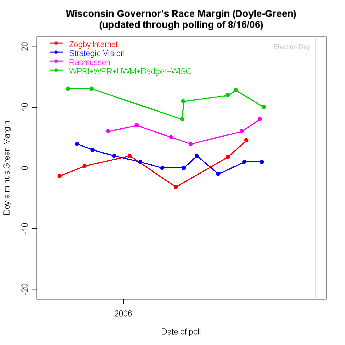
Two new polls out on the Wisconsin Governor's race tell much the same old conflicting story. (See here and here for previous tellings of this tale.) A WISC-TV/Research2000 poll conducted 8/14-16/06 found incumbent Democrat Jim Doyle with a 48%-38% lead over Republican challenger Mark Green. Green is the incumbent member of the U.S. House from the 8th Congressional district (Green Bay.) But a Strategic Vision survey conducted 8/11-13/06 found a miniscule Doyle lead, 45%-44%. The Strategic Vision poll is exactly in line with their past polling showing the race as a virtual dead heat, with a very slight Doyle advantage. The WISC/Research 2000 poll is in line with other statewide polling that has consistently found a substantial Doyle lead, but which has also shown a slow but steady rise in Green's support. The problem, of course, is which poll to believe, or at least how to understand why they are different.

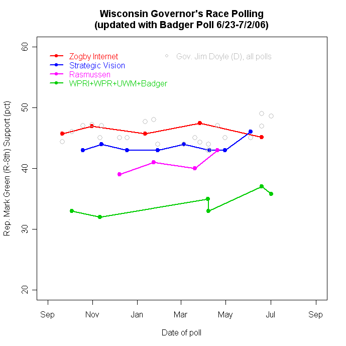
The top figure shows the trends for Mark Green with Doyle's support as the gray dots. Doyle's polling is quite consistent across all the polls, with support in the mid-to-upper 40s but consistently falling short of the 50% point. Green on the other hand varies widely across polls, with a slow upward trend for the "green" line polls but largely flat (though higher) in the other organizations' polling.

An alternative look is given in the graph below, which plots the margin between Doyle and Green in each poll. Strategic Vision and Zogby's Internet based polls find little or no trend, while Rasmussen's "Robo-poll" finds a larger margin, but also no trend. The other polls find a small downward trend and a larger Doyle lead.


(Graph updated 8/21 with new Rasmussen poll.)

So why the differences? One reasonable theory now seems less plausible. The "green line" polls from WPRI, WPR, UWM and Badger were samples of adults rather than "likely voters". That made for a nice story-- adult samples include more people who are less interested in politics and therefore know the least about any challenger. The result would be lower support for the lesser known candidate. In contrast Strategic Vision samples "likely voters" whose greater interest and involvement would increase their knowledge of the challenger, making him appear more competitive in their samples.

The problem is that the new WISC/Research2000 poll is also of "likely voters", so the 10 point gap there can't be explained as due to the sample population vs the population producing the 1 point gap in Strategic Vision. Now all firms differ in how they select "likely voters", and they rarely explain their methods (often they are considered proprietary) so there may still be some difference in method here. Still, this is a large and persistent gap.

A further complication is the fact that WISC/Research2000 DOES line up with the previous samples of adults. Why doesn't the more selective likely voter sample produce at least some advantage for Mark Green? (Any comparison across survey organizations is fraught with peril since they differ in many ways. Still we'd expect a systematic difference between adults and likely voters to stand out more.) If we must strain for some explanation of this, one possibility is that the campaign remains low key enough that even likely voters have not yet started paying attention. Us junkies are certainly attending to every word, and streaming the commercials as soon as they come up on the candidates' websites, but "normal" people may still not be that aware of the campaign, even among those regular voters who are captured in the "likely" voter sample. (Of course there is a good deal of post-hoc rationalization there, when the obvious prediction should be that Mark Green does better in LV rather than Adult samples, so make of this story what you will.)

If we accept for the moment that the issue is NOT the sample population, then what might account for the Strategic Vision difference? Democrats have been critical of the Strategic Vision surveys, pointing out that Strategic Vision is a Republican firm that does these statewide "free" surveys as a marketing tool. But I think Democrats are wrong to claim that Strategic Vision is a "bad" pollster. I tracked 1486 statewide polls of the 2004 presidential race, of which Strategic Vision did 196. The Strategic Vision polls average error overstated the Bush margin by 1.2%. The 1290 non-Strategic Vision polls overstated KERRY's margin by 1.3%. Further, the variability of the errors was a bit smaller for Strategic Vision than for all the other polls combined. (That is a little unfair to the other pollsters because it mixes many organizations while comparing to a single survey "house." Since pollsters differ, that increases the variation due to pollster in the 1290 non-Strategic Vision polls.) So the bottom line is that Strategic Vision does not appear, based on their track record in 2004, to be noticably biased compared to others. And they did err in the correct direction of the winner in 2004, while others erred in the direction of the loser.

So what else might explain the differences here? One possibility is the order of the questionnaires. WISC/Research2000 appears to have asked Doyle Job, Doyle and Green favorability and then vote. getting right to the point. In contrast, the Strategic Vision polls have always opened with a lengthy battery of national questions. In the most recent poll they have 11 questions before asking Doyle job approval, legislature job approval and then vote. The 11 opening questions include Bush job overall, on the economy, war, terror and immigration, whether Bush is a "Reagan conservative", amnesty for illegals, building a wall on the border, whether Roe v. Wade should be overturned, whether we should withdraw from Iraq within 6 months, and whether there will be a terrorist attack in the next six months! That's a LOT to think about before getting to the Governor's questions. While they mostly don't deal with state politics, this series seems likely to raise people's partisan and ideological awareness and might well then structure responses more along partisan lines. That could raise Green's votes among Republicans who aren't yet paying attention, but whose Republican loyalties have been activated by the opening 11 questions. In contrast, the WISC poll with little introduction would do less to get people thinking along partisan lines.

Since Strategic Vision always has had this lengthy opening section prior to the state race questions we can't know if the order of questions really produces this effect or not. (If they'd randomize the order for us once we could find out!) But since the sample population doesn't seem to be the key variable, survey question order is the next most likely suspect.

It is great to see WISC sponsoring Research2000 polling. That brings a new and independent pollster to the table, which provides crucial information about why the polls differ. At least now we know it isn't simply the adult vs likely voter difference in the samples.


Click here to go to Table of Contents

Thursday, August 10, 2006

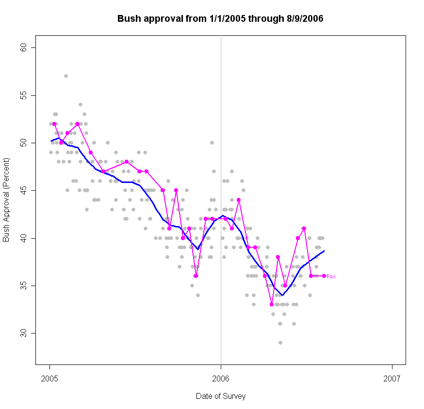
Bush Approval: Fox says 36%, unchanged


A new Fox poll taken 8/8-9/06 finds approval at 36%, disapproval at 56%. That is no change in approval from their previous poll of 7/11-12 but a 3 point increase in disapproval. With this addition my estimate of the approval trend is adjusted down to 38.7% from 39.0% as of 8/6.

It is great timing to have this and the CNN/ORC and ABC/Washington Post polls from late last week and the weekend just prior to the British terror arrests of this morning's news. This will give us a strong baseline to assess any effect of the terror arrests on approval or the structure of attitudes. Unfortunately, the timing of the arrests also means that any effects of Lamont's win in CT on national public opinion will be hopelessly confounded with the arrests. Damn.

The Republicans appear to see an opportunity in Lamont's win to paint him and the Democratic party as soft on terror. This strategy, which links Iraq to the "War on Terror" and argues that Democratic support for troop withdrawals can be translated into weakness on terror, seeks to exploit the President's remaining (relatively) strong card in public opinion. Approval of the President's handling of "the U.S. campaign against terrorism" was measured 8/3-6/06 by ABC/WP as 47% approve, 50% disapprove. Since January the approval rate has been 53, 52, 52, 50, 53,51 and now 47, a mild decline. But this at a time when overall approval was sinking into the mid-to-low 30s. So while far from the ace of trumps this issue once was, it remains the high card in the White House's hand. Apparently the party thinks this issue still holds the key to victory in the fall. Now events have unfolded to raise the salience of the terrorism issue once again.

Liberal Democrats, energized by the stunning success of Lamont in capitalizing on the Iraq war issue to unseat a seemingly safe incumbent, were looking forward to renewed criticism of Bush from the timid among their national leaders. The tactical question now is how to push that criticism of the (at least) mishandled (and at most unjustified) war without playing into the Republican strategy of making Dems look weak on terror. Expect Republicans to stress the link of Iraq and Terror in every speech.

Thanks to the timing of recent polls, we should at least be in a good position to measure how these latest developments play out in public opinion.

-----

On a different subject, in a comment here, Alexis asked about the Fox poll performance recently:
Fox has Bush at 36% again, exactly the same approval in their last poll from last month (although the disapproval rate is up three points). Didn't Fox use to have a significantly positive 'house effect'? How do you explain the fact that they've been consistently below trend as of late? Has there been any change in polling methodology or wording that you know of that could account for that?
So I thought I might answer that here rather than in the comments of the earlier item. The plot above shows that Fox has tended to be a little above the trend line though with a few below trend also. The last time I updated the "house effects" estimate in late April, Fox came in at +.72%, with a confidence interval from -.02 to +1.46. That puts Fox only one spot above the median across the 22 polls for which I have estimated house effects. The mean house effect is constrained to be zero in my estimates.

The Fox poll is often mischaracterized as strongly biased in a pro-Bush/Republican direction. At least on the approval question, that is not the case. Democratic pollster Stanley Greenberg's firm, for example, has a +1.83 house effect estimate and ABC/WP has a +1.29 estimate. Likewise other polls have considerably larger house effects in the opposite direction: CBS/NYT -1.87, Newsweek -2.18 and Pew -2.32.

Since January 2005 Fox has done 30 polls, 20 of which were above the trend and 10 below trend. The last two are a little below trend. This most recent is 2.7 below trend (-3 if you exclude this case from the calculation of trend.) That isn't large, relative to the variability of polls. Over the 1180 polls since Bush took office, the 80% confidence interval around my trend is -3.64 to +3.42. The 90% CI is -5.12 to +4.2. So by that standard, the current residual for Fox of -2.7 (or -3) is quite small. Given the small house effect, and the variability, it isn't that unexpected that we'd see two Fox polls in a row that fall below the trend.

So far as I know there have been no changes to Fox methodology of late. But I don't think we need to worry too much about the issue. So far, at least, there is little statistical reason to think that the behavior of the Fox poll has changed.


Click here to go to Table of Contents

Saturday, July 01, 2006

When the pollster matters most: WI Gov 06


Go to this link for a more recent update of the Wisconsin Governor's race polling. 7/20.

UPDATED 7/11 with new UW/Badger Poll data. See update at the bottom of the post.

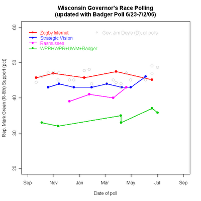
Here in Wisconsin we have a barnburner of a tight Governor's race. Or, the race is close enough to be interesting but not neck-and-neck. Or the incumbent is well ahead. Which is it? Depends almost entirely on which pollster you read.

The graph above shows the polling since Sepember 2005. The Wall Street Journal/Zogby Interactive poll shows it nip and tuck. Zogby averages 46.10%-46.16%, with challenger Rep. Mark Green (R) ahead by 0.06% over incumbent Gov. Jim Doyle (D). That's inside the margin of error, by the way.

Georgia polling firm Strategic Vision sees the averages as 45.0-43.6, with Doyle slightly ahead.

Robo-pollster Rasmussen has it averaging 46.25-40.75, a decent lead for Doyle.

And everyone else averages 45.4-34.0, the incumbent in a walk. ("Everyone else" here includes St. Norbert College for Wisconsin Public Radio (WPR), Diversified Research for Wisconsin Policy Research Institute (WPRI), and the University of Wisconsin, Milwaukee.)

It isn't unusual for different pollsters to produce consistent differences in repeated surveys on the same subject. These are called "house effects" and they arise from differences in sampling, question wording, interviewer training and whatever else the organization does consistently but differently from what other houses do. Still, it is rare to see differences this large that persist over some 9 months of polling. The trends for each organization are quite stable with little sign of convergence (with the possible exception of Rasmussen.)

The differences are almost entirely about Mark Green, rather than Jim Doyle. The Doyle percentages are tightly concentrated between 43% and 49% regardless of polling firm. For Green, they range from 32% to 47.4%. That large range dwarfs the modest trend upward in Green support.

We might expect this to happen with a challenger. While Green is a well known (and well liked) incumbent in the 8th congressional district around Green Bay, he is not so well known in the rest of the state and, as every challenger, must compete against a much more visible incumbent. The lesser known candidate might be expected to show greater house effects. Subtle differences in question wording or order are less likely to matter with a candidate voters have had four years to make up their minds about. But for a candidate they are just learning about you would expect small differences in wording to matter more. The most obvious case is a vote question that fails to identify the party of each candidate, or worse, one that offers a "or haven't you made up your mind yet" option. But those kinds of differences don't seem to be present here. The question wordings are

Zogby: If the election for governor of your state were held today, for whom would you vote? (Zogby doesn't say so, but I presume the candidates are then listed. Zogby Interactive polling is done over the internet so it is hard to imagine this question not being followed by a list of options to pick from.)

Strategic Vision: If the election for governor were held today, and the choice was between Jim Doyle, the Democrat and Mark Green, the Republican, whom would you vote for?

Rasmussen: Thinking about the 2006 election for Governor, suppose that Republicans nominate Mark Green and Democrats nominate Jim Doyle. If the election for Governor were held today, would you vote for Republican Mark Green or for Democrat Jim Doyle?

WPR/St. Norbert: If the election for Wisconsin governor were held today, and the race were between Democrat Jim Doyle and Republican Mark Green as the major party nominees, would you be more likely to vote for Democrat Jim Doyle, Republican Mark Green, or an independent/third party candidate?

WPRI/Diversified Research: If the election for Wisconsin governor were held today between Mark Green for the Republicans and Jim Doyle for the Democrats, for whom would you likely vote?

UW-Milwakee: The press release oddly did not include the question wording of the vote for Governor question, though it included all other question wording. The release mentions a large percentage of undecided, suggesting that might have been an explicit option. Regardless, the UW-M survey does not appear out of line with WPR/St. Norbert or WPRI/Diversified.

So on the face of it, these questions don't appear different enough to account for the wide spread and the huge house effects we see for the Green vote.

The nature of the sample and the polling technology may be a better explanation.

Zogby's polling for the Wall Street Journal uses a pool of volunteers from the internet rather than a random sample of telephone numbers. The results are weighted by demographic and partisanship characteristics and is supplimented by a small number of phone calls as well. (See his explanation for his methodology here.) There is a good deal of effort being devoted to developing reliable methods of internet-based surveys but the jury is still very much out on the question of how reliable they are. At the very least they cannot rest on the strong theory of random sampling that is the basis for all conventional polling. In the case of political polling, they are also likely to recruit respondents who are much more interested in politics than would be the case in a representative random sample. The result would seem likley to advantage the challenger, since a more interested and involved set of respondents is more likely to know and have opinions about a less well known candidate. And indeed, Green does best in the Zogby internet based poll.

Strategic Vision uses conventional telephone polls but samples "likely voters" rather than all adults or registered voters. Again, we would expect this to produce a more informed and involved group of respondents compared to samples of adults, to the advantage of the challenger.

Rasmussen also samples "likely voters" but uses a recorded voice to ask questions that respondents answer by pushing buttons on their phones. The sample is based on a random sample of phone numbers (avoiding the volunteer respondent problem of the internet) but the response rate is extremely low compared to conventional telephone surveys with live interviewers. We might expect this to drive up interest as well, but there is also some reason to think that the effect might not be as great as with the internet based polls. There is some good evidence that people agree to participate (or more often NOT participate) in polls based on "spur of the moment" factors: I'm in a good mood, surveys are fun, or "I'm bored" versus the baby's crying, supper is on the stove, I've had a hard day. So long as the reason to participate isn't correlated with vote choice, even a low response rate doesn't necessarily bias the results. If respondents participate or not BEFORE they find out this is a political survey (and don't hang up when finding it is) then the Rasmussen poll method could produce reliable results. Since it is a sample of "likely voters", it should resemble Strategic Vision in terms of more interested and informed respondents.

WPR/St. Norbert and WPRI/Diversified Research both sampled "adults" without screening for registered voters or for likely voters. That should produce a sample that is most representative of the state but not necessarily representative of November voters. Certainly these respondents should be on average less involved with politics than the samples of "likely" voters from Strategic Vision or the Zogby internet panel or Rasmussen's "likely" voters. That should hurt the lesser known Green in these samples, and indeed he performs worst in these polls.

The UW-Milwaukee survey sampled "residents who intend to vote". Based on the results they appear not too different from the adult samples of WPR and WPRI.

So the "house effects" appear to line up pretty well with the nature of the sample and the likely effect of sample selection on the level of information and interest in the set of respondents. The challenger does best when the sample is more interested and less well when the sample more nearly captures the adult population.

Of course, this begs the question "which is right"? The Green campaign should prefer Zogby while the Doyle folks should like WPR and WPRI. Unfortunatley, we don't have a lot of DIFFERENT polls to choose from or to compare. Zogby and Strategic vision have done the most with 5 and 8 poll respectively. Rasmussen has done 4 and no one else more than 2. This means that the sample selection effects that appear to account for the differences are also heavily confounded with any other house-specific effects, including the internet vs robo-phone vs conventional phone technologies. This makes it harder than it might be to estimate a "best fit" across all the polling. If we had a range of phone polls from different organizations, all sampling likely voters, we would be in a better position to sort out the house effects from the "real" underlying support for each candidate.

The house effects are not limited to vote choice either. When it comes to approval of the job Jim Doyle is doing as governor, there is a striking divergence as well. The figure below plots these trends.
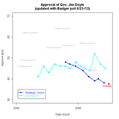


Here the striking comparison is between the substantial negative trend in approval in Strategic Vision surveys vs the generally flat trend in the monthly SurveyUSA samples. (SurveyUSA, like Rasmussen, uses a recorded interviewer.) And as before, we see that the "other" survey organizations produce divergent approval ratings, much higher than those of either SurveyUSA or Strategic Vision.

While it was clear why samples with more interested voters would be more aware of Mark Green, it is less obvious why the "adult" samples of WPR/St. Norbert produce strikingly high approval ratings compared to SurveyUSA's samples which are also of "adults". It may be that there is a pro-Republican advantage among likely voters which could account for some differences in the level of approval. But that doesn't seem able to account for downward trend in Strategic Vision surveys compared to the flat SurveyUSA trend.

A further puzzle is that while Strategic Vision has found approval of Doyle declining, they have not found a decline in the Doyle vote, or an increase in the Green vote (except for their most recent poll). We might expect these two series to move in tandem, but so far not so much.

Survey "house effects" and sample population effects are common, but rarely do we see them as clearly defined as in the Wisconsin Governor's race polling. The potential for such effects to cause confusion and conflicting claims about the race is compounded by the concentration of polls among a handful of firms and methodologies, at least two of which (Zogby and Rasmussen) are open to serious methodological questions.

The lack of regular polling by independent media organizations in the state compounds the problem. No Milwaukee or Green Bay or Madison news organization currently sponsors regular, professional and high quality readings of public opinion, with the exception of the widely spaced and small samples from WPR polling. That means not only citizens but reporters and editors as well are left to pick among the widely varying polls that are available because someone else sponsored them for their own purposes. Not, perhaps, the best state of affairs for journalism in Wisconsin.

(Full disclosure: I serve on the advisory committee of the UW Survey Center which previously conducted the "Badger Poll", which was sponsored by the Capital Times in Madison and the Milwaukee Journal Sentinel. That sponsorship ended last year. Other than my (unpaid) advisory committee duties, I have no ties to the Badger Poll or to the UW Survey Center. Likewise I have no connections to any survey firms.)

Update 7/11: A new UW-Madison/Badger Poll was conducted 6/23-7/2 though curiously not published until today, 7/11. Those data fit very nicely with the story told above, and from a new source not previously part of the data. The Badger Poll has been added to the graphs above, as the last data point in the horse race graph, and with a red highlight in the approval graph.

The Badger poll finds support for Gov. Doyle at 48.6% and for Rep. Green at 35.8% with 15.6% undecided. That is entirely in line with the green line in the top figure for "other polls", a group including Wisconsin Public Radio/St. Norbert College, Wisconsin Policy Research Institute/Diversified Research, and UW-Milwaukee. Those polls have averaged 34.0% support for Green and 45.4% for Doyle. So the Badger results fit right in. What Badger has in common with these others is conventional telephone random sampling (with live interviewers) and a sample of adults, rather than likely voters.

News reports seem to be leading with "double digit lead" but I think that's a questionable interpretation of the data. As the data show, Mark Green is still very much an unknown in the state, outside the Green Bay area of his 8th congressional district. The Badger poll found a whopping 58.7% unable to say if they had a favorable or unfavorable impression of Green. That makes perfectly good sense at this point in the race, though political junkies find it hard to believe how little candidates penetrate the consciousness of the general public this far from election day. Even Doyle, after nearly four years as Governor, cannot be rated by 23.8%.

So realistically, how well can ANY candidate be expected to do when nearly 60% of the public has no impression of him? I'd say doing 35.8% support is pretty good. That support has to be based on a combination of partisanship and dissatisfaction with Doyle, and not a lot because of the attraction of Green. As Green gets better known, he will attract support on a personal basis as well, but that isn't a large part of his support as of today. NOR should we expect it to be at this stage of the race.

The polls that are closer, especially Strategic Vision which uses the same telephone methodology but selects "likely voters" finds a much closer race. But that makes excellent sense. The more interested likely voters are also more likely to have formed an impression of Green, adding that element to their vote choices. Hence a closer race in Strategic Vision.

So why should the news reports NOT lede with the "double digit margin"? Because it is an artifact of name recognition (or lack thereof) rather than a sign of a weak challenger.

If I wrote the lede, it would be "Gov. Jim Doyle, while leading in the horse race, faces an electorate in which 56.6% disapprove of his handling of the job of Governor. Only 37.5% approve of the job he is doing. " Those are remarkably bad job approval numbers for an incument seeking reelection, and provide the basis for a challenger to rise substantially in the polls once the campaign commences. To emphasize the horse race margin is to miss the serious vulnerability the poll reveals.

There is, however, one very puzzling result. While Doyle's job approval is pretty dismal, his favorability rating is a relatively good 46.7-29.5. It seems odd that Doyle gets a favorable rating from nearly half the sample when only 38% approve of his job performance. These two need not track exactly, but that is quite a gap. Perhaps this favorability provides a reservoir of support that is helping overcome the poor job approval numbers.

The job approval also looks bad broken down by party. Dem approval is only decent at 57%, but Independent approval is a disappointing 37.1% and Republicans a predictably low 23%. You certainly can't win Wisconsin with only Democratic support, so Doyle needs to win over a lot of independents who are currently not very impressed with his performance.

One might question whether the approval rating is believable, given the gap between vote (49%) and favorability (47%) and approval (38%) . But here the Strategic Vision polls show a downward trend in approval that ends at a level quite close to the Badger Poll. SurveyUSA's automated polling finds a higher approval as have other polls, though a good bit earlier. At the least, this is a quite unsettling finding for the Doyle folks and source of hope for Green.

Put that together, and the bottom line is that a "double digit lead" doesn't mean much for the fall. Doyle may well win reelection, but it seems very unlikely to be by a wide margin. The nice irony here is that the polls showing a currently close race are most likely wrong, AS OF TODAY, but are probably about right as forecasts of where opinion is heading once the campaign starts activating and informing voters.


Click here to go to Table of Contents

Monday, March 20, 2006

Partisanship moves


(Click the figure, then click it again to see the full resolution.)

Partisanship is a moving target over time and exhibits considerable variation across pollsters. The combination of both over time and across pollster variation makes simple comparisons of partisan balance across polls potentially misleading and agreement on a single partisan distribution difficult at best.

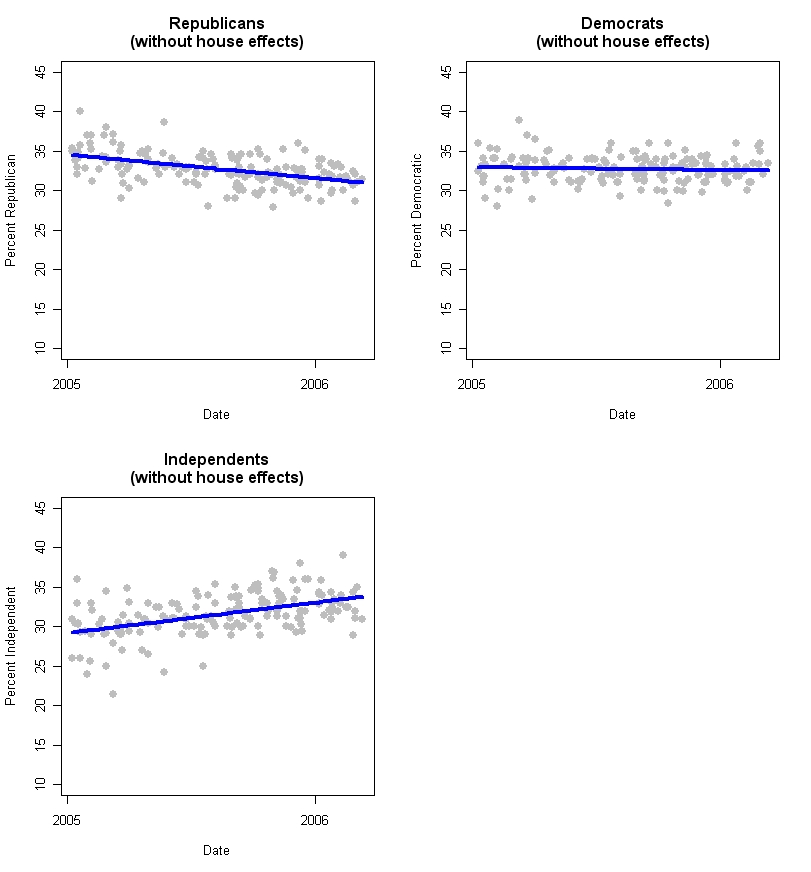
Between January 1, 2005 and March 12, 2006, Republican partisan identification declined by an estimated 3.6%. The percentage of the adult population calling themselves Independent rose by 4.6%, and the percentage of Democrats declined by a statistically insignificant 0.4%. These changes are important for polling methodology and also present a politically important shift in the partisan balance.

In the first post of this series on partisanship (here), I showed that pollsters differ substantially in the percentages in each partisan group their polls typically find. In this post I turn to change over time. While much more stable than many political attitudes, party identification is not immune to systematic variation over time. This makes the party id distribution for any pollster a moving target, while posing the problem of how to know what the target is at any given moment. This is particularly an issue for those who think polls should be weighted to a constant distribution of partisanship, or even to a moving average of previous polls. Perhaps more importantly it means that those who judge a poll's merit on the basis of it's partisan balance need to be much more aware of how much variation there is, even over the relatively short span since President Bush's reelection. Differences between polls that are pointed to as signs of at best “bad samples” and at wost malignant bias by pollsters are in fact well within the range of variation typically found across polls and over time.

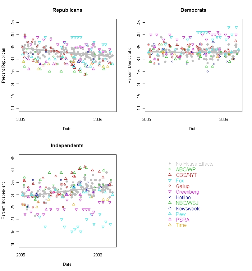
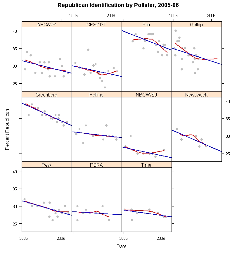
In the figure above, I plot the trends in Republican identification through 2005-06 for all pollsters for whom I have sufficient observations to make reasonable estimates. (The AP is omitted because their results are generally only available in a “leaned” form, with Independents who lean to either party included in the party totals. The data here are only for “unleaned” question formats.) The “house effects” are clear in the range of vertical variation across pollsters. Fox is quite high (they are also high on percent Democrats) while NBC/WSJ is quite low (they are also low on Democrats.) And the others vary between these extremes. As we saw in my previous post, most of the variation across polls is related to the percentage of Independents. Fox gets few Independents, and is thus high on both Reps and Dems. The Fox question wording does not offer an explicit “Independent” alternative, which surely accounts for this difference. NBC/WSJ is quite high on Independents, and so is low on both partisan groups. There is no obvious question wording that would explain this consistent house effect.

More importantly, however, all of the pollsters show a downward slope over the course of the 14+ months included here. While there is substantial variation in what the percentage of Republicans is at a given moment in time, all the polls agree that this percentage has fallen since January 2005. The straight line in each panel is the linear estimate of trend over time. The red curved line is a local regression that can provide a non-linear fit to change. While the trend is somewhat non-linear for Fox and Gallup* in particular, and a bit off of linear for CBS/NYT and perhaps NBC/WSJ, in most panels the trend is pretty close to linear regardless of which estimator is used. Also the slope varies across the polls, but not hugely. A statistical model that allows the slopes to vary (along with house effects) is not statistically distinguishable from a model that assumes equal linear slopes (but with different house effects for the level of Republican identification.)

(*Gallup data requires explanation. Gallup does not routinely release the partisan breakdown on their polls, at least not that I've been able to find. They do list partisanship breakdowns for all polls on their subscription only website. The data I display here is taken from the Roper Center at the University of Connecticut's “iPoll” database, which is available to subscribers and which includes permission to publish results of research based on the data. My university is a subscriber. Those data end in September 2005. As an individual, I am a long time subscriber to the Gallup website but do not wish to publish data they do not consider available without fee to anyone on the web. I've therefore used their data through March 2006 in my statistical analysis, and in the fitting of the regression and local regression lines in the above figure, and those that follow. However, to honor their desire to protect their data from release, I've suppressed the plotting of data points in the Gallup series after September 6, 2005, the last data available to me from the Roper Center. As is clear from the figure, Gallup data show a Republican decline through September 2005, but this flattens out after that. I believe it would be misleading not to show the trend based on the entire dataset so I've included the linear and non-linear trend lines estimated on the full dataset but have not plotted the data points themselves after early September. You will have to take my word for it that the Gallup data after September scatter more or less randomly around the non-linear trend line. The linear fit is not terrible but does under-estimate Republican identification for the Gallup poll late in 2005 and in 2006.)

By pooling the data across polls, and fitting a linear model with dummy variables to capture house effects, I estimate that Republican identification was 34.6% on January 1, 2005 and 31.0% as of March 12, 2006. That is a small change compared to shifts in presidential approval over the same period, but is a statistically and substantively significant shift in the relatively more stable partisanship measure.

Paradoxically, the loss of Republican identifiers should be helping President Bush's approval rating among “the base”. If those shifting out of Republican and into Independent are very marginal Republicans, then their support for the President should be less than that among stronger identifiers. By leaving the party, they avoid dragging down presidential approval among the remaining GOP identifiers. For example, in recent Gallup polls approval among Republicans has been around 80%, and about 30% among Independents (roughly speaking). If we added back to the GOP the 3.6% they've lost, and if they behaved like other Independents, then approval among the GOP would be only 74.8%, not the current 80%. So that isn't a huge amount, but it is noticeable. (Of course, the 3.6% might not be typical of other Independents, so the effect could be less. But you get the idea.)

These estimates are based on samples of adults. The 2004 exit polls estimated a Republican share of 37% among actual voters, a modest advantage for Republican turnout. Election day was 59 days before January 1, so my estimate would be 35.1% Republican on election day, if the trends in 2005-06 extended back to election day 2004, within 2% of the exit poll estimate.

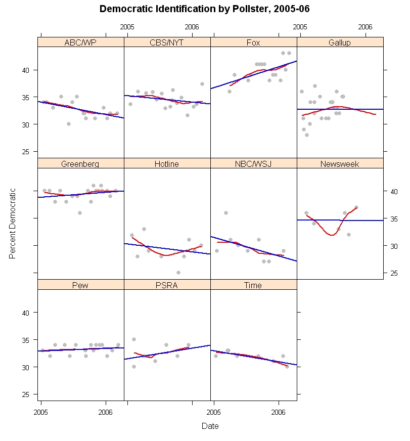
In contrast to Republican identification, the percentage of Democrats has remained quite stable in most polls since January 2005. The figure below shows the trend in Democratic identification using the same methods as for Republicans above.


The variation in slopes over time are generally modest, with the exception of Fox and NBC/WSJ. Once more a statistical test fails to find convincing evidence that the trends differ significantly across polls. (The Fox upward trend is likely related to the question wording. I discuss this below.) When pooled across polling houses, and taking account of house effects, the estimate is that Democratic identification is statistically flat over this time period, with a non-significant decline of 0.4%. By these estimates, Democrats made up 32.9% of the adult population on January 1, 2005 and 32.5% on March 12, 2006. Here the gap with the 2004 exit polls is larger. The exit polls estimated that Democrats and Republicans both made up 37% of the voters on election day. Based on these 2005-06 polls, the Democrats were about 4% lower than this in the population, at least as of January 1, 2005. In the last 14+ months, the Democrats appear essentially unchanged, despite the bad times for President Bush and the losses suffered by the Republican identifiers. So what about Independents?


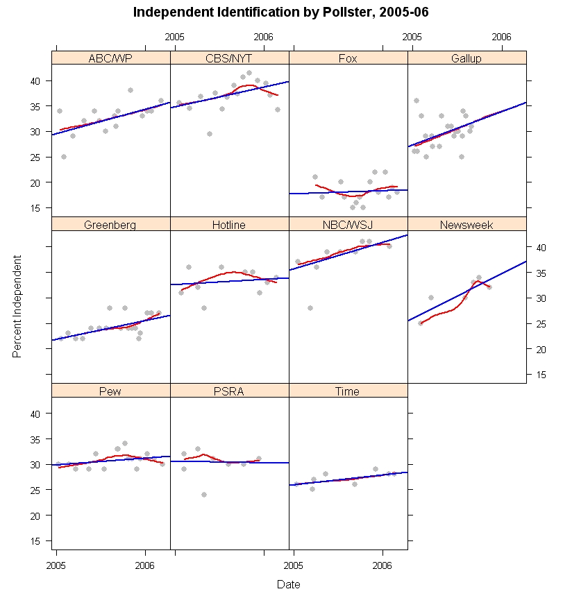
Independents have grown in size across most of the polls. PSRA (Princeton Survey Research Associates) has them flat, and Fox has a small slope but every other poll shows small to substantial gains in Independent identification over the last 14+ months. The gains are essentially linear, as the local regressions lie very close to most of the linear fits. And a statistical model again finds that a model in which Independents gain at a common rate across polls cannot be rejected (with house effects for level but not for slope.) Based on the model, Independents have moved from 29.2% at the start of 2005 to 33.8% as of March 2006, a 4.6 percentage point increase.

There is a considerable debate in political science over how malleable partisan identification is. I belong to the camp that argues for significant responsiveness of party id to the policy positions of the parties. Others (Morris Fiorina, and the team of Bob Erikson, Jim Stimson and Mike MacKuen, for example) argue that party identification responds to government performance of one kind or another. We all agree that partisanship can shift in non-trivial ways over relatively short periods of time. There is another side, led by Don Green and colleagues who argue that party id is actually very, very stable and except for some random measurement error is really not responsive to other political forces. We'll leave that discussion for another day.

When shifts occur in party id, it is reasonable that those most likely to shift categories on the partisanship question are those in or near to independence. (There are arcane academic debates on exactly why this is, but in the big picture it seems reasonable enough that those with the weakest attachments to parties would be most likely to shift when given a reason.)

So how does that help us with the data before us? In 2004 the presidential election favored President Bush who won by a small but comfortable margin in the popular vote. If we assume this is because short term forces favored the Republican candidate, it is reasonable that some people who are near the dividing line between independence and Republican identification were moved to shift a bit to their right, into declaring themselves “Republican” when asked “In politics, as of today, do you consider yourself a Republican, a Democrat, or an Independent?”, the Gallup form of the question. In 2005 and so far in 2006, the balance of forces has been against the President and the Republican party. The result should be that those who were moved a little into the Republican category during 2004 are now likely to move out and into independence. The result is a downturn of Republican identifiers and a growth in the proportion of Independents.

What about the Democrats? The 2004 election was one of the most polarizing elections in the last 60 years. It would seem plausible that some Independents who lean towards the Democratic party were convinced to declare themselves “Democrats” as a result of this polarization. When the election period was over, we might normally expect these people to drift back into independence as well, resulting in some decline in Democratic as well as Republican identification. However, the bad year for President Bush has produced political forces consistently disadvantaging the Republicans, and hastening the departure of especially weak identifiers. At the same time these forces should act to hold the most marginal Democrats in the party, keeping them from drifting against the tide of partisan forces over the last year or so.

Of course, we don't have individual level data, so this is a plausible explanation, not one that is beyond debate. We would need to see which individuals shifted to be confident that my story is correct. With only these aggregate data it is possible that some other, more complex, interchange among the three partisan groups has occurred. The net effect, however, is not in doubt: fewer Republicans, more Independents, about the same number of Democrats.

But how much spread is there across polls, and what happens if we take out the house effects to our view of partisan trends. The figure below shows each partisan group over time, with the observed data and with a trend (in gray) of what we would estimate partisanship to be having taken out the house effects using my statistical model.


The spread of partisan estimates is considerably larger than the spread of estimates with house effects removed. This is especially striking for the Independents, where the house effects are huge. The very low percentage of Independents in the Fox poll is undoubtedly due to their question wording, “When you think about politics, do you think of yourself as a Democrat or a Republican?” The lack of an explicit “Independent” option would be expected to drive down that category, and it clearly does. While not quite as extreme as the results from allocating partisan “leaners” to a party, the Fox question results in a distribution that appears much more partisan for both parties than other polls. NBC/WSJ has the opposite result. Their question is seemingly innocent, “Generally speaking, do you think of yourself as a Democrat, a Republican, an Independent, or something else?” They don't get many “something else's”, only about 4%, yet their Independent group is quite large relative to other polls. This could be due to interviewer training, I suppose, but the large number of Independents is something of a mystery to me (unless interviewer's encourage “something else” respondents to choose Independent before recording the response. Based on other polls with a “something else alternative, this could add 6-8% to the Independent category. Still, that wouldn't explain the low numbers of Dems and Reps that NBC/WSJ get.) The result is that NBC/WSJ is consistently low on both Republicans and Democrats. Other polls fall between these extreme house effects.

The gray dots and trend line shows what the distribution of partisanship would be if we remove the house effects but keep the common trend over time. The distribution is reasonably tight about the trend, certainly compared to the raw polls.

These figures should make clear why comparing party identification across different pollsters and/or at different times is a dangerous business. It is certainly true that house effects differ and they differ substantially. So compared to Fox, everyone else has too few Republicans. Of course, they have too few Democrats as well! The problem is there are house effects but more importantly we don't have any single “correct” value for party identification. The figures here demonstrate that there is great variation, yet who is to say that any one of these pollsters is “right” and the others wrong? The technology of polling is essentially shared by all. I deny that anyone seeks to intentionally ask biased questions. Rather question wording variation reflects the purposes of the survey organization, and these may differ for legitimate reasons, as when Fox leaves out an Independent option, or when some pollsters offer a “something else” alternative or stress “Generally speaking...” as opposed to “In politics as of today...”. These produce different results, but none is clearly better or worse than the others.

So if we can't agree on a single standard, what can we do? We can estimate the house effects, and compute a pooled estimate normed to a single survey house. This figure appears below (and in gray in the figure above as well.)


Here (and throughout this analysis) I've used Gallup as the reference pollster simply because Gallup does more surveys than anyone else in my dataset and it makes sense to use the house with the most cases as the base. This does not mean that Gallup has the “right” measure of partisanship. It is merely convenient.

If we wanted to weight datasets to a fixed partisan distribution, this figure shows the problems we encounter, even after pooling across 165 surveys. First, there is a trend. Weighting to ANY static values for partisanship will be wrong if partisanship actually moves, as the data here demonstrate. If instead you use a moving average of past polls, you'll always have estimates behind the current point on the trend line. So you could use the regression estimate for the current party balance, which still uses the past but requires a good fit to the trend. As it happens we do have a good fit to the linear trend here, but there is no reason to think that is guaranteed in the future. And while these trends are not extremely sharp, they do imply a shift of 3.6% down from Republicans and 4.6% up among Independents. Some strong words have been used to describe polls as “biased” for differences of this magnitude compared to what the antagonists think are the “right” numbers. So that is a non-trivial issue.

Second, the variability around these regression lines suggests uncertainty of about +/-4% even when we leverage all our data as much as we can. My estimate of current Republican identification is 31.0%. But I can't say with any confidence that it is not 28% or 29% or 33% or 34%. Or maybe even 27% or 35%. And this is after taking out all house effects and allowing for change over time.

Some argue for weighting to the exit polls, which is ironic in light of all the criticism of exit polls after the last three elections!

My point here is not to take sides on the weighting to party id issue (though my analysis is relevant) but rather to point out how difficult it is to have a target party distribution that is precise enough to have absolute confidence in (which is what you need if you are going to weight to it.) We are pretty darn sure what the percentages by education, sex, race and region are in this country. Those make good weighting criteria. Not nearly so good an idea for party, no matter how you care to measure it.

Finally, there are some that argue that even the variation around the trend line in the figures is evidence of systematic response to political events. While I cannot distinguish this from random noise, it is possible that some of this variation is “real”, but very short term, change Weighting to an unrealistically stable target might avoid partisan criticism but would also distort the actual variability of public opinion.

To conclude this look at party over time, as Galileo said, “it moves.” Right now that is working to disadvantage the Republicans, but not so much in favor of the Democrats. The rise in Independents may itself change if they are pushed more strongly towards one party or the other.


Click here to go to Table of Contents

Thursday, March 02, 2006

Partisanship across polls


Partisanship generally varies more across pollsters than over time for a single pollster. This has implications for how we assess whether a poll has a reasonable partisan balance. (Hint: Double clicking on the figure gives a bigger image. Clicking on the image one more time magnifies it slightly, giving the optimal image quality, at least under Windows XP.)


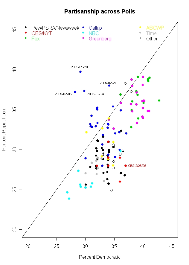
The latest CBS/New York Times poll, 2/22-26/06, provoked a common criticism. Along with a low 34% approval rating for President Bush, the poll had a partisan split of 28.4% Republican, 34.2% Independent and 37.4% Democratic. Critics of CBS in particular were quick to seize on this as evidence of an "obvious" bias by CBS. But what should be the standard for partisanship against which we measure an individual poll? I expect that few commentators on this poll have a very clear picture of partisanship and how it varies across surveys. But such a perspective is crucial if we want to talk meaningfully about this topic. Starting with this post, and continuing for the next week or so, I will review some of the facts about partisanship in polls and compare the results across polling houses and over time. For today, we'll start with how partisanship varies across polling organizations, and put the new CBS poll in perspective.

The most compelling point of the figure above is that polls from a single polling organization tend to cluster but that the organizations themselves tend to differ substantially. NBC and the Wall Street Journal, for example, tend to get a Republican-Democratic split of about 25% Rep-29% Dem. (These are medians across 2005-2006 polling, using questions that do NOT include leaners in the party categories.) At the other extreme Fox gets 37% Rep-39% Dem. Greenberg et al, a Democratic pollster, actually closely matches the supposedly conservative Fox with a split of 36% Rep-40% Dem. For CBS and the New York Times, the split is 28%R-34%D.

In fact, the variation within each polling organization is much smaller than the variation across all polls. Taking account only of the organization that conducted the poll accounts for 77% of the variance in Republican identification, and for 76% of the variance in Democratic identification. These "house effects" are a little stronger with the measurement of independents, where polling organization accounts for 80% of the variation.

So is this the smoking gun that demonstrates pollster bias? Not quite. A lot of the variation has to do with how many Reps and Dems there are. But if we switch to the party balance, making the difference between Reps and Dems the dependent variable, the house effect is less than half as much: 29% of the variance in the Rep-Dem difference is explained by polling organization.

Part of what is going on here are differences in question wording and sample frame. If the sample is of either registered or likely voters (as compared to adults) the poll boosts both Republican and Democratic percentages by about 3-4%, and decreases independents by about 4.5-6%. This is presumably due to the greater political involvement of likely and registered voters which results in stronger partisanship.
Question wording is the area where polls vary substantially and a considerable amount of variation in the results can be laid at the door of question wording. Fox, for example, gets high percentages of both Republicans and Democrats because their question omits the independent option:
"When you think about politics, do you think of yourself as a Democrat or a Republican?"

Survey respondents are often sensitive to question wording. Options not offered are options less chosen. How big can this effect be? Princeton Survey Research Associates, which polls for Pew, Newsweek and other clients, usually asks partisanship with the following question, reasonably similar to Fox's, but with an explicit independent option:
In politics today, do you consider yourself a Republican, Democrat, or Independent?

The difference: The median percentage of independents for Fox in 2005-06 was 17.5%. For Pew the median was 31%. That means that Fox has about 14% more "independents" who are fitting themselves into one of the partisan categories than Pew does. The result is that Fox gets a median of 37% Rep- 39% Dem, while Pew has it 30% Rep and 33% Dem.
Variation in questions also extends to whether respondents are offered an option for "something else", "none of these" or (literally!) "or what".

Here Pew's pollster, Princeton Survey Research Associates, gives us a comparison. Their usual question is
In politics today, do you consider yourself a Republican, Democrat, or Independent?

But in a poll taken 4/1-5/1/05 they varied the wording:
In politics today, do you consider yourself a Republican, a Democrat, an independent, or something else?

The difference? When given the option of "something else", 11% took it. When not offered the option in a PSRA poll taken at the same time (3/31-4/3/05), less than 1% volunteered that they thought of themselves as "something else". In this case, the percentage of Independents was substantially affected: 24% when "something else" was offered, 33% when it was not. The Republican and Democratic percentages were little affected however, 29% ("something else") and 28% (no "something else") Republican and 32% Democratic in both cases.

But house effects are not just due to question wording. NBC/Wall Street Journal (whose polls are done by a Dem-Rep polling pair of Peter Hart and Bill McInturff) also offers a "something else" option:
Generally speaking, do you think of yourself as a Democrat, a Republican, an independent, or something else?

But their results don't produce the high "something else" results that PSRA got (or that Time gets with a nearly identical question). The median NBC/WSJ "something else" response is only 4%. Time's median is 10%, close the the one result from PSRA.

NBC/WSJ also get more independents than most pollsters, though there is nothing obvious about their question that would account for this. The median independents for NBC/WSJ is 39% while for all other polls the median is 29%. That higher percentage of independents drives the NBC/WSJ percentages for each party down, and you can see the result in the figure: NBC/WSJ is at the lower left of the figure with the lowest Rep and Dem percentages of any poll. So why does NBC/WSJ produce these results when similar questions produce fewer independents and more partisans? It's a mystery. Sometimes house effects are like that.

Gallup appears somewhat unusual in the figure because a number of their polls in 2005 found more Republican than Democratic partisans. As the dates added to the figure point out, most of these polls were taken early in 2005, and Gallup (as we'll see in a later post) experienced some decline in estimated Republican identification over the year. The median Gallup results produced a 33% Rep-33% Dem-30% Ind split. (The Gallup data here end in September 2005, so if there is a trend these results may differ when the entire year can be considered. See the data note at the bottom of the post for more details.)

And so where does CBS/New York Times fit within this? The CBS median split is 28%R-34%D, while all other polls have medians of 32%R-34%D. So while CBS doesn't tend to be higher than other polls on the Democratic proportion, it does tend to be about 4% lower on the Republican percentage. If we consider the Republican minus Democratic difference, CBS has a median difference of -6%, compared to -3% for all other polls. Here is how the polls compare.

CBS/NYT -6
ABCWP -4
Fox -2
Greenberg -4
NBC/WSJ -4
Pew -4
Newsweek -4.5
PSRA -4
Time -3.5
Gallup -1

So CBS/NYT does turn out to produce polls that are about 2% more net Democratic than the median for all other polling. In a world of 3% margins of error, that isn't a lot but it is a persistent house effect that should be considered when comparing polls.

But the bottom line problem is, what is the "truth"? Maybe CBS has it right and everyone else is biased in favor of the Republicans. Maybe Gallup has it right and everyone else is biased towards the Democrats. Maybe the median is right with a -4 gap and polls vary a bit around this. The crucial point is that when we talk about vote outcomes, there is an objective "truth" (subject to counting errors!) that we can compare polls to. But when we talk about partisanship there is no objective standard by which to judge the polls. At best we can make relative comparisons.

The figure above should make this point. Estimates of partisanship vary widely. Using a 90% confidence interval, you could say that Republicans are between 26% and 39% of the public, Democrats are between 29.4% and 40.6% and Independents between 17.4% and 36.6%. Those are widely varying estimates. They get pushed around by question wording, sampling frame, house effects and plain random sampling error. To pick any single value for the party distribution and claim it is "right" in some absolute sense is fantasy.

What we can, and should, do is analyze the data and base our conclusions on the evidence. The variability we see in the figure shows pretty strongly that the variation from one CBS poll to another (or one Fox poll to another) is small compared to the variation across polling organizations. Analysis that takes account of house affects when comparing across polling houses is essential if we want to make solid inferences. Comparison within organization over time is also a good way to make an apples-to-apples comparison. But comparing one organization to another without some estimate of the house effect is asking to be mistaken. (And that is exactly what happens when readers pick the 34% from CBS but fail to consider the CBS house effect and other polls.)

More on partisanship and polling in the next few posts.

Data: The data here are for 129 national polls taken during 2005 and 2006. The data were gathered from the Roper Center's iPoll database and in some cases from the pollster's website. Unfortunately the data are not uniformly available across polling houses. For example, the Gallup data ends in September. Models that include a trend term suggest that this is not a substantial problem. Likewise the CBS/New York Times data are for joint surveys only. CBS News does not appear to post full topline results for their surveys, or at least I could not find them except for very recent polls. If anyone knows different, please let me know. CORRECTION: CBS News DOES indeed post the complete marginals, including their party id marginals. In fact, they are the only poll I found that shows both the weighted and unweighted party id distribution. The "topline" (or marginals) are available in a link either in the body of the story, usually about 1/3 of the way in, OR in a box on the left. I could not find results prior to September of 2005 on the CBS poll page, however. MY THANKS TO CBS for helping me see the links that are actually clearly there. My bad.

The CBS/NYT data came from the quite complete New York Times polling site. (I've not altered the post here but stayed with the joint data as posted on the NYT site. The NYT marginals leave "DK/NA/Some other party" as a separate category, while the CBS topline folds these into the independent category. There are therefore some significant differences in the percent Independent between the NYT and CBS websites. However, the Republican and Democat percentages are either identical or very similar. In later posts I'll use the CBS data as well.)


Click here to go to Table of Contents