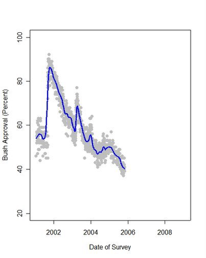
Presidential approval polls (gray dots) with local regression trend (blue).
In the aggregation of 1014 polls taken by various public polling organizations during his administration, President Bush remains near the low point of his public approval rating. The blue trend line is an estimate of approval that pools across all survey organizations using a "lowess" fit. The gray dots represent each poll and their spread around the line gives a sense of how much variation there is across polls around the trend.
The trend line does not reflect public reaction to the CIA Leak indictment or to the withdrawal of the Harriet Miers nomination or her replacement by Judge Samuel Alito. As such, this is a good point to take a deep breath before plunging into what comes next-- the post-Katrina, post-indictment, post-Miers, post-Alito phase of the Bush administration.
Gallup and ABC/Washington Post Polls taken after Miers withdrew and after the "Scooter" Libby indictment showed insignificant changes from previous results. However, a good deal more polling will be needed to gauge the impact of these events. More on that as results come in.
Why does the graph go through 2008? When we judge the rate of change in approval or the range of approval, we need a constant visual perspective in the plot. All polling organizations I know of do not understand this. As a result their trends change shape as new data are added (and sometimes old data removed.) When looking at approval over an administration, it is important to maintain the same perspective. My graph above will grow to the right as time passes, but the trend shown will look exactly the same in future graphs as it does today. For a more extended example of how misleading other presentations of these data can be, see my paper here.
