
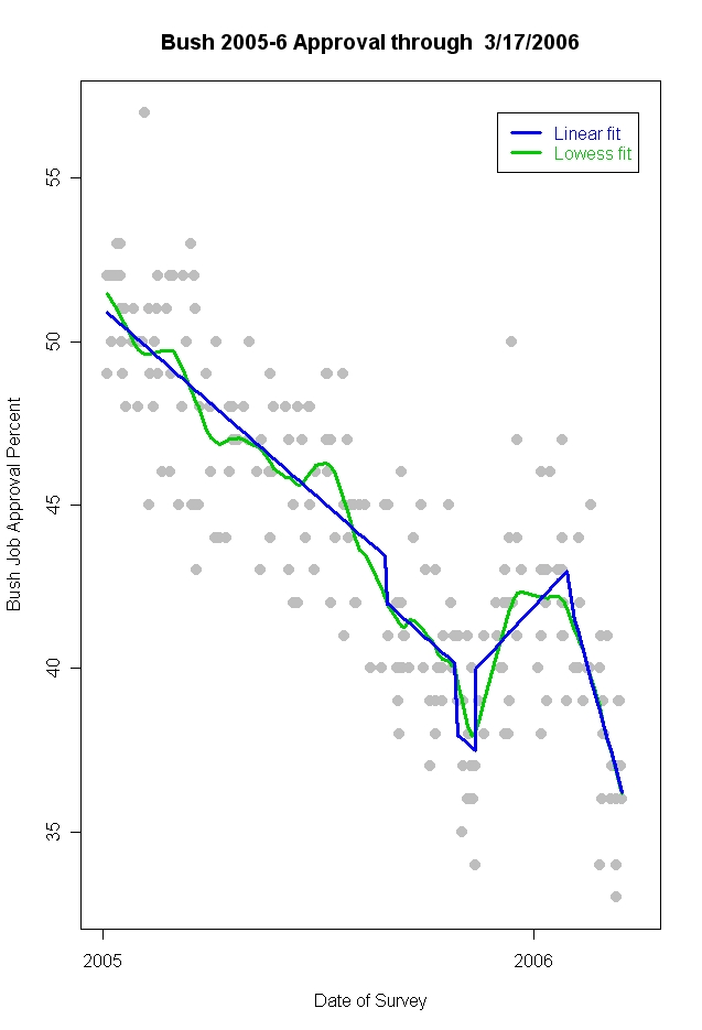
Does the graph show continuous decline or stable approval broken by sharp decline and then steady approval again? The red line is my usual model for presidential approval. The green line uses less than half as many polls to estimate each day of the trend, making it more responsive to short term changes, but also more likely to respond to "noise" rather than "signal".
MysteryPollster Mark Blumenthal posed an important question last week. He pointed out that one can read the polling since January as showing an abrupt downturn in approval of President Bush in February but a steady approval rating since that drop. Mark wrote:
I do wonder if the spacing of polls in this case helps create the impression of a gradual "week-to-week" sinking when the real change may have been an abrupt decline in late February in the wake of news about the UAE ports deal (beginning the weekend of Feb. 18-19) and about the chaos in Iraq following the bombing of the Samarra mosque (on Feb. 22). When I looked at polls conducted between early December and Early February, I saw no trend in the Bush job rating. Obviously, all of the polls conducted since mid February show a decline 3 to 8 points depending on the pollster. The very few organizations that have polled twice since mid-February (which as of this morning includes an update from Fox News) also show no significant trend over the last 2-3 weeks. If we connect the dots before and after mid-February -- whether one pollster at a time as in yesterday's graphic or with Franklin's lowess regression -- we get the impression of a steady decline. But could that apparent gradual trend be just an artifact of the timing of the polls?
I've taken too long to give MP an answer, in part because it is a damn good question and in part because I really wanted to look at these data rather than dash off a "defense" of my model's fit. I hope we can go beyond making this question a Rorschach test of poll perceptions. It is NOT an easy issue to decide, and your eyes may tell you a different story than mine. Nonetheless, here is my best shot.
The graph above shows two plausible fits to the approval data since January 1. (Each is estimated using ALL polls for both 2005 and 2006 but I'm only focusing on the 2006 data.) The red line is the fit I use in my regular posts of current approval of President Bush. It is a fit that uses about 35 polls to estimate each day on the trend line. I've found that this gives a trend estimate that is pretty responsive to changes yet also fairly resistent to the effects of one or two unusual polls ("noise"). It also fits the actual poll data well, with no evidence of systematic failure to follow the trends in the polls when we look back to all the polls since 2001. As you can see, it suggests a decline in approval since mid-January that started slowly and then accelerated in early February. Most important, this trend suggests that approval continued to fall at a steady rate throughout February and the first half of March. (Data go through the Newsweek poll of 3/16-17, the latest available as of this writting.)
In contrast, the green line is not as smooth and suggests that approval was relatively stable at 42-43% in January, then stepped down around February 1, was stable briefly, then took a sharp decline around February 19 or so, but stabilized again around March 10 or so. This trend estimate uses about 15 polls in the estimate of each day's trend, less than half what I normally use. The advantage is it can catch changes quicker than my usual estimate. It also just so happens to support Blumenthal's observation. Frank Newport of the Gallup Poll also sees this pattern that Blumenthal had previously pointed out:
In general, it's clear that the public's assessment of Bush's job performance has not undergone a dramatic free fall, as some may think. Gallup's regular assessment of president job approval ratings allows us to determine that Bush's ratings have remained remarkably constant for significant periods. The pattern of late has been marked by periods with virtually identical ratings, followed by small shifts and then another period of stability.(That quote is now on Gallup's subscription only site, so no link to it.)
So how do we go about getting some purchase on this question? First, let's be clear that a constant downward trend does not mean that the trend must continue. We saw a sharp upturn in approval after November 11, 2005 when the White House launched a strong defense of the President's policies. My usual trend line picks that up nicely as you can see here. However, I'm the first to admit that it requires data to show a change in trend, and it took some time before my usual trend line picked up the November change in the president's ratings. I wrote here on December 6 that an upturn was visible, and followed that with posts confirming the trend (see the December archive). It took 7 new polls after November 11 before I posted something. So it does take a while for my model to spot a change, but with moderate amounts of data the change will show up in my "standard" model. So if Blumenthal and Newport are right, I should see my trend line flatten out with a few more polls in hand. But as the figure shows, so far it hasn't. However, if we want to shift to the riskier but more responsive green trend, then we'd see that things have settled down into a "steady as you go" period.
So let's try some stats to see if we can find evidence for or against the "constant decline" model or for the "sudden shift, then steady" model.
An alternative to the local regression trends I usually present is a linear regression model that includes changes due to specific events-- in this case, Katrina, the Libby indictment/Meiers withdrawal, the November 11 speech offensive, and now a post-State of the Union period. The advantage of this is that the linear model forces trends to be exactly linear within periods. If the data do not fit this assumption, we should be able to see this in either the plot or in the residuals plot (of the errors from the fitted model.) Here is the fit, with a local regression fit for comparison.
I've used a local regression here that is between my usual and the less smooth one above. The local fit shows the stable approval in December and early January, that is NOT present in the linear fit which predicts continued rise during that period. However, the local regression and the linear decline match each other almost exactly after January. That suggests the linear fit is not a bad estimate (though if I'd used a rougher local regression with fewer data points it would of course have shown the plateaus we see in the green line of the first graph.)
A better way to look at fit is to check the residuals, the deviations between the observed polls and the predicted value of the linear fit. If the model is reasonable, we should see a random scatter around a mean residual of zero. The variability around that line should be stable, and there should be no local movement away from a mean of zero. Here is what that plot looks like:
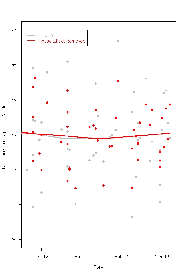
The red and gray lines are local fits and show no significant departure from a mean of zero. They do hint that the trend may be changing since mid-February, but if so the change is on the order of a quarter-to-a-half of one percent, far below levels we could find statistically significant. This plot also separates out raw poll results from results adjusted for "house effects", the tendency of different polling organizations to find approval ratings higher or lower than the average. The gray points are raw polls, and spread a little bit wider around the zero-line. The red points have removed the house effects (adjusting all to the mean of all house effects) and is a little more tightly bunched. However, regardless of whether we remove the house effects or not, the residuals still center around zero with no clear evidence of departure from the linear model. This argues for a steady decline since February 1, rather than the decline-then-steady model.
These house effects are moderate in size. If we imagine that we get a batch of polls that all come from organizations with "negative" house effects, we could be fooled into thinking that the trend was down more than it really is. If we got a batch from more positive pollsters, we could think things had stabilized or even increased. And if we get polls more or less randomly-- from some "positive" houses and some "negative"-- and mixed together over time, then the house effects shouldn't distort things very much in terms of trend (though of course comparing results from a "positive" house to a "negative" house would certainly be confusing.) Here are the estimated house effects, based on all polls taken in 2005-06.

House effects are consistent but relatively modest. They vary within 3 percentage points of the average effect. However, comparing an NPR poll (which tends to be favorable to the president, with a Pew or Quinnipiac poll can produce a difference of a shade over 5%. In my "adjusted approval" data below, I've taken out these effects, so that we can make better "apples-to-apples" comparisons.
If we plot the data with and without house effects and fit a local regression, we should see a difference between the lines if house effects are distorting the trend. If the fitted lines are pretty similar, then we should see an approximate parallel between the two fits. (I've again used less data per point than usual so change can be more apparent. The green line is the same as in the first graph above. The blue line uses exactly the same amount of data but with the house effects taken out of the approval rating. I've also expanded the time frame to go back to November to show both the rise and the fall of approval.)

Taking out the house effects smooths the local fit a bit, especially in late December and early January. In March, the green line based on raw data shows the flattenning and slight upturn we've seen above. But the blue line, with house effects removed, shows no evidence that the decline in approval has hit a steady state.
These views of the data have required some fancy stats with adjustments and fits and residuals. What if we take a simpler view of the data? Let's group the polls into two-week intervals, from November 11 through the March 17 latest poll. This gives us a reasonable number of polls in each group:
Weeks --- N of polls
11/13 --- 5
11/27 --- 7
12/11 --- 11
12/25 --- 1
1/8 --- 9
1/22 --- 9
2/5 --- 9
2/19 --- 9
3/5 ---- 11
In the boxplot below focus on the heavy black line in the middle of most boxes. That's the median of the polls taken in that week. The box goes out to the 25th and 75th percentiles of polls that week. In a period with really consistent polls, namely 2/5, there is no box-- just the median. Also during the 12/25 period there was only a single poll, hence only a median. And 2/19 most polls were low, so the median and 25th percentile are the same. The width of the box indicates how many polls were taken during the period, from 1 during 12/25 to 11 during 3/5. The spread of the boxes gives you a feel for how much variation there was among polls during the two weeks, and the trend in the median should tell us what is happening over time.
So no fancy stats here, just looking at what happens to the median over time. First the raw, unadjusted, approval:

Just following the medians there is little suggestion of any slowing of the decline in approval, at least for two-week wide intervals of polls. The medians fall each period from 1/8 through 3/5.
What if we take out the house effects?
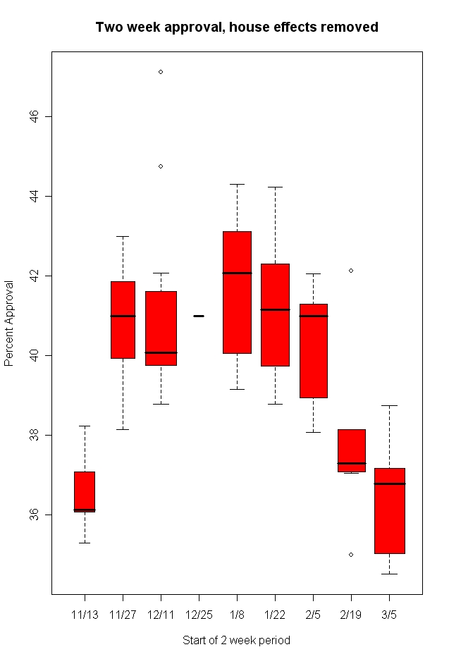
Now the decline is still monotonic, but the three periods through 2/5 don't show as pronounced a decline as they did in the raw data. There is then a sharp drop in the 2/19 data, and only a small further decline in 3/5. This is more the Blumenthal and Newport story again. It is also a bit different from the local regression lines we saw above which made the trend look steady when adjusted for house effects. So what gives here? Temporal aggregation. Clumping in two-week periods has masked some effects by lumping together high and low weeks. Look at the same data with a one-week interval (and small numbers of polls per week, but that's the price you pay.)
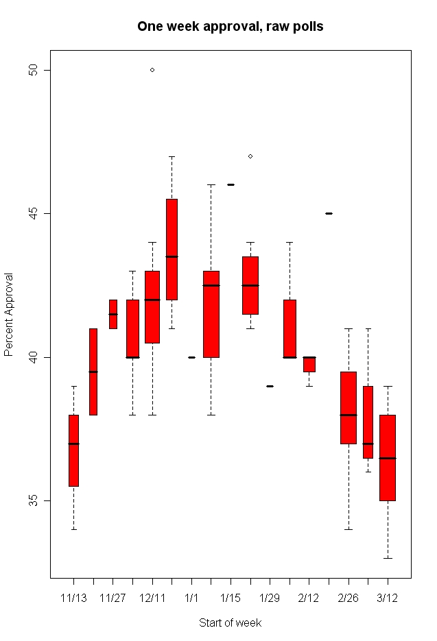
With un-adjusted approval ratings, the regular decline is still pretty clear, though week-to-week variation is greater with fewer polls. When we look at the adjusted approval rating, removing house effects here is what we get:

More noise, and few polls in some weeks, but to my eye at least I still see continued downward movement and not stabilization.
So what's the data say? The local regression line can be made more responsive to short term data, and when that is done we can see a local fit that looks like the Blumenthal/Newport story. Using more data to estimate the trend for each day removes this and gives continued downward movement. Which is it? The linear model, with changes at the time of major events over the past 15 months finds very little evidence for departure from linear decline since the State of the Union address on January 31. The residual plot showed a seemingly random distribution of errors, as it should, and the mean residual remained very close to zero throughout the period. I do conceed that there is perhaps 0.25-0.5% shift, but that is not close to statistically significant.
If we remove the house effects and replot the data with a local regression, we find that results with house effects removed also show continued decline. This argues that seeming stabilization might be due to the mix of polls that have been released in the last week or two.
Finally, if we go low-tech, the trends in the medians of the polls again suggests to me little evidence of new stability, but rather of a continuing downward trend, at least through the week of 3/12.
Now, what does the future hold? I don't know. The President has started a new round of speeches, press conferences and town meetings to boost his standing. I've argued here that he needs to do that and that opinion should respond to this effort. Others have argued that he's already gone to that well, and it won't work again. We'll see.
What I stress is that my models here are not intended to predict future events. My goal is to clarify what the data show has happened. I'm pretty sure approval has continued down. If the data next week show it has stopped and started up, then I'll be happy to show that. But I'll be unhappy if eventually the timing of the stabilization or upturn is shown to have occurred before March 19. If so, I'll point that out too.