
Updated with Complete Returns 8/9 @ 13:00 CDT. See bottom of post for final comments here and links to related posts.
Sen. Joseph Lieberman lost last night to Ned Lamont in a primary that will be a prime example of the limits of incumbency for years to come. With 99.6% of precincts reporting, the AP has the results as 51.78% for Lamont, 48.22% for Lieberman. That margin is a good bit closer than the 6-13% in the late polling.
Some of the late commentary on this race concerned turnout and the Lieberman decision to cut back on get out the vote (GOTV) efforts. As I said here on Monday
The press and political blogs have reported that Lieberman's get out the vote (GOTV) effort has been cut back. If so, the inability to exploit this possible "return to the fold" among moderates may haunt Lieberman Tuesday night. Two weeks ago nothing seemed to be going his way in the polls. Now when there is a small glimmer of hope, the campaign may no longer be prepared to exploit that.So let's take a look at turnout and how it affected the vote.
All data are now complete, no thanks to the SoS's office. The Courant has complete vote returns. So ignore the rest of this pragraph.
[First a note: the CT Secretary of State's office is slow to update their data. AP in reporting over 99% of precincts reporting, but the SoS's office is showing only about 70% of towns reporting. I'm using data on 119 of the 169 towns in the state. I'll update this tomrrow when, one hopes, the full data are available. I'll hope the rest of the data don't contradict what I say here, but do take these results as preliminary pending the full report of the data. UPDATED 8/9@09:45 Now with 127 Towns but still only 76% of total votes. Still waiting on the CT SoS office to finish entering their data! See update at the bottom of this post for more details. ALL GRAPHS HAVE BEEN UPDATED].
My story comes in three parts.
First, the figure above shows that Lieberman did better in the larger towns and cities, and Lamont did best in smaller places.
In the figure the number of active registered Democrats is the horizontal axis. I've taken the log of this, so each unit represents a 10 fold increase over the one before it. For example, 3 is 1000, 4 is 10,000 and 4.5 is 31,600 registered and active Democrats. The dots are also scaled so their size is proportional to the number of Democratic registrants. (And another footnote, the SoS does not have uptodate registration figures so I'm using November 2005 data. Given the substantial new registrations from this summer, there will be some inevitable error in these data. However, the relative sizes should be about the same (that is, big towns are still bigger than small ones, even after the influx of new registrations.))
The straight blue line is a linear regression relationship between size and Lieberman vote. The purple line is a local, non-linear, fit between size and vote. The difference between these lines shows how much the data depart from a linear relationship. Not too much in this case.
While Lieberman did better in larger places than small, Lamont did well enough in the larger towns to not fall too far behind due to that, and he dominated the many smaller towns.
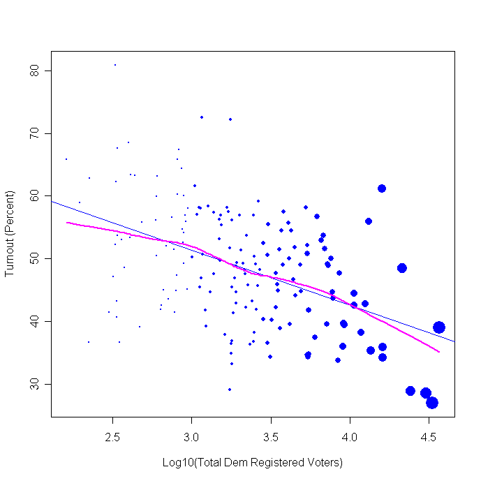
The figure above shows that the largest places had turnouts well below 50%, and often below 40%. Most smaller places had turnouts above 40% and many above 50%. This also means that where Lieberman was strongest, the turnout was lower. An effective GOTV program that raised the turnout in these larger towns would be doubly advantageous: raising turnout in populous areas raises the NUMBER of votes to a satisfying degree, and the populous areas were Lieberman's strength, so mobilization there would have brought in new voters with higher than average support for the incumbent.
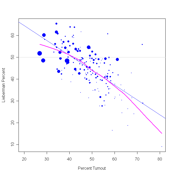
Where voters were most energized, they turned out in high proportions for Ned Lamont. Where they reluctantly went to the polls, Lieberman was the beneficiary. Lamont's problem here is getting a high percentage of high turnout but in small places. That may not add up to a large number of votes. Lieberman has the opposite problem: high percentage of votes in big places but where turnout was quite low. The obvious strategy would have seemed to be to maximize that turnout, and reap the benefit. As the closeness of the final tally shows, this race was within reach for Joe Lieberman. Whether a stronger GOTV effort could have found the needed 10,000 votes (3.5% of the total turnout) is hard to answer. A stronger campaign that held a few more former supporters combined with mobilization of the larger towns might well have done so.
UPDATE (8/9/06@ 09:45):
The Ct. SoS office is still slowly updating their town-level vote reports. I've updated all the figures but there are still 42 towns not reported (and 127 which have.) The totals here now represent 76% of the total vote the AP is reporting. You know, it is annoying that state officials are routinely unable to compile complete returns in a timely manner. We have these remarkable machines called computers and high speed networks, but the AP is still faster using the telephone.
One important issue that has been talked about that I didn't get to posting about in the early morning is the "donut" vote. Hotline on Call puts it this way:
Where The Lattes ReignI don't have the economic data handy (at the moment!) but one way to look at this is by the partisanship of the towns. If Hotline and others are right, we should see Lamont do well in areas that have a high concentration of Republicans while Lieberman does well where there are few Republicans. NOTE that this doesn't mean Republicans or conservatives voted for Lamont! It means that in the upper-income and education areas where Republicans are more common, the DEMOCRATS who share their socio-economic status (but NOT their political views) were heavy Lamont supporters, while in the low-socio-economic status towns where Republicans are rare, the Democrats were more likely to support Lieberman.If there was a way to obtain the per capita income and racial demographics of each Connecticut town, some politico cartographer wizard out there could have a field day portraying the economics and ethnicity of this race. Ned Lamont, scion of the Eastern Establishment, rolled up staggering margins in those places most likely to include his fellow anti-war WASPs. Joe Lieberman, son of a Stamford liquor store owner, won the workaday towns most likely to include other ethnic voters less motivated by opposition to Iraq.
The graph below tells the tale:
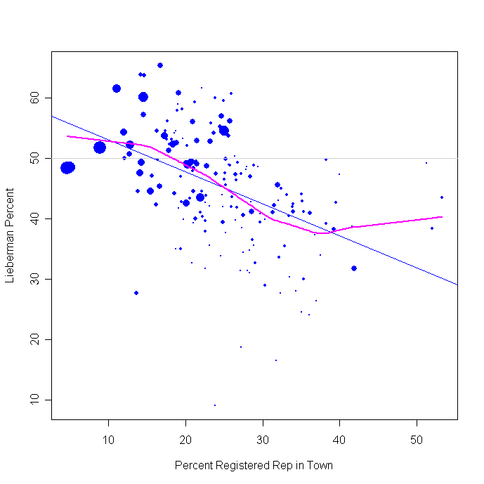
As Republican strength (measured as the percent of registered voters who are Republican) goes up, the Lieberman vote goes down and Lamont goes up.
The class lines reflected in the voting pattern are interesting, if not surprising. They also point to the division in the Democratic party between the highly educated and well paid compared to the traditional working class base. The latter often don't share the ideology of the former. That division has been the party's weakness since at least 1972. (Or arguably 1968; remember Chicago.) Republican divisions are also showing up, though perhaps less often. Last night's results in Michigan's 7th congressional district are an interesting example. (Moderate Republican incumbent Joe Schwarz lost to conservative primary challenger Tim Walberg. I hope to have more to say about that in a separate post.)
Update 8/9 @ 10:47:
I don't want to diminish at all the remarkable success of the Lamont supporters in both turnout and in conversion of votes to their guy. I've written above mostly from the perspective of the failures of the Lieberman campaign, but don't mean to take anything at all away from Lamont and his successes. They are the flip side of each of the graphs above.
More updates as data come in.
FINAL Update 8/9 @ 13:00 CDT:
The complete returns did not alter the story line above, thank goodness.
I've followed up on the class and ethnicity effects in separate posts:
I used percent Republican registration as a proxy for socio-economic status. That is addressed directly in this new post.
I also looked at ancestry here, showing that the old patterns are still in play for the most part.
Click here to go to Table of Contents