
Congressional election outcomes are among the most interesting yet difficult to gauge indicators in American politics. The race for control of the House of Representatives is the aggregate outcome of 435 separate races, each with its own dynamics and each with its own unique features, plus the power of incumbency and the fact that though we hate congress, we love our congress(wo)man.
The blunt instrument pollsters use to estimate the state of the race for control of the House is some variant of
"If the election for U.S. House of Representatives were held today, would you vote for the Democratic or Republican candidate in your congressional district?"The problems with the question are obvious: no mention of who your candidates are by name (and many voters don't have a clue) or who the incumbent is (a huge advantage in name recognition alone, not to mention positive generalized affect) and the likelihood that uninformed voters reply by reflecting their partisanship rather than anything specific to the race.
NONETHELESS, this is the indicator we have, and we follow its ups and downs with great interest.
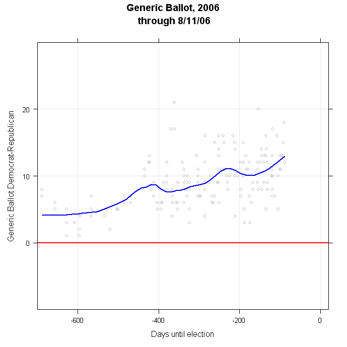
At the moment, this indicator looks quite favorable for the Democrats. Since the 2004 elections, the share of voters preferring the Democrat over the Republican has climbed steadily. There is considerable variation from poll to poll, but the current estimated trend is a Democrat lead of +14.65%.
There has been a long-term tendency for Democrats to do better on this generic ballot question than they in fact do at the polls, so considerable care is required in thinking about this number. If a Democratic lead in the Generic Ballot were sufficient for control of the House, the Democrats would have won the House in 5 of the last 6 Congressional elections, including 1994! The trend estimates for each year, as of election day are:
2004: -1.07
2002: +1.49
2000: +5.26
1998: +8.03
1996: +5.45
1994: +3.35
Nevertheless, the current margin in the Generic Ballot is very large by comparison to recent election years. If we plot the polls and the trend since 1994, we find that 2006 is by far the largest Democratic lead at a comparable time in the election cycle:

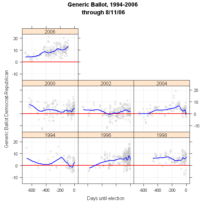
In no cycle since 1994 has the Democratic lead approached 10%, let alone exceeded it. So by the standard of "relative lead" in the generic ballot, 2006 reflects extremely strong pro-Democratic forces.
Using the generic ballot to forecast the actual House outcome? That's a story for another day. (Update 8/17: Jay Cost now has an excellent discussion of the generic ballot on RealClearPolitics here. He discusses, among other things, the difficulty of estimating seat changes from the generic ballot, a topic I'll have more to say about here soon as well.)
Click here to go to Table of Contents
8 comments:
On NPR's Morning Edition on July 27th they reported on an interesting poll of the fifty most competitive House districts and used both the generic question and a question with the actual candidates. The results were virtually identical. What do you think of that poll? The poll results can be found at the following:
http://www.npr.org/templates/story/story.php?storyId=5585086
anonymous,
The NPR polling is especially interesting. I wish other organizations would pick up on this. Greenberg et al (the Democratic firm that pairs with Public Opinion Strategies, a Republican firm, for the NPR polling) has been experimenting with identifying the respondent's congressional district and including the incumbent's name in the congressional vote question. I hope to find the time to write something about that.
My overall impression is that this is a nice bit of work. The only warning is that there are far too few respondents to make any inferences about individual house races, so the results still are an aggregation across 50 races rather than 50 individual estimates. So how that vote is distributed across races still matters a lot. But this is a much better design for surveying the House, and combined with specific canididate names it is a huge improvement over the generic ballot.
\chf
Charles, this is the post I have been waiting for.
I responded with my own (perilous) extensions and extrapolations at F&V.
Would it be possible to overlay the generic poll results immediately prior to each congressional election with the actual resuls of the elections themselves so as to directly see any correlation between the two.
I was thinking of a bar plot that measures democrat-republican delta in congressional seats and overlaid on that the graphs you already have taking just the portions closest to the actual election.
Oh and if I could have a pony too, that'd be nice. Can you get right on that? Swell.
(seriously though if you wouldn't mind putting a plot like that together it might be worthwhile)
Matt-- thanks. And everyone should go over to Fruits and Votes to read Matt's very interesting piece.
tlaloc-- I'm working on a serious look at this as a forecasting issue. I'll have an extended look at it before too long. And the pony will be delivered soon. Do you want that delivered to your house or office? <;-)
Charles
Having had my attention called to the sharp narrowing of the Democratic advantage in the Aug. 20 Gallup poll, I was looking over recent generic-ballot numbers, and it does indeed appear that, whereas Republican numbers had previously been mired in the 30s, three of the four polls taken since the story broke of the reported terrorist plot in Britain have placed the Republicans in the low to mid-40s. Is this shift to be taken seriously, or is it noise?
david--
I haven't updated the generic this week. I'll try to over the weekend and we'll see what the trend line does.
Charles
I was just the subject of a rather extensive Polling Point survey, and they asked - amoung tons of other things - both about my general (rep/dem/other) preference as well as my specific preferences in the senate, house and gubantorial races.
Polling Point uses extremly large sample bases (40000 is a rough figure I recall) so it should have a lower margin of error than other polls.
Post a Comment