Thursday, August 31, 2006

Hillary's image, 1993-2006


(Click on figure for a larger view.)

Hillary Rodham Clinton's public image is very much in the news with this week's Time cover story, so let's take a quick look at one of the longer running public figures. Sen. Clinton is an unusual public figure both in terms of the length of the time series of data we have on her, and in her changing roles in politics. These changes stand out pretty clearly in her favorability ratings above.

After a typically positive view of the new first lady, favorability fell quite a bit as Sen. Clinton took on a policy role (which failed) with the health care reform initiative in 1993-94. Her favorability actually declined a bit more by the end of 1995, before starting a sustained recovery through out 1996 and 1997.

The amazing Monica Lewinsky scandal gave her further boosts in favorability, in contrast with views of her husband. This trend peaked just as the impeachment trial ended.

As Sen. Clinton turned to running for the Senate from New York, public perception again changed from the positive views of 1998 to a balance more typical of political office seekers in 1999 and especially 2000. Now a candidate in her own right, favorability shifted from around 65% to slightly over 50% as she ran for office. For the most part, favorability towards Sen. Clinton has remained close to the 50% mark, with some recent rises in 2005 and most recently in 2006 some modest decline.

Sen. Clinton is often described as an intensly polarizing figure, and there is some evidence for this in the levels of her "unfavorable" ratings. These rose sharply in 1993-94 as she took on non-traditional policy roles while first lady. But having reached 40% unfavorable by 1995, they have rarely dropped below that. Only during the Lewinsky scandal did unfavorable drop to around 30%. Since then it has remained in the ball park of 40%, but at times rising to around 45%. While not a measure of the intensity of these feelings, the data certainly show that Sen. Clinton has been viewed unfavorably by a consistent 40% of the population for the last six years. This of course is one of the difficulties she faces in a race for national office.

Those national favorability numbers set the stage for a possible run for the White House in 2008. But how has she fared in the state she represents in the Senate, New York? Below are job approval figures from samples of New York state since she became Senator.


Here Sen. Clinton's success at winning over voters is clear. After initially withholding judgement, New Yorkers have come to approve of her handling of her job as Senator by better than 2-1 margins. The rise has been slow but steady until 2005, when approval peaked at just over 60%. Since then there has been some fall off of approval, to about 55%.

As with her unfavorable ratings, there is a steady contingent of about 30% of New Yorkers who have consistently disapproved of the her handling of her job. This has varied by as much as 8 points, but represents a stable resevoir of opposition.

Given that Sen. Clinton seems to be coasting to reelection, the decline in approval is worth watching. Is that due to presidential ambitions hurting her at home, or is it her support for the war or is it simply renewed partisanship as the Senate election draws nearer? And how will a big win in November translate into both state and national perceptions of Sen. Clinton as she considers a 2008 bid for the White House? Ahhh.. wait for more data.


Click here to go to Table of Contents

Tuesday, August 29, 2006

Katrina and Bush, One Year Later


A year ago, Katrina hit New Orleans. Coincidentally, PoliticalArithmetik made its debut on Labor Day last year. As a result, I fell into an analysis of the ongoing effect of Katrina on President Bush's approval ratings. Hadn't planned for that, but then neither had FEMA.

With the anniversary of Katrina, there are lots of news stories offering a retrospective, so why not here as well.

You can read over the original Katrina analysis (and see if it stands the test of time!) here,
here, here, here, here, here, and here.

Now seems a good time to go back and reestimate the effects of Katrina with complete data, rather than as a moving target. As always, my model fits the impact of events on approval, including both a possible immediate shift in approval and a possible change in slope. With Katrina and the Miers/Libby fiasco, the effects were essentially shocks that changed the level of approval but didn't shift the slope appreciably. Since then, the post Nov 11 rally, the winter decline, post-immigration speech rally and now post July 9 apparent stability, the slopes have shifted along with the level.

The figure above shows the plot of the fitted values for the linear model (in red) and for my usual trend estimator of approval (in blue). The blue trend is more flexible, but as is clear from the plot the linear fit is a good approximation of the non-linear trend. The linear model is a bit rough at points of change in direction, where it tends to overshoot the trend a bit. But for the crucial Katrina impact, the match between linear and non-linear trends is quite good.

The non-linear trend is actually worse at capturing sudden change points, so the blue trend appears to start down before Katrina hits. That is an artifact of how the trend is fit, and in this case the red linear model does a better job capturing Katrina's effect.

The immediate impact of Katrina was a loss of 1.4 percentage points in President Bush's job approval rating, based on a statistical analysis of all polls taken since 1/1/05. That doesn't sound like much, but just prior to Katrina he was losing approval at a rate of 1 percentage point
each 32.6 days, so a loss of 1.4 points was the equivalent of 46 days of decline all in one moment. Or looked at another way, approval declined about 8 points from January 5 2005 until the end of August. It then dropped by 18% more following Katrina. (8 x .18 = 1.4).

By comparison, the impact of the Libby indictment and the Miers withdrawal (in the same week) was a further loss of 1.6 points, marking the low point of 2005 (almost-- things started rebounding on Nov 11, a week or so later.)

Or a third take. Approval on 1/5/05 was 50.2%, based on my approval trend estimate. By 8/28/05 it had fallen to 42.2%. By 10/2/05, the day before the Miers nomination it had fallen to 41.2. By 11/11/05 it was 38.9%. (This comes from a different model so is a little different in the numerical details from the previous paragraph, though the basic point is the same-- Katrina was bad, Miers/Libby was worse, probably because the latter hurt approval among Republicans more than did Katrina.)

So let's not exaggerate, but Katrina was a substantial "hit" to approval after a decent summer in which the approval decline had flattened out a little bit (though not started back up) after a very poor winter and spring that included the failed social security reform.

My take on Katrina was that it kept the White House away from it's agenda (if it had one at the time-- from where I sit the focus seemed to drift after the social security defeat.) In any case, Katrina made the issue for the fall "incompetence" and "cronyism", which was just reinforced and exacerbated by the inexplicable Miers nomination.

Only on November 11 and thereafter with the President's renewed defense of his policies in Iraq, and a White House that seemed to stay on message for several weeks, did the decline reverse, with a considerable recovery by the end of the year. I think that the period after 11/11 was the first time that the White House seemed back in control of its affairs since giving up on social security reform.

Some of the perceived incompetence may still haunt the administration. Democrats don't seem to be that successful making it a campaign issue, though. And so far we've not had a hurricane for FEMA to manage WELL this season. If there is one, and they do well, then the administration can point to "fixing the problem" in time for the elections. If it goes poorly, however...

Katrina established some negative expectations about FEMA in particular, Homeland Security in general, and the administration including the President himself. If it performs better than expected the next opportunity, then that might actually be a good thing for the administration. This hurricane season, coinciding with the fall campaign, presents both an opportunity and a peril in establishing whether the administration has in fact solved the problems at FEMA and Homeland Security and the "competence thing".


Click here to go to Table of Contents

Monday, August 28, 2006

Generic Ballot: New polls mostly below trend


Recent Generic Ballot polling has fallen a below the trend estimate. In polls taken since the British terror plot against airlines, five of the seven polls have shown a reduced Democratic advantage. The largest change is the Gallup poll, which on other grounds appears to be an outlier. However, other less extreme results also show some rise in Republican support. The effect of this is not to turn the trend estimate down, but to flatten it at +12 for the Democrats.

Estimates that are more sensitive to the latest polls show a slight downturn in the trend, but those are also subject to being heavily influenced by the Gallup outlier. For that reason I favor the more conservative estimate.

Interestingly, the post-plot polling does not show any evidence for an upturn in overall presidential approval. It would seem a little odd if the plan plot affected the congressional ballot but not presidential evaluations. So for the moment I think the trend estimator reading "steady" rather than changing is supported by the evidence.


Click here to go to Table of Contents

Saturday, August 26, 2006

Bush Approval: Newsweek says 36%


A Newsweek poll completed 8/24-25/06 finds approval of President Bush at 36% with disapproval at 56%. That's a two point decline in approval from 8/10-11, immediately after the plane plot story broke, and a one point increase in disapproval. With the addition of this point to the data, the trend estimator (dark blue line) stands at 37.2%, remaining quite flat.

See yesterday's post on the new Time poll for a more extended discussion of recent results. The Newsweek poll is entirely consistent with the current trend estimate of approval.


Click here to go to Table of Contents

Friday, August 25, 2006

Bush Approval: Time at 38%


A new Time Magazine poll, taken 8/22-24/06 finds approval of President Bush at 38%, a three point rise since Time's last poll, done 8/9-10. The Time story (here) does not report the disapproval rate. With this latest poll, my approval trend stands at 37.4%. There has been a bit of settling of the rate, now mostly recovered from the CNN and Gallup high outliers at 42 (and the earlier AP low outlier at 33.) The trend remains quite flat with considerable spread, as is obvious in the figure above. Equally obvious is that my trend estimator is doing a pretty good job splitting the difference among a number of widely varying polls since June.

A small note is that Time has generally tracked my trend very closely. The three polls before this one were all about two points below trend. That isn't far in comparison to other polls, but was unusual for Time. With this poll, they return to within a point of the trend estimate. Time's "house effect" is only +0.3, making it the second closest to the overall trend of the 22 polls I track.

With Labor Day coming up soon, and the unofficial start of fall campaigns, it will be very interesting to see what happens to the approval trend. The last 2 or 3 months have been a remarkably stable period for approval. At times I estimated it trending up (at less than a point per month) and at other times trending down (again, but less than a point per month.) As of now, the retrospective estimate using all the polls of summer, argues pretty strongly that most of June and all of July and August (so far) has represented an unaccustomed calm. No previous period of the Bush presidency has seen so long a period of stable approval. It has almost always been either trending up, down, or just turning around. It is hard to imagine the fall campaigns will not leave an imprint. But what direction?


Click here to go to Table of Contents

Thursday, August 24, 2006

Bush Approval: Harris 34%, Hotline 39% (or 42%)


Two new polls split the difference, leaving estimated approval pretty stable. A new Harris poll, taken 8/18-21/06 finds approval at 34% and disapproval at 65%. Harris has a substantial negative house effect of -2.94, so that 34% should not be taken as evidence for decline in approval. In fact, the previous Harris poll taken 8/4-7 and the one before that taken 7/7-10 also found approval at 34%. This result then, is quite compatible with a story of stable approval ratings, rather than decline. And adjusted for the house effect, suggest approval is really around 34+2.94 or about 37%, which is quite close to my trend estimator.

The second poll of the day is the Hotline poll, taken 8/17-20/06, which finds approval at 39% and disapproval at 58%. That is a one point rise in approval (and one point decline in disapproval) since their 7/20-23 poll. The Hotline house effect is +1.72, so adjusting for that also produces an estimated approval of about 37%. For once, we have glorious agreement among (house adjusted) polls!

The estimated trend in approval of President Bush with these two new polls stands at 37.4%, a small adjustment from the previous estimate of 37.6%. The graph also shows that the trend line is currently estimated to be quite flat, trending neither up nor down for some while. (I caution that the "old blue" estimator has had some trouble figuring out what direction the trend has been moving since June. For some while the data kept it moving slowly up. Then we went through a little while when it looked to be declining. Now the data suggest flat is the best story. Sometime in October we'll have a good idea of what really happened this summer!

Two points are worth mentioning. The Hotline poll found approval/disapproval at 39/58 among registered voters. PollingReport.com reported these figures. Among likely voters the Hotline found approval/disapproval at 42/56. RealClearPolitics.com chose to use this result in their list of approval polls, without any indication that they were reporting a subsample result. I have no objection to reporting both results (something neither of these sources did) but presenting only the LV subsample without an indication that this was for less than the full sample seems dubious to me. In principle every poll of adults could also produce results for RV and LV subsamples. The norm for presidential approval is to report the results for the full sample, however that was defined, and to indicate what population that sample represents. RealClearPolitics.com does an excellent job of linking to sources for the poll results, but in this case I think they made a poor editorial call.

The Harris poll house effect also deserves comment. At -2.94 the Harris poll has the largest negative house effect of all 22 pollsters for which I currently estimate house effects. Before leaping to a conclusion of bias, I want to point out that Harris is one of the few polling firms that uses a four point approval scale: Excellent, Good, Fair, Poor, rather than the more common dichotomous approve/disapprove. It is entirely reasonable that the middle two categories here can provide a "halfway house" between what would register as approve and disapprove on the dichotmous indicator. "Fair" can be attractive for unhappy Republicans, for example, who might reluctantly stick to "approve" on the dichotomous measure. So the negative house effect for Harris should be understood as a combination of house effect AND question wording (response options) effect. As the graph above makes clear, Harris tracks the trend in approval quite well, but with a systematic downward shift for the house/question effect. Before tossing out acsusations of bias, one should consider other reasons for the large house effect.


Click here to go to Table of Contents

Wednesday, August 23, 2006

Bush Approval: CBS steady at 36%


The new CBS/New York Times poll, conducted 8/17-21/06, finds approval unchanged at 36%, with disapproval also stable at 57%. Those are the same ratings CBS/NYT found in a poll taken 8/11-13, immediately after the British foiled a terrorist plot against U.S. bound aircraft. In CBS/NYT's last poll before the plot was disclosed, approval was 36 with disapproval at 55. That poll was completed 7/21-25. With the latest CBS/NYT data included, my trend estimator for President Bush's job rating now stands at 37.6%, revised down a bit from yesterday's 38% estimate in which the CNN/ORC and USAToday/Gallup polls at 42% approval exerted a substantial influence. If further polling confirms that the CNN and USAT polls are indeed outliers (as I showed in previous posts here and here) then the influence the polls have on the trend will diminish. In terms of the trend estimator, what appeared to be an upward slope yesterday has now returned to a flat trajectory between 37% and 38%.

Basing a conclusion on a single organization's polling is risky, but in this case at least the impact of the plane plot appears to be nil. The reason to use the CBS/NYT data is that they conducted a poll close to, but before, the plot was announced, then one immediately after and now a third poll a week later. Since it is the same organization conducting all three, house effects won't influence change between polls, confounding the impact of the plot. Further, the sample sizes are substantial, so we aren't dealing with a small sample in any of the three surveys.

One doesn't need a lot of statistics to conclude that 36-36-36 represents rather little evidence of change.

There are 5 polling organizations that have good pre-post plot polls we can use to take a broader look at the effect of the terror plot impact:
Pew, 7/6-19 and 8/9-13*
Zogby, 7/21-25 and 8/11-15
Gallup, 7/28-30 & 8/18-20**
CNN, 8/2-3 and 8/18-20
CBS/NYT 7/21-25 & 8/11-13

* Pew's first day of interviewing was before the plot was revieled in the US
** Gallup did a 8/7-10 that included one day after the plot was exposed
(Newsweek has a post plot poll, but their pre-poll is from May, a useless comparison.)

If we compare the post minus pre approvals WITHIN poll, thus removing house effects, we get the following changes from pre to post:
+1
-1
+2
+2
0
for an average change of +0.8%.

The conclusion is clear. No impact of the plot on presidential approval directly.

The plot may well have increased the salience of terrorism and the sense of threat. We have seen terrorism rise as the "most important problem" in some polls. But so far at least, that has had no discernible effect on presidential approval.


Click here to go to Table of Contents

Tuesday, August 22, 2006

Bush Approval: Gallup says 42% too!


UPDATED 8/22@12:00. See bottom of post for new material.

The USAToday/Gallup poll conducted 8/18-20/06 reports that approval of President Bush has jumped to 42%, with disapproval sinking to 54%. The approval number matches another weekend poll by CNN/Opinion Research Corporation taken over the same dates. That is a 5 point jump from Gallup's previous reading of 37% approval over 8/7-10.

With the new Gallup AND the CNN, my poor would-be-conservative trend estimator is having a hard time knowing where to move. After turning down in the week following 8/7, these two new polls drag the trend estimator into a small upward slope, and a current estimate of approval at 37.96% (or 38% after rounding.) That's a lot of change over the past four or five polls. Between 8/7 and these last two polls, the trend estimator had adopted a small but clear downward slope. Now the opposite-- a small upward trend. What's an honest estimator to do?

One possibility is to take another look at outliers. If we do that, then the new Gallup is also an outlier, as was the CNN poll earlier in the day before USAToday released the new Gallup poll. The outliers are shown below.


Gallup is an outlier even when we allow CNN's result to raise the trend a bit (but exclude the latest Gallup from the outlier trend estimate.) So this demonstrates that Gallup's latest is indeed a bit unusual.

You might also note the number of previous Gallup polls above the upper margin of the 90% confidence interval. Don't be deceived-- Gallup does a LOT of polls, so they would have a number above the top line in any case. In theory, 5% of polls should fall above the upper CI limit. In Gallup's case, 7.7% of their polls have fallen above the top of the CI, while none have fallen below the lower CI limit. This is consistent with Gallup's typical "house effect" which is +.55, indicating the Gallup is on average about a half a point above the average approval across all pollsters. That isn't a lot, and doesn't seem to entirely account for the increased number of Gallup points above the upper CI limit. However, I don't think this is a large enough discrepancy to question the modest house effect estimate, at least not for now.

So the problem is what to make of this wide range of poll results, now reinforced on the high end by two identical results over the same polling dates. I remain reluctant to give full credit to polls that appear to be outliers. Give me a couple more in the 40+ range and I'll change my mind, but for now, I continue to think the trend estimate of 38% (and I'd subjectively say, 36.7-38%) is a better estimate of approval. (36.7 was the estimate before these two polls came in at 42%.) The minor debate would be a slight upward trend or a slight downward one or continued stasis. That must be very much in doubt given how conflicted the trend estimator has been over the past 10-14 days. That approval is moving slowly somewhere in the 36.7-38% range seems pretty strongly supported by the trend and by the usual variability around that. However, the range of recent polls, from AP's low outlier at 33% to these at 42% is a wider range than we usually see. Other recent polls, however, do NOT exhibit higher than normal variability, so I'm sticking to the basic story that we've seen 3 outliers (1 low, 2 high) in a short period of time. That isn't common, but a look at the residual plot shows that it isn't exceptionally rare either.

I'd just like to get a break from outliers for a while!

Update, 8/22: Mike in Maryland in a comment below raises the question of the distribution of partisanship in the two samples. Great point. Here are some results:

My sources "in the kitchen" tell me that the new Gallup has a partisan split of Rep: 33%, Ind: 32%, Dem 34%.The previous poll was Rep: 31, Ind 31, Dem 36. Not a huge shift, but in the Rep direction. The substantial difference seems to come from "leaners". If we add Rep+LeanRep we get 43, vs Dem+LeanDem at 48%. That compares with 39% and 51% in the previous poll.

None of those differences is statistically significant, but they all break the same way, which could shift approval by a bit.

Gallup notes that Independents show the largest shift, up 10 points in approval (from 26 to 36) between 8/10 and 8/20 while the approval rate for Reps remains 81% and Dems are up slightly from 8% to 11%. Since there are more "LeanRep" independents, that would boost the approval rate among independents.

Let's see what effects we'd get from changing size of the R,I,D groups compared to the effects of changing approval rates within groups, and finally to the effect of changing both size and approval, between the Aug 10 and Aug 20 surveys.

A caveat: All the approval and group sizes are rounded to whole percentages. Also, the partisan categories add to 98% in 8/10 and 99% in 8/20 so there are 2% and 1% of the sample unaccounted for who might have expressed approval or disapproval of the President. So the numbers I'm going to get won't exactly duplicate the reported percentages for the 8/10 or 8/20 surveys. But they should be good enough for us to appreciate the components of change here.

First, what if approval rates within group remained fixed but the sample proportion of each partisan group changed:

8/10:

R: 31 x .81=25.10
I: 31 x .26= 8.06
D: 36 x .08= 2.88
------------------
Total approval = 36.05%
(Note this differs from the 37% reported due to the rounding noted above.)

8/20, with DIFFERENT sample but same loyalty rate:

R: 33 x .81=26.73
I: 32 x .26= 8.32
D: 34 x .08= 2.72
-------------------
Total Approval = 37.77%

So the effect of the change in partisan composition alone, holding approval rates fixed within party categories, would be an increase in approval of 1.72%, or allowing for the rounding problem, say in the ballpark of 2%. Not nothing, but not huge either.

Now what if Gallup had managed to keep the size of the R,I,D groups exactly the same (say by weighting to some fixed party id distribution) but the approval rates had shifted within category from what they were on 8/10 to what they are in 8/20:

The 8/10 calculation is the same as above, for a total approval of 36.05.

For 8/20 with the same partisan shares as 8/10 but with 8/20 approval rates:

R: 31 x .81=25.11
I: 31 x .36=11.16
D: 36 x .11= 3.96
-----------------
Total Approval = 40.23

So for a fixed partisan sample, the shift in approval rates would account for a 40.23-36.05=4.18 point increase in approval, or about double the effect of the shifting sample but with fixed approval rates.

If we combine both effects then we get something close to what we actually saw in the published results:

8/20 with both sample and approval rate shifts:

R: 33 x .81=26.73
I: 32 x .36=11.52
D: 34 x .11= 3.74
---------------------
Total Approval = 41.99.

So both effects together account for a 41.99-36.05=5.94 point increase, or about 3 times the effect of sample composition alone and 1.5 times the effect of changed approval rates alone.

Controlling partisan composition would have made approval come out at about 40%, rather than the 42 when both group size and rate vary. That would have been yet another Gallup cycle between 37% and 40% that we've seen over the last several polls. But lets not overstate the composition issue either. It accounts for about 1/3 of the shift between polls. The shifting rates within partisan category are the larger effect here, and it is much harder to argue for some kind of weighting to control those effects. Those who support weighting by party id can rightly claim that such a procedure would have made this latest Gallup merely a bit high rather than an outlier. Opponents of weighting could rightly argue that the shifts due to partisan composition are small relative to the total shift, and fall well within the limits of sampling error for subgroups in any case. By trying to control effects on the order of 2-3 percentage points, we are worrying about effects that are better absorbed as random error into some synthetic statistic, like, say, my blue line approval trend estimator. <;-) Click here to go to Table of Contents

Monday, August 21, 2006

Bush Approval: CNN at 42%


A new CNN/Opinion Research Corporation poll taken 8/18-20/06 finds approval of President Bush continuing to rise, with approval now at 42% and disapproval at 57%. That is a 2 point rise in approval and a two point decline in disapproval since the last CNN/ORC poll 8/2-3. With the addition of this data point, my approval trend estimate stands at 37.2%, revised up from the previous 36.7%.

But hold on a moment. The new CNN is an outlier-- as was the AP's reading of 33% on 8/7-9, in the opposite direction.


An outlier is a poll result that is unlikely to occur, given the current estimate of the overall trend, which was 36.7% prior to the new CNN poll. That means CNN at 42% is 5.3 points higher than we would expect. Over the nearly 1200 polls taken in the Bush administration, 90% fall within -4.7 and + 4.0 percentage points of the estimated trend, with 5% of polls below -4.7 and 5% of polls above +4.0 points from the trend. At +5.3, the new CNN clearly is above the upper limit. Now that CAN happen by chance alone (and WILL, 5% of the time, by definition) and it could also signal a sudden and abrupt shift up in approval, though the lack of an obvious reason for such a shift makes me think not. What highlighting outliers does is caution us not to place too much confidence in a single outlier. Just as some Dems were delighted by the AP at 33%, now some Reps will be thrilled to see CNN "validate the President's improving ratings". Neither is likely to be supported by further polls, nor by shifts in the trend estimate. Outliers happen, but they rarely signal true change.

Based on this, I expect the approval trend is more accurately represented by the 36.7% we estimated prior to this CNN poll. A couple more polls within the expected range will bring the estimated trend back towards that level.

Even with the CNN outlier, the trend estimate remains slightly down, which is probably the more important harbinger.


Click here to go to Table of Contents

Friday, August 18, 2006

WI Gov: New polls, same story


UPDATE 8/21: Rasmussen has a new poll showing Doyle at 49, Green at 41. Blogger is refusing to upload my new graphs, but as soon as it feels better I'll update the graphs here as well. Graphs are now updated.

Two new polls out on the Wisconsin Governor's race tell much the same old conflicting story. (See here and here for previous tellings of this tale.) A WISC-TV/Research2000 poll conducted 8/14-16/06 found incumbent Democrat Jim Doyle with a 48%-38% lead over Republican challenger Mark Green. Green is the incumbent member of the U.S. House from the 8th Congressional district (Green Bay.) But a Strategic Vision survey conducted 8/11-13/06 found a miniscule Doyle lead, 45%-44%. The Strategic Vision poll is exactly in line with their past polling showing the race as a virtual dead heat, with a very slight Doyle advantage. The WISC/Research 2000 poll is in line with other statewide polling that has consistently found a substantial Doyle lead, but which has also shown a slow but steady rise in Green's support. The problem, of course, is which poll to believe, or at least how to understand why they are different.

The top figure shows the trends for Mark Green with Doyle's support as the gray dots. Doyle's polling is quite consistent across all the polls, with support in the mid-to-upper 40s but consistently falling short of the 50% point. Green on the other hand varies widely across polls, with a slow upward trend for the "green" line polls but largely flat (though higher) in the other organizations' polling.

An alternative look is given in the graph below, which plots the margin between Doyle and Green in each poll. Strategic Vision and Zogby's Internet based polls find little or no trend, while Rasmussen's "Robo-poll" finds a larger margin, but also no trend. The other polls find a small downward trend and a larger Doyle lead.


(Graph updated 8/21 with new Rasmussen poll.)

So why the differences? One reasonable theory now seems less plausible. The "green line" polls from WPRI, WPR, UWM and Badger were samples of adults rather than "likely voters". That made for a nice story-- adult samples include more people who are less interested in politics and therefore know the least about any challenger. The result would be lower support for the lesser known candidate. In contrast Strategic Vision samples "likely voters" whose greater interest and involvement would increase their knowledge of the challenger, making him appear more competitive in their samples.

The problem is that the new WISC/Research2000 poll is also of "likely voters", so the 10 point gap there can't be explained as due to the sample population vs the population producing the 1 point gap in Strategic Vision. Now all firms differ in how they select "likely voters", and they rarely explain their methods (often they are considered proprietary) so there may still be some difference in method here. Still, this is a large and persistent gap.

A further complication is the fact that WISC/Research2000 DOES line up with the previous samples of adults. Why doesn't the more selective likely voter sample produce at least some advantage for Mark Green? (Any comparison across survey organizations is fraught with peril since they differ in many ways. Still we'd expect a systematic difference between adults and likely voters to stand out more.) If we must strain for some explanation of this, one possibility is that the campaign remains low key enough that even likely voters have not yet started paying attention. Us junkies are certainly attending to every word, and streaming the commercials as soon as they come up on the candidates' websites, but "normal" people may still not be that aware of the campaign, even among those regular voters who are captured in the "likely" voter sample. (Of course there is a good deal of post-hoc rationalization there, when the obvious prediction should be that Mark Green does better in LV rather than Adult samples, so make of this story what you will.)

If we accept for the moment that the issue is NOT the sample population, then what might account for the Strategic Vision difference? Democrats have been critical of the Strategic Vision surveys, pointing out that Strategic Vision is a Republican firm that does these statewide "free" surveys as a marketing tool. But I think Democrats are wrong to claim that Strategic Vision is a "bad" pollster. I tracked 1486 statewide polls of the 2004 presidential race, of which Strategic Vision did 196. The Strategic Vision polls average error overstated the Bush margin by 1.2%. The 1290 non-Strategic Vision polls overstated KERRY's margin by 1.3%. Further, the variability of the errors was a bit smaller for Strategic Vision than for all the other polls combined. (That is a little unfair to the other pollsters because it mixes many organizations while comparing to a single survey "house." Since pollsters differ, that increases the variation due to pollster in the 1290 non-Strategic Vision polls.) So the bottom line is that Strategic Vision does not appear, based on their track record in 2004, to be noticably biased compared to others. And they did err in the correct direction of the winner in 2004, while others erred in the direction of the loser.

So what else might explain the differences here? One possibility is the order of the questionnaires. WISC/Research2000 appears to have asked Doyle Job, Doyle and Green favorability and then vote. getting right to the point. In contrast, the Strategic Vision polls have always opened with a lengthy battery of national questions. In the most recent poll they have 11 questions before asking Doyle job approval, legislature job approval and then vote. The 11 opening questions include Bush job overall, on the economy, war, terror and immigration, whether Bush is a "Reagan conservative", amnesty for illegals, building a wall on the border, whether Roe v. Wade should be overturned, whether we should withdraw from Iraq within 6 months, and whether there will be a terrorist attack in the next six months! That's a LOT to think about before getting to the Governor's questions. While they mostly don't deal with state politics, this series seems likely to raise people's partisan and ideological awareness and might well then structure responses more along partisan lines. That could raise Green's votes among Republicans who aren't yet paying attention, but whose Republican loyalties have been activated by the opening 11 questions. In contrast, the WISC poll with little introduction would do less to get people thinking along partisan lines.

Since Strategic Vision always has had this lengthy opening section prior to the state race questions we can't know if the order of questions really produces this effect or not. (If they'd randomize the order for us once we could find out!) But since the sample population doesn't seem to be the key variable, survey question order is the next most likely suspect.

It is great to see WISC sponsoring Research2000 polling. That brings a new and independent pollster to the table, which provides crucial information about why the polls differ. At least now we know it isn't simply the adult vs likely voter difference in the samples.


Click here to go to Table of Contents

Votes, Seats and the Generic Ballot


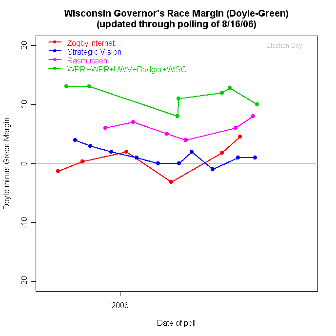
This is a "good news/bad news" story. For Democrats it is good news/bad news and for Republicans it is bad news/good news. It is all about how to convert the generic ballot into votes, and votes into seats.

Yesterday Jay Cost posted an excellent analysis of the generic ballot on RealClearPolitics.com. Here I want to illustrate one of the things he wrote about, and expand a good bit on the problem of going from the generic ballot to the national vote and on to the number of seats won. My colleague at UCSD, Matt Shugart, has also ventured down this road at Fruits and Votes with a very interesting analysis. I'll try to add something to both.

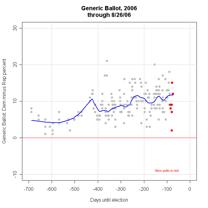
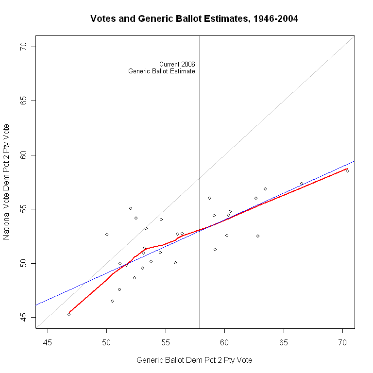
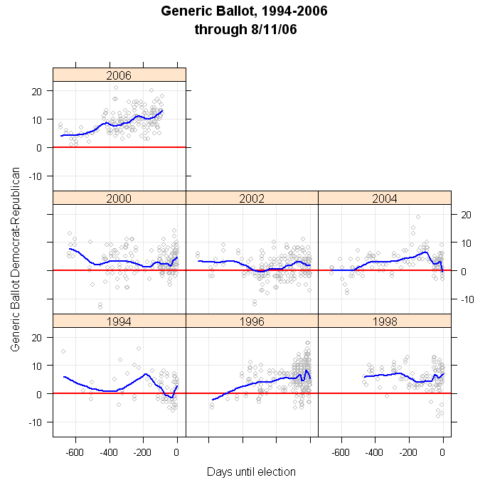
The graph at the top of this page illustrates two of the main points Cost made. The generic ballot almost always overstates the actual Democratic vote, and this bias (he says "skew") gets worse as the Democrats do better on the generic ballot.

In the figure, the gray diagonal line is where the points should be if the generic ballot exactly predicted the national two party vote. What we actually see is that in all but 3 of the last 30 elections, the polls fall well below this gray diagonal line-- they overstate the Democratic vote. Further, the gap between the points and the gray diagonal line gets larger as the generic ballot favors the Democrats more and more. This is exactly Cost's first two points, and the evidence is very clear.

(Technical notes: The straight blue line is the linear fit of actual vote to generic ballot, and the red line is my usual "local regression" which more flexibly fits the pattern of the data, without the assumption of a linear relationship. In this case, above about 53% Dem on the generic ballot we have a fit that is quite linear. Below that the red line tails down quite a bit, showing that even for low Democratic support in the generic ballot the poll still overstates the actual Democratic vote. I use two party vote because it is a better predictor of seats won than using D and R shares of the total vote. I also convert the "don't knows" in the generic ballot by allocating them equally to each party because this gives (somewhat) better predictions of the actual national vote than does allocating them proportionally to those who have decided. I then estimate support for the Democrats on the generic ballot as of election day using all the polls for the election year and estimating the value that the trend would predict on election day. This way I avoid using a single "September" poll, or any other method that throws out information. The method I'm using here is not all I could wish for, and I hope to make technical improvements in the coming days and weeks, but it is "good enough" for now. From here on, when I talk about "generic ballot" or "generic ballot estimate" I mean the estimate as of election day using this method, not a single poll result earlier in the campaign.)

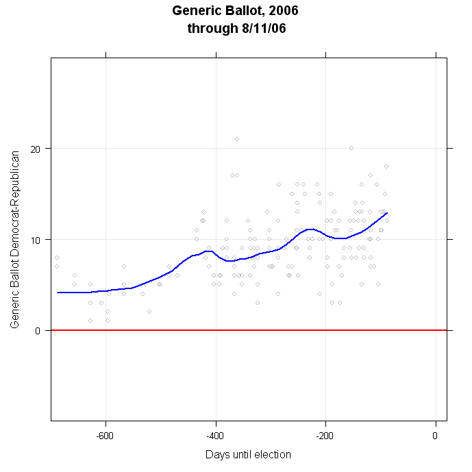
The first bit of "good news" for Dems is that despite these problems, it is still the case that as the generic ballot goes up for Dems, their national vote share has also generally gone up. So if we throw out all the econometrics and just ask "Does higher generic ballot support usually mean higher vote share on election day?" then the answer is yes. (Rapidly followed by the qualification that the relationship has a good deal of variability so we can't be very certain about specific predictions.) As I showed in an earlier post here, the 2006 election cycle is showing the highest support by far for Democrats on the generic ballot of any election since 1994. So without quantification, that must be good news for the Dems.

With a bit of quantification, the current estimate for the Dem share on the generic ballot, projected out to election day, is 57.9%. Taking account of the overestimation, either the linear or the local model give the same prediction: the Dems should be expected to win about 53% of the national two party vote. The uncertainty (about which I will have very little to say here, but perhaps more later) of this prediction is considerable: +/- 3.3%, or from 49.7-56.3%, which is quite a wide range. (And actually, that +/- 3.3% is too SMALL a margin of error. I just don't have time to calculate a better one this morning.) Still, all the caveats aside, this prediction is for the best year than the Democrats have had since 1990, at least in terms of the national vote.

(Robert Erikson and Lee Sigelman have an interesting article on the generic ballot in Public Opinion Quarterly, 1995. They point out that there are additional variables at work here, one of which is party control of the White House. Likewise Alan Abramowitz at Emory has a forthcoming article estimating seat change as a function of past share of seats, midterms, presidential approval, generic vote, open seats and challenger quality. By including some or all of that I could improve the fit of my model. However, my goal is to illustrate the relationships and the basic problem, rather than produce the best forecasting model, so I'll not go that route here.)

But House races are won or lost in 435 separate contests, not one national race. So how does the generic ballot do when predicting the number of seats the Democrats might expect to win? We'll look at that two ways, first directly, then indirectly.

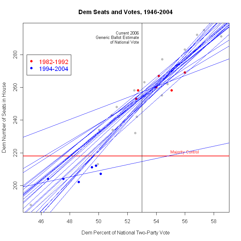
We can plot the Democratic seats in the House against the generic ballot estimate for each year. That produces the graph below, again with a blue linear fit and a red local fit.


The magic number here is 218 seats for a majority, marked by the horizontal red line. Once more we see that the better you do on the generic ballot, the more seats you tend to win, but we also see a lot of variation around that relationship. In particular, we see that in the 8 congresses since 1946 that were controlled by Republicans, the linear fit fails to predict the Republican majority 7 of 8 times. We also see that 7 of the 8 Republican congresses came from generic ballots in the 50-55% Dem range. However, there were 8 other congresses in this same range of generic ballots but which were easily held by Democratic majorities. That's poor prediction when it counts most. We'll return below to this problem of explaining the Republican congresses.

We also see in the figure that given the estimate for the 2006 generic ballot of 57.8%, we should expect to see a large Democratic majority, with an astonishing 252 seats. That would be a 49 seat increase, which seems wildly out of touch with current opinion that Democrats MAY not quite manage to gain the 15 seats needed for a majority. And again the uncertainty is huge: +/- 43 seats! (So between a 6 seat gain and universal domination at 295 seats. One suspects even Democrats don't think 295 is very likely.) Again, this uncertainty could be reduced by adding other predictor variables. But my point is that those who wish to rely on the generic ballot in thinking about likely outcomes have to grapple with both seemingly unrealistically high predictions based on past elections and an embarrassingly wide margin of error.

Still, the good news for Dems is that high generic ballots do tend to go with more seats. Bad news for Reps.

We've seen the perils of predicting national vote from generic ballot, and likewise for seats. But let's pause for a moment. Suppose we actually could get a PERFECT prediction of the national vote shares from the generic ballot (or any other source for that matter.) How much would that help us predict the outcome of the battle for control of the House?

The graph below plots the number of Democratic seats against the national vote share won by the Democrats, so here there is no error in the vote measure. Rather the variability that comes in is due to the fact that national vote totals don't translate directly into seats as they would in a proportional representation system. This "Votes-Seats" relationship lets us appreciate how much uncertainty there is in party control, EVEN IF WE TOOK OUT ALL THE UNCERTAINTY in the generic ballot.


Here the relationship is tighter, as it must be, than for the generic ballot. Still, the variation around the blue regression line is about +/- 19 seats for any given level of actual votes. That's more uncertainty than what the Dems need to gain to take control, so it seems unlikely we could readily forecast with confidence who will win the House, even if we knew the final vote today.

But not to let that stop us, translating the generic ballot at 57.9% into a predicted national vote of 53.0% gives the vertical black line in the figure. It crosses the blue regression line at 251 seats, essentially the same estimate we got from directly estimating seats from generic vote.

So what can we say? IF the pattern of relationships between generic ballot and votes, and between votes and seats held in 2006 as it had from 1946-2004, then we should expect an easy Democratic capture of the House, and with much room to spare. (but remember all that uncertainty we are ignoring in rushing to declare a Democratic victory.) Still, uncertain as we are, that would be the smart way to bet.

That's the last of the good news for the Dems. Now the Reps get their turn.

The "catch" in that last paragraph is the phrase "IF the pattern of relationships ... held in 2006 as it had from 1946-2004". That pattern may not hold. If not, then the predictions will, of course, differ.

But this is not idle speculation. There is evidence that the pattern has in fact differed in the last six elections. And if that difference persists, the Democrats may well fail to take control of the House EVEN IF they do very well in the national vote shares.

In the votes-seats graph immediately above, the blue dots fall pretty nicely around the blue regression line, and the red local regression is close enough to the linear model that I don't think it is worth worrying too much about nonlinearities in the votes-seats relationship. At a glance then, a graph of a linear relationship to write home about, and to use as an example in class. But an example of what? When we add labels for year, a new pattern becomes immediately obvious.

The figure below shows what we should have known anyway-- the points below 218 seats are Republican congresses, 6 of which are from 1994-2004, and two from 1946 and 1952. If we look at these compared to the overall fit line, they don't look too bad. But if we focus on just the 6 points since 1994, we see that they don't show the same votes-seats relationship as the rest of the data do. Seats have been MUCH less responsive to changes in votes since 1994 than in the previous 46 years.


The green line is the votes-seats relationship for 1946-1992. It is quite close to the gray line we estimate using all the data. But the red line is estimated for the 1994-2004 period only, and it is dramatically different. From 1946-1992, a one-percentage point gain in the Democratic share of the national vote produced a gain of 8.2 seats (and vice versa for Republicans.) Since 1994, a one point gain in votes has produced a gain of only 1.9 seats. The translation of votes into seats has become dramatically less responsive. This is the curse of the Dems in trying to gain a majority, but also the curse of the Reps in trying to expand theirs.

It is true that during this period votes have held to a relatively narrow range of about 46%-50% Democratic (a bit wider though than Michael Barone's 49-49 nation notion.) Yet under the "old" votes-seats relationship this would have accounted for shifts of some 33 seats. In fact the number of seats has shifted by only 10 over this period.

And this is the good news for Reps and the very bad for Dems. IF the votes-seats relationship in 2006 follows the pattern of the past six elections, then EVEN THE EXTRAORDINARY SUCCESS currently forecast by the generic ballot may not be enough to give Dems control of the House. In the figure above, the red line for the 1994-2004 votes-seats relationship remains below the magic 218 seats even when Dems win the 53% of the national vote which current generic ballot results would predict. Rather than the 251 seats they would be able to expect under the 1946-1992 relationship, they will expect only 215 seats, 3 short. The Dems would need 55% of the vote to reach a predicted number of seats of 218, and even the current excellent generic ballot results are not enough to sustain that number of national votes.

So, while the generic ballot looks the best (from a Democratic perspective) in years, and in the past would have been plenty of reason to expect to win the House, the votes-seats relationship appears to have changed so much that control may remain beyond the Dems' grasp. Good news, Reps. (If I was worrying about uncertainty here, I'd be insisting that there is so much uncertainty that the small gap between 215 and 218 seats means the race for control is essentially a flip of a fair coin.)

One question is whether we should believe that the votes-seats relationship has really changed, or is this just a fluke of these particular six elections. Maybe there have been lots of groupings of six elections in the last 60 years that would give us equally flat, but transitory, votes-seats relationships.

In the graph below I test this. I run a separate regression for all possible groupings of six consecutive elections since 1946. I plot one blue regression line for each group of six years, 25 estimates in all. If the votes-seats relationship is unstable, we should see lines going every which-way, like a dropped bowl of chopsticks.


That doesn't happen. All but two of the 25 lines are pretty close to the overall line based on all years. The largest departure from the overall pattern is clearly the 1994-2004 line we saw in the previous graph (though now colored blue rather than red.) In these sixty years, only one set of years had a similarly small slope. That line is for 1982-1992, and is the highest line in the top left quadrant of the figure. Yet even then the slope was 3.3, compared to 1.9 now. Moreover, that estimate is sensitive to the data in a way the the current period is not. The 1982-92 period is marked with red dots. With only six points, it is normal for the regression line to be sensitive to which six points are included. (Which is why the stability of the OTHER 23 lines is remarkable.) But if we look at the red points, it is easy to see that there are two or three points that are crucial for determining the slope of the line. The estimate is quite sensitive to the data.

In contrast, if you look at the blue dots for 1994-2004, no single point is very influential in determining the slope. Remove any one, and the rest continue to produce essentially the same line, with a very small slope. So I could argue that the 1982-1992 period is more of a fluke of particular elections, but I cannot make the same case for the current period.

(Why these two sets of years? It might be redistricting which got more sophisticated in the 80s, and still more so each decade since. It could be an increase in incumbency advantage, independent of redistricting. It is interesting that the two periods with smaller slopes come consecutively, suggesting that structural or behavioral changes drive the changing votes-seats relationship. But that's a story for another day, as are the normative implications of a much less responsive "People's House", in the sense of seat change in response to vote change.)

This means that I would be very reluctant to assume that the historic relationship between votes and seats is still true. (And a statistical test confirms that the slopes differ to a statistically significant extent between 1946-1992 and 1994-2004.) And the implication of that is that even a very successful vote for Democrats need not translate into control of the House.

If we shifted to a race-by-race evaluation, we might well reach different conclusions. The national vote doesn't need to change by much if the shifts are concentrated in exactly the right districts, and those who know such things (Charlie Cook, Stuart Rothenberg, CQ) tell us there are many more competitive races than expected eight months ago. That should raise the uncertainty and anxiety for both parties.

But if you are betting on the generic ballot to predict control of the House, even when it looks awfully strong for Democrats, you might want to think again. The relationship has weakened and the uncertainty is huge.


Click here to go to Table of Contents

Thursday, August 17, 2006

Bush Approval: Pew at 37%


A Pew poll conducted 8/9-13/06 finds approval of President Bush at 37%, with disapproval at 54%. That is a one point increase in approval from Pew's 7/6-19 reading, and a three point drop in disapproval. The addition of the Pew data barely changes my estimated trend, which now stands at 36.7%.

A series of polls which show shifts of 1-3 points, none of which are individually statistically significant, have cumulatively convinced my conservative trend estimator to decide that approval is now trending down, and this despite several recent polls in the 40% approval range. While it is still imprecisely estimated, the last several trend estimates have agreed that the high point of approval was around July 9. Since that time approval has trended down at a rate of one percentage point each 44.1 days. That is a slow rate compared to most of 2005 or to the Feb-May period of 2006. The all-time low trend estimate for President Bush is 33.98% approval on May 12, 2006.


Click here to go to Table of Contents

Bush Approval: Zogby at 34%


CORRECTION #2, 8/22: This story gets more amusing. The good folks at the PollingReport.com sent me the topline results from the Zogby International poll. The difference in 34% (Zogby's website report of this poll) or 35% (PollingReport) ends up a matter of how you calculate and how you round. Zogby finds 96 respondents saying "excellent" and 256 saying "good" for Bush job performance. With 1018 respondents total, (96+256)/1018 = 34.5776, which rounds up to 35% in anybody's book. So why did Zogby say 34% on their website? If you compute the percentages for Excellent and Good separately, and round to a single decimal place, you get 9.4%+25.1% = 34.5%, which some would say should round to the even number, giving 34% as the approval number. So in this case I think both could make a case for their numbers. For me, I'd go with PollingReport's method-- you should never round intermediate results before rounding the final result. In this case the difference is small and doesn't substantially affect my results for the trend, especially since more polls are now available to leaven the effects of this one poll. Not tonight, but soon I'll change the data to 34.5% and redo the figures, but I'm not going to change the text below. Some things just aren't worth worrying about!

CORRECTION 8/17: The Zogby website reports approval at 34%, not the 35% at pollingreport.com. The Zogby site however does not give the disapproval rate for the entire sample. I've taken the 34% from Zogby, and report the disapproval at 65%, as pollingreport.com does. I'll update this further if needed. The graph and text below has been updated to reflect the correct 34% approval rating reported by Zogby. This change shifts my approval trend estimate from 36.76 to 36.62. Thanks to an anonymous reader for pointing out the error.

A new Zogby poll, conducted 8/11-15/06 finds approval of President Bush at 34% with disapproval at 65%. This is a two point decline from Zogby's previous poll of 7/21-25. With Zogby added to the data, the trend estimate falls to 36.6% approval.

The shift to a negative trend is no longer overly sensitive to the very low (33%) approval rating in the recent AP poll. Without that poll the blue trend line is still moving in a small but clearly negative direction.

There is also considerable variation in recent polling, which ranges from 33% to 40%. Some of that is due to the different polling organizations doing the surveys. Four of the last six polls are from organizations with negative "house effects", meaning their polls typically fall a couple of points below the average approval across all polls. Two of these (Fox and Gallup) usually fall a little (less than 1 point) above the average. The result is some differences between polls that seem substantial but which actually fall within the normal range of error around the estimate of 36.6%.

The downturn in approval is still small, but compared to two weeks ago when the trend still seemed to be up, this represents an important turning point for approval. The precise turning point cannot yet be well estimated.


Click here to go to Table of Contents

Tuesday, August 15, 2006

Bush Approval: Stale Gallup at 37%


A surprisingly stale Gallup poll, completed 8/7-10/06 but only released today finds approval of President Bush at 37% with disapproval at 59%. While some interviews were completed after news of the British plane plot broke, this cannot be considered a clear reading of post-plot approval. It nonetheless falls between the CBS poll at 36% and Newsweek at 38%, both taken entirely after the news of the plot.

With the addition of this poll, my estimated trend stands at 37.2% approval. This additional poll also increases the support for a new downward trend in approval after weeks in which the estimator consistenly showed a small but positive trend. With seven or eight recent polls to support the trend estimate, I am now less concerned that this estimate is driven entirely by one or two low readings from Harris and the AP. Still... some caution is in order. If the AP poll at 33% is removed, the trend estimate would be 37.6 and the downward trend far less visible. So I remain a bit cautious about the downturn, but the evidence HAS clearly turned against the continued slow rise my model was estimating as of 2 weeks ago.

The Gallup poll has fluctuated between 37 and 40 for the last 5 polls. That leaves a lot to the imagination in deciding whether this represents a shift in trend or not. It could bounce back to 40 for the third time. So... I look forward to more post plot polls, and an end to August.


Click here to go to Table of Contents

Generic Congressional Ballot


Congressional election outcomes are among the most interesting yet difficult to gauge indicators in American politics. The race for control of the House of Representatives is the aggregate outcome of 435 separate races, each with its own dynamics and each with its own unique features, plus the power of incumbency and the fact that though we hate congress, we love our congress(wo)man.

The blunt instrument pollsters use to estimate the state of the race for control of the House is some variant of
"If the election for U.S. House of Representatives were held today, would you vote for the Democratic or Republican candidate in your congressional district?"
The problems with the question are obvious: no mention of who your candidates are by name (and many voters don't have a clue) or who the incumbent is (a huge advantage in name recognition alone, not to mention positive generalized affect) and the likelihood that uninformed voters reply by reflecting their partisanship rather than anything specific to the race.

NONETHELESS, this is the indicator we have, and we follow its ups and downs with great interest.

At the moment, this indicator looks quite favorable for the Democrats. Since the 2004 elections, the share of voters preferring the Democrat over the Republican has climbed steadily. There is considerable variation from poll to poll, but the current estimated trend is a Democrat lead of +14.65%.

There has been a long-term tendency for Democrats to do better on this generic ballot question than they in fact do at the polls, so considerable care is required in thinking about this number. If a Democratic lead in the Generic Ballot were sufficient for control of the House, the Democrats would have won the House in 5 of the last 6 Congressional elections, including 1994! The trend estimates for each year, as of election day are:

2004: -1.07
2002: +1.49
2000: +5.26
1998: +8.03
1996: +5.45
1994: +3.35

Nevertheless, the current margin in the Generic Ballot is very large by comparison to recent election years. If we plot the polls and the trend since 1994, we find that 2006 is by far the largest Democratic lead at a comparable time in the election cycle:


In no cycle since 1994 has the Democratic lead approached 10%, let alone exceeded it. So by the standard of "relative lead" in the generic ballot, 2006 reflects extremely strong pro-Democratic forces.

Using the generic ballot to forecast the actual House outcome? That's a story for another day. (Update 8/17: Jay Cost now has an excellent discussion of the generic ballot on RealClearPolitics here. He discusses, among other things, the difficulty of estimating seat changes from the generic ballot, a topic I'll have more to say about here soon as well.)


Click here to go to Table of Contents

Monday, August 14, 2006

Bush Approval: CBS at 36, post plane plot


A CBS News poll conducted 8/11-13/06 finds approval of President Bush unchanged at 36%, with disapproval at 57%, up two points since the last CBS poll 7/21-25. The CBS poll comes in below the trend estimate, and combined with recent low ratings from Fox, Harris and AP, helps to produce a slight negative trend in approval. With the CBS result the approval trend estimate stands at 37.2%.

The Newsweek poll also conducted after the British disrupted a plot against US-bound airplanes found approval at 38%. With luck we'll see a couple more polls this week to help stabilize the estimate of the effect of the renewed threat of terrorism.

The CBS poll found no change in approval of the President's handling of terrorism: 51% approve and 43% disapprove, unchanged from 51/42 in July. Newsweek found 55% approval of handling terrorism, with 40% disapproval.

Perhaps the most important result from the poll for those considering the fall elections is the President's approval rating by party and comparing overall job with terrorism. The key there is among independents: 29% approve of his overall job performance, but 50% approve of his handling of terrorism. Disapprovals are 62% overall but only 43% for terrorism. The Republican emphasis on this issue as a key to congressional elections has a clear basis in the data here. Whether these relatively strong approval rating among independents can be translated into congressional votes is another matter. But the contrast between overall and terrorism approval is particularly striking here.

CBS found a noticable jump in the percentage saying terrorism was the most important problem facing the country, to 17% from 7% in their July poll. The war in Iraq continued to lead the list at 28%, up from 23%. The economy and jobs finished third in the MIP list at 11%, unchanged since June.

(See the "Basic Trends" section for the long-term trend in President Bush's handling of terrorism.)


Click here to go to Table of Contents

Saturday, August 12, 2006

Bush Approval: Newsweek at 38% post air plot


Newsweek has the first poll to be conducted after the plot to blow up airplanes from Britain to the US was foiled. The Newsweek poll was conducted 8/10-11/06 and finds approval at 38%, disapproval at 55%. With these data included, the estimated approval trend (the dark blue line) stands at 37.5%. (That includes the AP outlier at 33.)

The addition of the Newsweek data point helps stabilize the trend estimate and reduce the leverage the AP poll at 33% was having on the trend estimate. I still don't know which way the trend will go, but it is now back to almost flat from being slightly down. This is unstable so we need more polls to clarify what's happening. Thanks, Newsweek, for providing that.


Newsweek notes that approval of President Bush's handling of terrorism showed a jump to 55% from 44% in their May poll. That May poll, it should be noted, was taken 5/11-12, the exact bottom of Bush approval in 2006, and Newsweek has not conducted a poll in the 3 months between that and this new one. Like many poorly analyzed stories, the Newsweek article gives credit for all the change between May and August to events which have just occurred, rather than recognize the long term change that took place during this three month period.

I recently added approval of Bush's handling of terrorism to the "Basic Trends" feature here. Based on those data, my estimate of approval of handling terrorism was 46.4% on May 12 when Newsweek's reading was 44%, a reasonable fit. My current (pre-plot) estimate was 48.3%, a modest upturn. It seems likely that the increased salience of terrorism will boost the President's standing on this issue, at least in the short term. Newsweek's reading of 55% would be quite an increase from the 48.3% estimate prior to 8/10. With the Newsweek poll added, the estimate increases to 50.2, though more polls will be needed for that to become a stable estimate. For now, we don't know where the level of approval will stabilize.

I'll update the Terrorism trend in the Basic Trends secion with these new data.


Click here to go to Table of Contents

Bush Approval: Harris (8/7) at 34%


A Harris poll taken 8/4-7/06 finds approval at 34% and disapproval at 66%. That is unchanged since the previous Harris reading 7/7-10. With the addition of this poll and the AP "outlier" from 8/7-9, this brings the estimated trend to 37.4%, with a small downward trend. If we exclude the AP, then the trend estimate is 38.0% and the trend is slightly rising. Both estimates include the Harris reading. The plot above includes the AP poll in the trend. I've never excluded a poll from the trend estimate, even if the evidence shows it to be an outlier. Any effect will be diminished with a few more polls.

But this does pose a bit of a question of what's happening to approval. I've maintained that the evidence prior to the Harris and AP polls was that approval was increasing at a very slow rate of about 1 percentage point per month since June 20. With the Harris poll that rate of increase would be decreased, and the inclusion of AP reverses the trend direction, though by a small amount.

First, note that the last four Harris readings have been 29, 33, 34 and 34. That is consistent with what the overall trend has done-- a low point followed by increase followed by either slow or stagnant trend thereafter. Harris's low level of approval is consistent with the Harris house effect, which is the most negative house effect of the 22 polls I track house effects for. Here is an updated table of house effects on approval:


The Harris estimate is -2.94, which is consistent with the purple line in the top figure, showing Harris consistently below the estimated trend. Applied to the current estimate, that would say Harris+2.94 would be about 37%, which is in striking distance of the 38% trend estimate without AP or the 37.4% with AP. So Harris doesn't appear WAY out of line with the trend, given it's large house effect.

Yesterday I showed that the AP reading at 33% IS an outlier
. If we add the Harris poll into the data, since it was completed before the AP poll, this conclusion remains unchanged-- even revising the approval trend to include Harris does not stop AP from being outside the 90% confidence interval. However, Harris does not appear to be an outlier regardless of what method is used to test that (either with or without accounting for house effects.)

So I'm left wondering if the small downturn we now see with Harris and AP (and Fox at 36) added to the trend is telling the future or not. Given the three 40% readings in the first week of August, it is not really credible that approval has jumped down to the 33-36 range from the 38% range of the trend estimate before these new polls came in. And Harris and AP do have relatively large and negative house effects (Fox is a modest +0.64), so it isn't surprising they would be below trend.

Lacking a crystal ball, I'll wait for more data. Certainly this week's data have reduced the credibility of rising approval and increased the evidence for a flat period. Whether that will turn into a decline or new rebound or just plain stability is unclear.


Click here to go to Table of Contents

Friday, August 11, 2006

Bush Approval: AP plummets to 33%


The new AP/Ipsos poll, completed 8/7-9/06 finds President Bush's approval rating plummeting to 33%, a remarkable result when the last 14 polls have remained in the range from 36 to 40. If true, this is a sharp departure from recent trends. The dissapproval rate in the new poll is 64%, a one point increase from July. (Note that RealClearPolitics has the disapproval rate at 57%. This is wrong according to the AP/Ipsos results published on their site, which shows the balance at 33-64. This has now been fixed at RealClear.)

A three point drop is "huge", but not by the standards of statistical inference. The previous AP poll (7/10-12) was at 36%. Both polls are of about 1,000 adults (1000 and 1001 to be precise.) The margin of error for each poll is 3.2%, but the margin of error for the DIFFERENCE between two polls, each of 1,000 respondents is 4.47%. So the three point change between the AP's July and August polls cannot be said to be statistically significant, even if it "seems huge." I've written at length on the problems of detecting change in approval polls (link and link). This case is a prime example of this difficulty when approval changes relatively slowly but polls vary by a good deal more than the expected change. For example, if Bush approval were changing by 1 point per month, then in this example it would take 4.5 months to change enough to show a "statistically significant" difference in the AP poll. Here the polls are just under a month apart so detecting "real change" is difficult.

It is clear from the graph above that the new AP poll is well away from the scatter of other polls around the trend line. Does this mean it is a statistical "outlier"? That is, farther from the trend line than we would reasonably expect given sample size and the variability we see across all polls? Let's see.

The "residuals" are the observed approval rating minus the predicted approval from the dark blue trend line in the figure above. In the time since January 2002, 90% of all polls have had residuals falling between -4.66 and +4.04 of the trend line. (The mean residual is zero.) I start with 2002 because the effects of 9/11 on approval are extreme and exaggerate the size of the residuals.

The 90% confidence interval is the region in which 90% of the polls fall. The "outliers" are the 5% of polls that fall more than -4.66% below the trend and the 5% that fall more than +4.04% above the trend. In the plot below I highlight the outliers in red, and plot the AP/Ipsos polls in orange. Other polls that are not outliers are in gray. The horizontal lines indicate the low and high limits of the 90% confidence region plus the mean residual at zero.


By this standard the latest AP poll is an outlier. It is clearly outside the lower bound of the confidence interval, with a residual of -5.7. (Technical note, this is the residual from the trend estimated WITHOUT including the new AP poll. We want the outlier assessment to be independent of the effect the outlier has on the estimated trend. As of yesterday, before the new AP poll arrived, the estimated approval trend was 38.7%.)

So what do we conclude from this? It is unlikely that we would get a poll this far from the current trend estimate. Further, given movement in the trend over time, it is not plausible that there has been a "real" three point drop in approval. There is great variability from poll to poll, but the trend estimates show that approval changes at a pace of one percentage point every two to four weeks, not by three points in one week, or even in four weeks if we compare the last two AP polls.

It is possible that the AP result signals a sharp break from the past. Given the track record of outliers in these data (over 1100 polls in all) that is not likely. Far more likely is that new polls will confirm that the trend has changed by modest amounts, either up or down, and that the next poll will be closer to 38.7% (both above and below) than to 33%.

This is not to say that the trend cannot change. We have seen three very clear examples of reversals in aproval trend since January 2005: in November 2005, February 2006 and May 2006. At some point approval may again trend down (or more sharply up, for that matter.) But it would not be a statistically good bet that the AP poll is where approval really stands right now.


P.S. There was a great question in the comments, so I'm copying it in here, along with my response, so more people will see it.

Alexis Leon said...

What is the rationale for defining the residuals as (observed approval rate - trend estimate), instead of (observed approval rate - trend estimate - polling company's own house effect)? After all, wouldn't you expect a new AP/Ipsos poll to be a bit below trend already, given that they come with a slightly negative house effect? I suspect that, after taking that into account, the new AP poll could no longer be considered an outlier.

In any case, what is the current estimated approval trend (that is, after including the new AP poll)?

Thanks a lot for the great work you're doing here!

1:39 PM

Charles said...

Alexis,

Excellent question!!

We can take out the house effects, but then the residual variance shrinks as well, so what the AP gains from accounting for the house effect it loses to the tighter confidence interval.

Still, it is a really good point, so I re-ran it taking out house effects. The result is that the AP residual after accounting for the house is -3.55 and the lower boundary of the confidence interval is -2.94. So it remains an outlier. (In fact, it is also outside the 95% CI as well, which has a lower bound of -3.44.)

Accounting for house effects does very little to alter the trend estimates, by the way, because the polls are pretty close to symmetric around the mean. But house effects do reduce the residual standard error by quite a bit-- about a 25% reduction.

As for the trend WITH the AP included: it is revised down to 37.95. However, that is misleading because the AP is both extreme and at the end of the series, so it is exerting a strong effect on the trend estimate. With a few more polls, the impact of the outlier will come close to vanishing, and the trend will return to somewhere close to 38.7, depending of course on what the new polls show. Outliers matter for my trend estimator only briefly. Once they are surrounded by other data their effect is much reduced.

Charles

2:37 PM


Click here to go to Table of Contents

Thursday, August 10, 2006

Bush Approval: Fox says 36%, unchanged


A new Fox poll taken 8/8-9/06 finds approval at 36%, disapproval at 56%. That is no change in approval from their previous poll of 7/11-12 but a 3 point increase in disapproval. With this addition my estimate of the approval trend is adjusted down to 38.7% from 39.0% as of 8/6.

It is great timing to have this and the CNN/ORC and ABC/Washington Post polls from late last week and the weekend just prior to the British terror arrests of this morning's news. This will give us a strong baseline to assess any effect of the terror arrests on approval or the structure of attitudes. Unfortunately, the timing of the arrests also means that any effects of Lamont's win in CT on national public opinion will be hopelessly confounded with the arrests. Damn.

The Republicans appear to see an opportunity in Lamont's win to paint him and the Democratic party as soft on terror. This strategy, which links Iraq to the "War on Terror" and argues that Democratic support for troop withdrawals can be translated into weakness on terror, seeks to exploit the President's remaining (relatively) strong card in public opinion. Approval of the President's handling of "the U.S. campaign against terrorism" was measured 8/3-6/06 by ABC/WP as 47% approve, 50% disapprove. Since January the approval rate has been 53, 52, 52, 50, 53,51 and now 47, a mild decline. But this at a time when overall approval was sinking into the mid-to-low 30s. So while far from the ace of trumps this issue once was, it remains the high card in the White House's hand. Apparently the party thinks this issue still holds the key to victory in the fall. Now events have unfolded to raise the salience of the terrorism issue once again.

Liberal Democrats, energized by the stunning success of Lamont in capitalizing on the Iraq war issue to unseat a seemingly safe incumbent, were looking forward to renewed criticism of Bush from the timid among their national leaders. The tactical question now is how to push that criticism of the (at least) mishandled (and at most unjustified) war without playing into the Republican strategy of making Dems look weak on terror. Expect Republicans to stress the link of Iraq and Terror in every speech.

Thanks to the timing of recent polls, we should at least be in a good position to measure how these latest developments play out in public opinion.

-----

On a different subject, in a comment here, Alexis asked about the Fox poll performance recently:
Fox has Bush at 36% again, exactly the same approval in their last poll from last month (although the disapproval rate is up three points). Didn't Fox use to have a significantly positive 'house effect'? How do you explain the fact that they've been consistently below trend as of late? Has there been any change in polling methodology or wording that you know of that could account for that?
So I thought I might answer that here rather than in the comments of the earlier item. The plot above shows that Fox has tended to be a little above the trend line though with a few below trend also. The last time I updated the "house effects" estimate in late April, Fox came in at +.72%, with a confidence interval from -.02 to +1.46. That puts Fox only one spot above the median across the 22 polls for which I have estimated house effects. The mean house effect is constrained to be zero in my estimates.

The Fox poll is often mischaracterized as strongly biased in a pro-Bush/Republican direction. At least on the approval question, that is not the case. Democratic pollster Stanley Greenberg's firm, for example, has a +1.83 house effect estimate and ABC/WP has a +1.29 estimate. Likewise other polls have considerably larger house effects in the opposite direction: CBS/NYT -1.87, Newsweek -2.18 and Pew -2.32.

Since January 2005 Fox has done 30 polls, 20 of which were above the trend and 10 below trend. The last two are a little below trend. This most recent is 2.7 below trend (-3 if you exclude this case from the calculation of trend.) That isn't large, relative to the variability of polls. Over the 1180 polls since Bush took office, the 80% confidence interval around my trend is -3.64 to +3.42. The 90% CI is -5.12 to +4.2. So by that standard, the current residual for Fox of -2.7 (or -3) is quite small. Given the small house effect, and the variability, it isn't that unexpected that we'd see two Fox polls in a row that fall below the trend.

So far as I know there have been no changes to Fox methodology of late. But I don't think we need to worry too much about the issue. So far, at least, there is little statistical reason to think that the behavior of the Fox poll has changed.


Click here to go to Table of Contents